Create a custom dashboard
This section describes the process of creating a set of custom visualizations using Kibana and how to add them into a dashboard to create a custom dashboard.
Creating Visualization
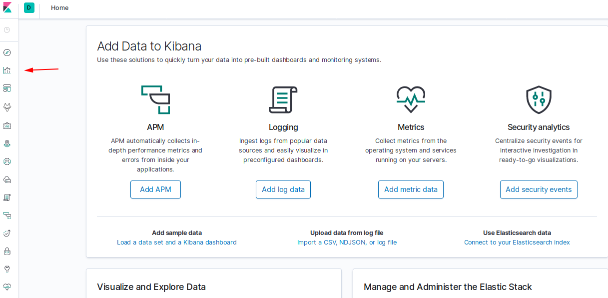
Go to the Visualize tab.
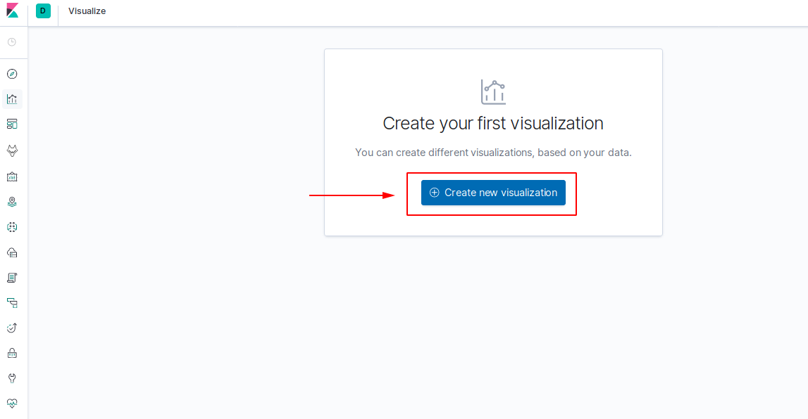
Click on Create new visualization.
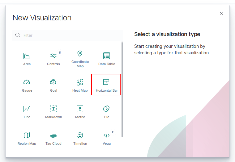
And select a visualization type among the ones available. As an example, we will be taking the Horizontal Bar chart, but it is essentially the same for other types of visualization.
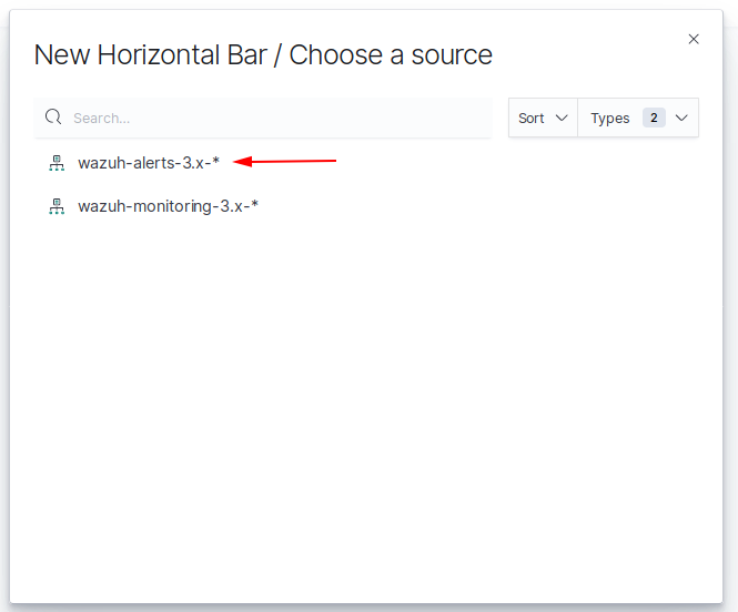
Next step will be selecting the index that will be used as a data source. We can work with any index that we created previously, but generally, we will be working with wazuh-alerts-3.x-*.
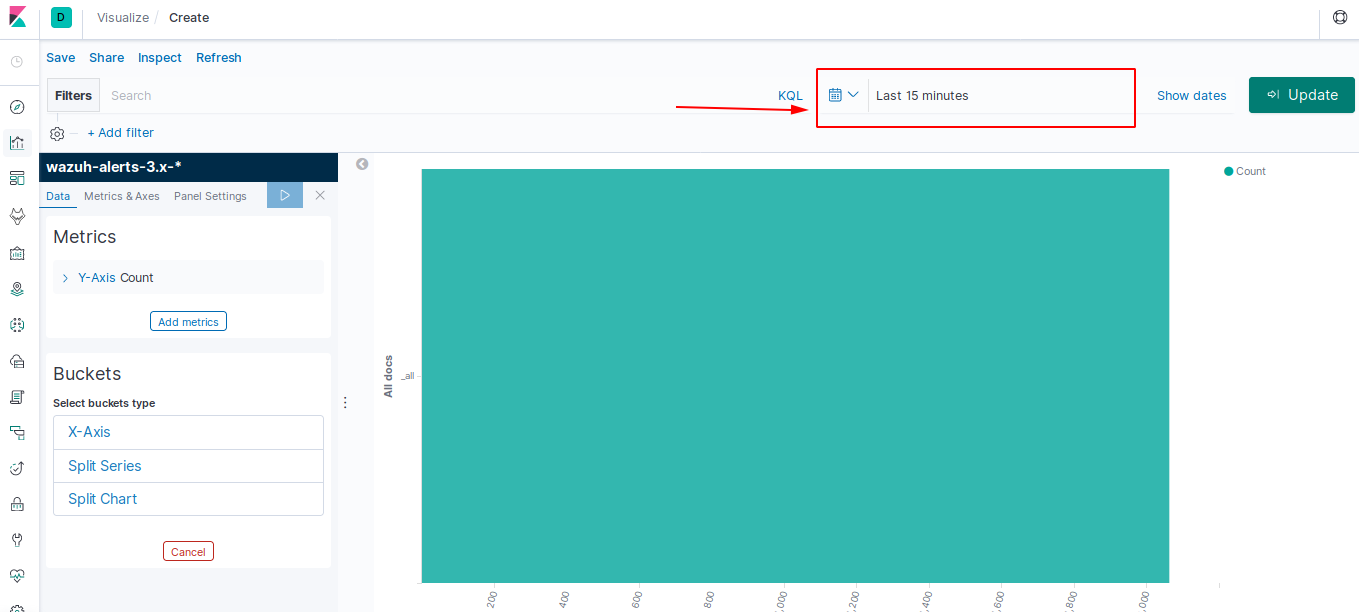
At this point, a graph will be generated. You can select a lapse of time to display the information related to that period. Click on the following dropdown menu, define it and then update your changes.
This chart can be configured to match your preferences. You can organize your data using Metrics and Buckets.
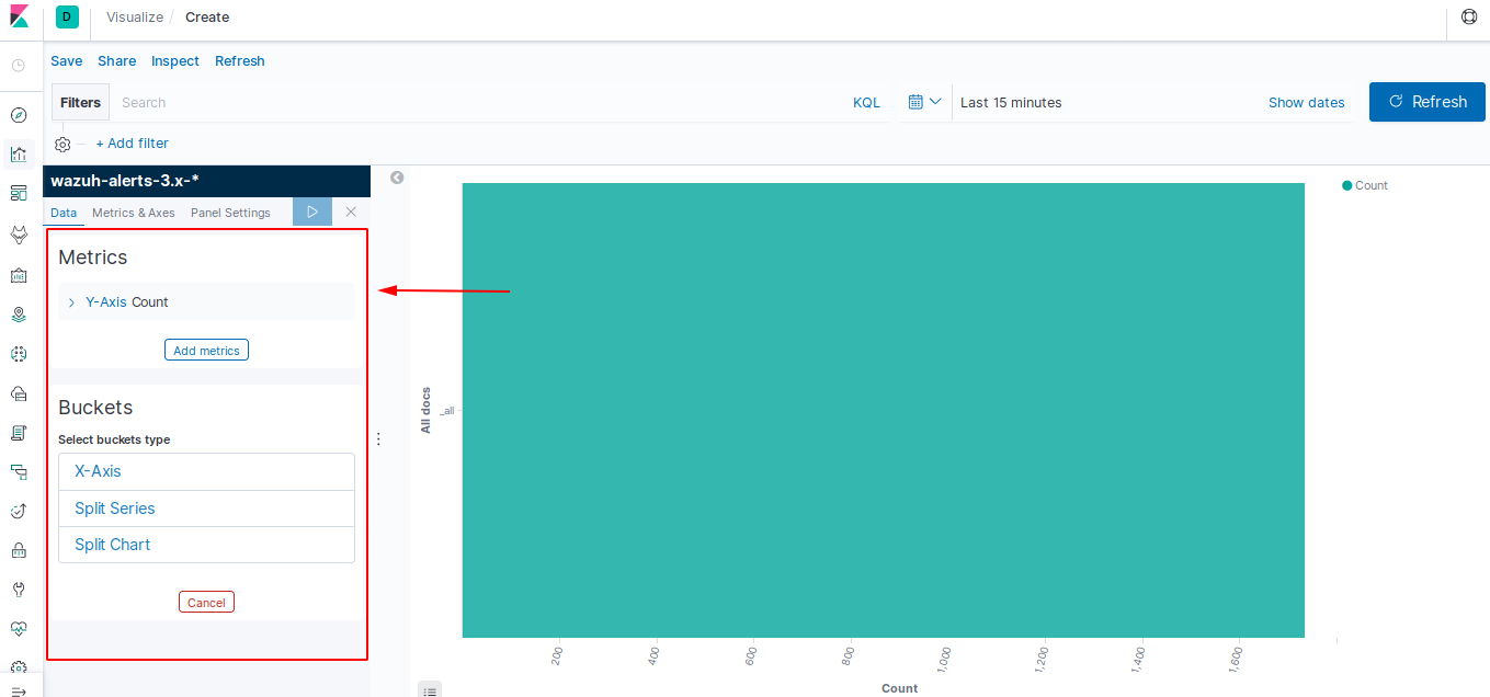
Metrics section has options in order to quantify the data: Count, average, sum, max/min, etc.
Buckets are aggregations of data that are sorted according to your search criteria.
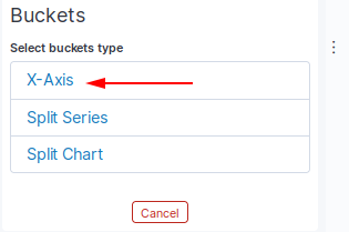
For this example, we will leave the Y-Axis as default (count) and we will modify the Buckets (X-Axis) to sort them according to the level of the rules that have been triggered.
To do so we will have to click on X-Axis:
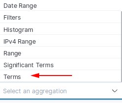
Select the Terms option in the Select an aggregation menu:
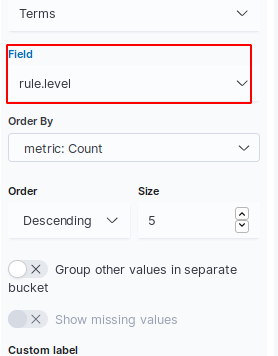
Now you will be able to select a Field to sort by (e.g. rule.level):
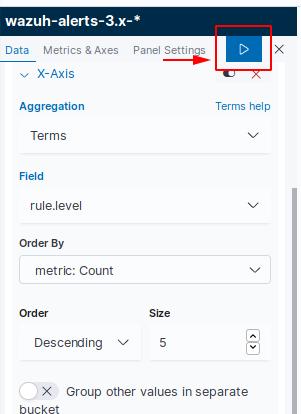
And, eventually, you will need to apply the changes to visualize them:
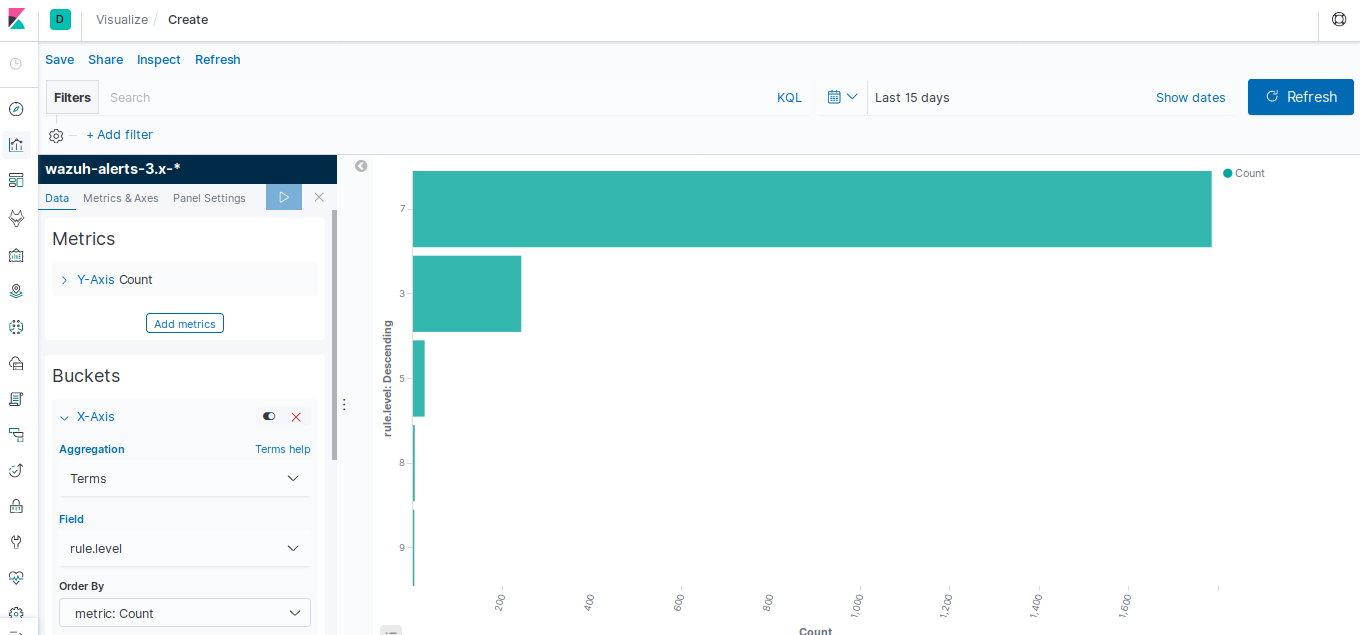
Now you will be able to see a chart like this:
Saving a Visualization
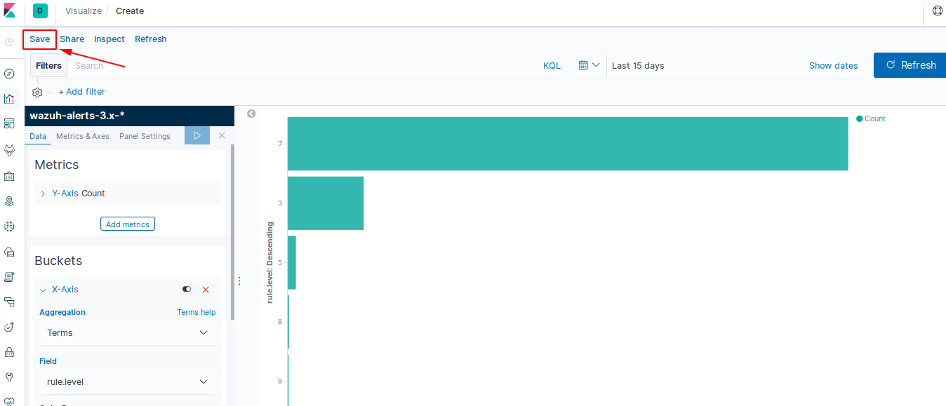
Once we have created a customized visualization, as we did in the previous section, we can save it by clicking on Save.
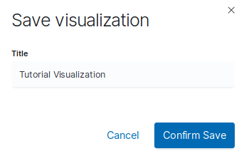
After that, set a name for it and confirm.
Creating a Custom Dashboard
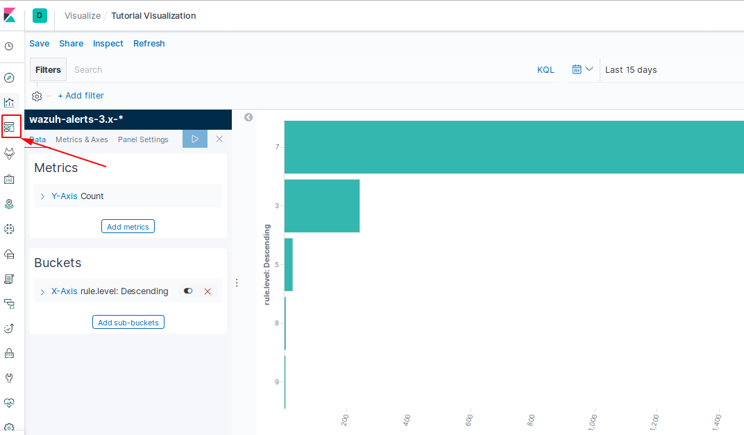
In order to create a customized dashboard we can reuse a saved visualization in the Dashboard section:
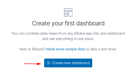
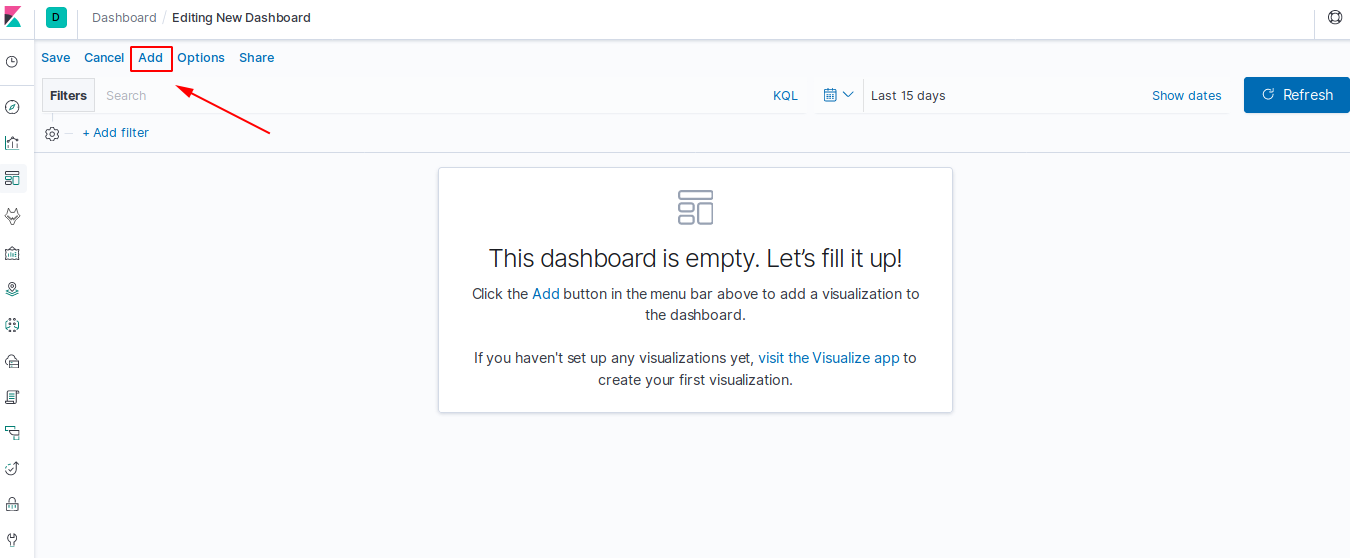
Just have to click on Create a new dashboard:
And then click on Add.
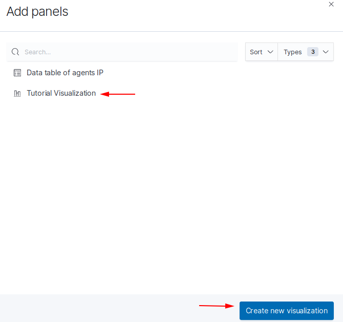
Now you can select a visualization to add among the ones you have saved. We will choose the bar chart that we created previously and then click on Create new visualization:
You will be able to see the visualization added to the dashboard:
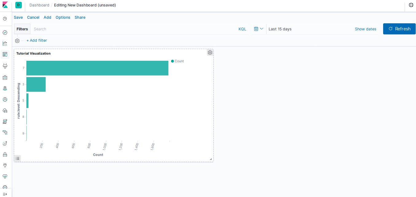
You can keep adding visualizations to the dashboard following the same process so that it fits your preferences.
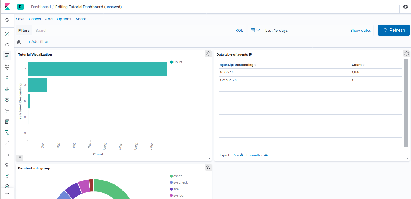
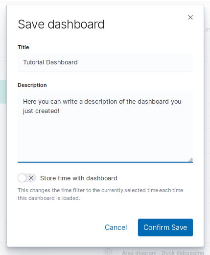
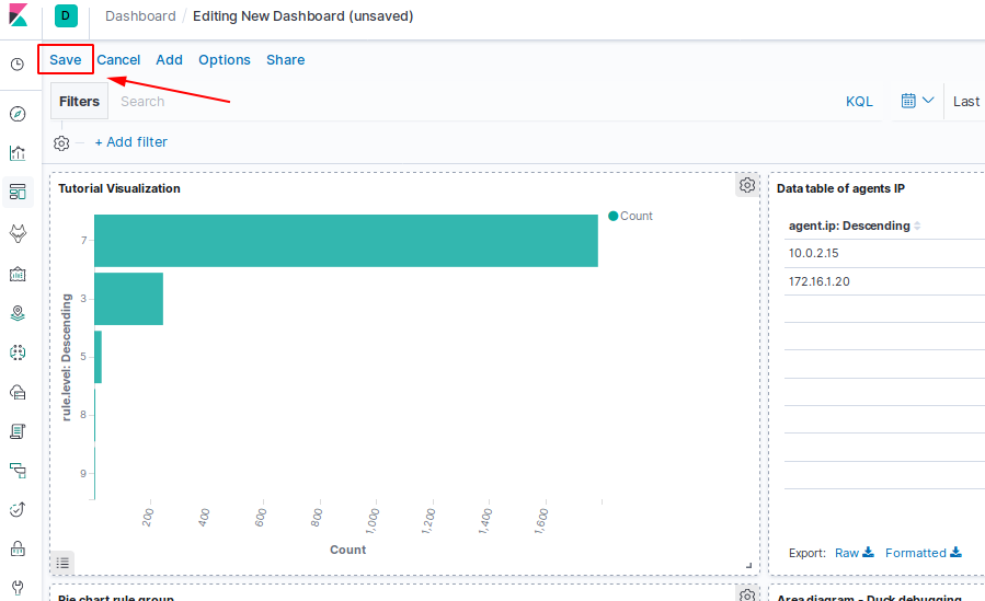
Once you have finished editing your dashboard you will need to save it by clicking Save.
Set its name, description and save it: