Wazuh dashboard configurations
The Wazuh dashboard provides a centralized interface for configuring and managing Wazuh platform components and capabilities. It covers managing log normalization and event-based detection, configuring automated response actions, and integrating Wazuh with third-party notification and orchestration platforms. It also describes multi-tenancy configuration, dashboard customization, data visualization, and the creation of custom dashboards to support security monitoring and analysis.
The following configuration and management capabilities are covered in this section:
Security analytics
Security Analytics is a core section of the Wazuh dashboard that provides tools for managing the full lifecycle of log normalization and event-based detection. It centralizes the configuration of integrations, decoders, key-value databases (KVDBs), detection rules, and detectors through a unified interface powered by the Wazuh Engine.
Integrations, decoders, KVDBs, rules, and detectors are organized into Spaces. The Draft, Test, and Custom spaces are user-managed and represent different stages of the content lifecycle, while the Standard space is read-only and contains the built-in content shipped with Wazuh.
Security analytics is organized into sections that support different stages of the event processing workflow. The Normalization section focuses on parsing, enriching, and structuring raw log data. The Detection section manages the rules and detectors used to identify security findings from normalized events. The Wazuh Log test tool allows users to validate parsing and detection logic before deploying changes.
The Security Analytics section on the Wazuh dashboard provides access to these sections:
Normalization: Provides visibility and management over the components that are used to parse, enrich, and structure raw log data before detection and analysis. Users can configure and manage integrations, decoders, and the Key-Value database (KVDB) used during log normalization.
Detection: Provides visibility and management over the rules responsible for generating findings from normalized events processed by the Wazuh Engine. Users can configure and manage detection rules and detectors for continuous threat monitoring.
Log test: Provides an interactive interface to validate that a specific log event is correctly parsed by active decoders and test detection logic directly from the Wazuh dashboard.
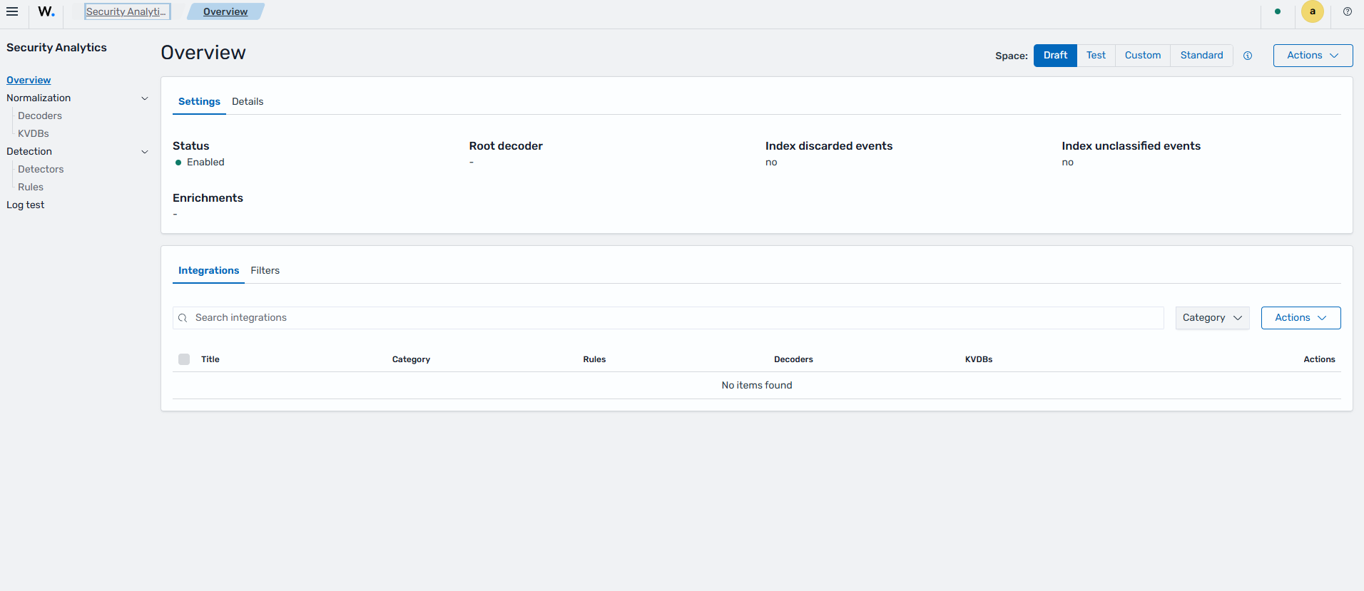
To view the Security Analytics dashboard, click ☰ to open the menu and navigate to Security analytics > Overview.
Space
Security analytics organizes content across four spaces. These spaces are based on the Wazuh indexer structure and are synchronized to the Wazuh Engine through the CMSync module. The Wazuh CMSync module periodically pulls content from the Wazuh indexer and applies any detected changes to the Wazuh engine. This synchronization process ensures that Wazuh Engine always uses the latest integrations, decoders, KVDBs, rules, and detectors configured in the Wazuh indexer.
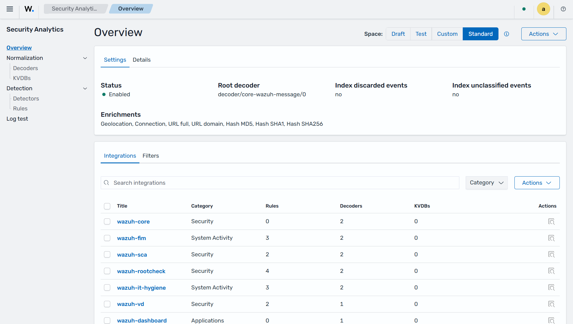
Security analytics uses four spaces: Draft, Test, Custom, and Standard. The Draft, Test, and Custom spaces are user-managed and represent different stages of the content lifecycle. The Standard space contains default integrations, decoders, and rules maintained by the Wazuh CTI.
Space |
Managed by |
Purpose |
|---|---|---|
Draft |
User |
An environment where integrations, decoders, rules, and KVDBs are created and modified. Content in this space is not active in the Wazuh Engine. |
Test |
User |
Validation environment used to test integrations, decoders, rules, and KVDBs with sample or live events before deployment. Content in this space is loaded into the Wazuh Engine for testing. |
Custom |
User |
Production environment containing user-defined content that is active and applied to incoming events processed by the Wazuh Engine. |
Standard |
Wazuh |
Read-only space containing the default integrations, decoders, and rules maintained by the Wazuh CTI and distributed through the Wazuh indexer. |
User-managed content is typically promoted sequentially from Draft to Test and from Test to Custom after validation.
Normalization
The Normalization section of Security Analytics in the Wazuh dashboard provides visibility and management over the components responsible for parsing, enriching, and structuring raw log data before it is used for detection and analysis.
The Normalization section manages the following components:
Integration
An integration is the top-level organizational unit in security analytics. It groups related decoders and rules that provide support for a specific log source or use case. Each integration is configured through a space policy within a space. The policy must be enabled before the integration can progress through the promotion workflow. It also defines the root decoder used by the normalization engine as the entry point for processing events for the integration in the Test and Custom spaces.
In the Security Analytics section of the Wazuh dashboard, click Overview to display all integrations available across the active spaces (Draft, Test, Custom, and Standard), along with their status and associated metadata.
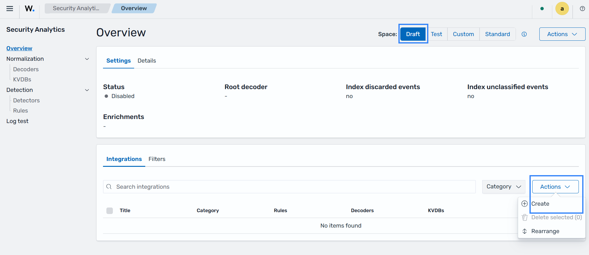
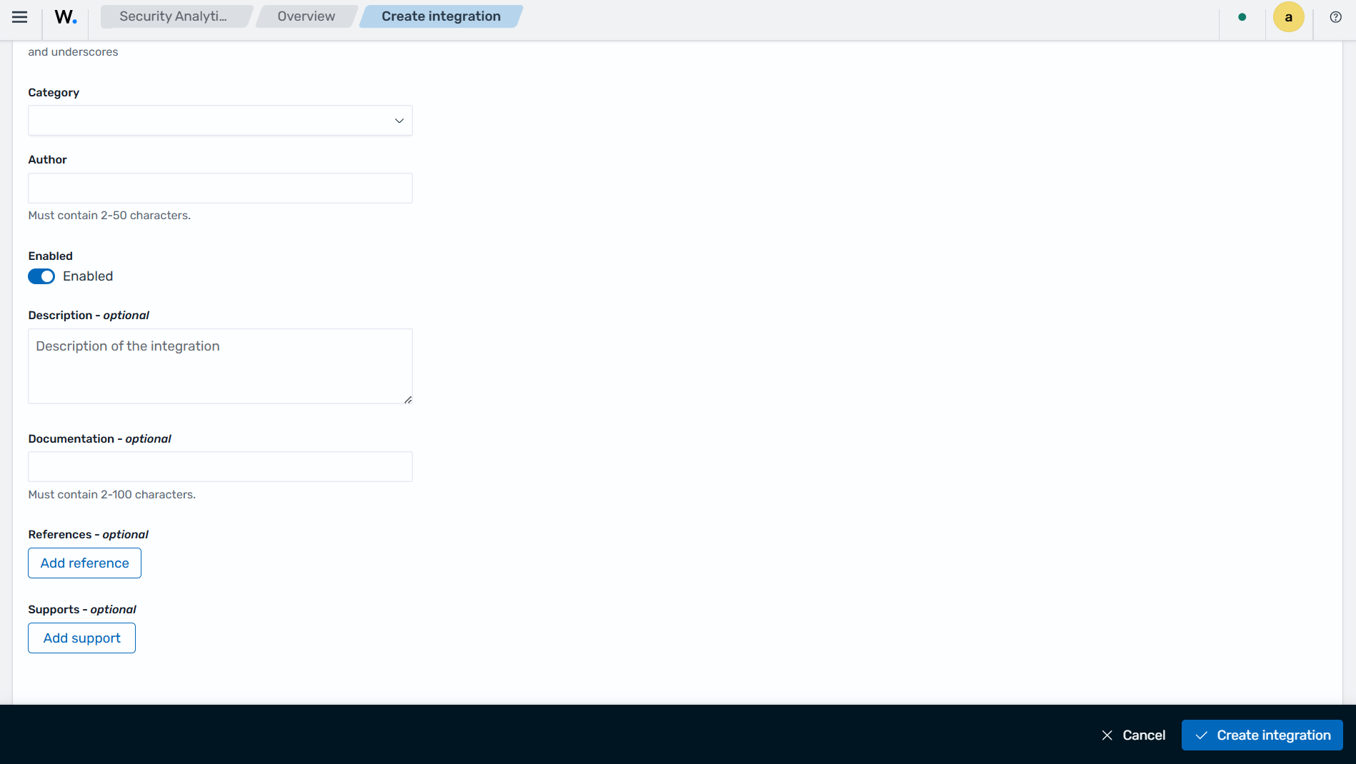
In the Security Analytics section of the Wazuh dashboard, navigate to Overview > Draft > Actions > Create to create custom integrations.
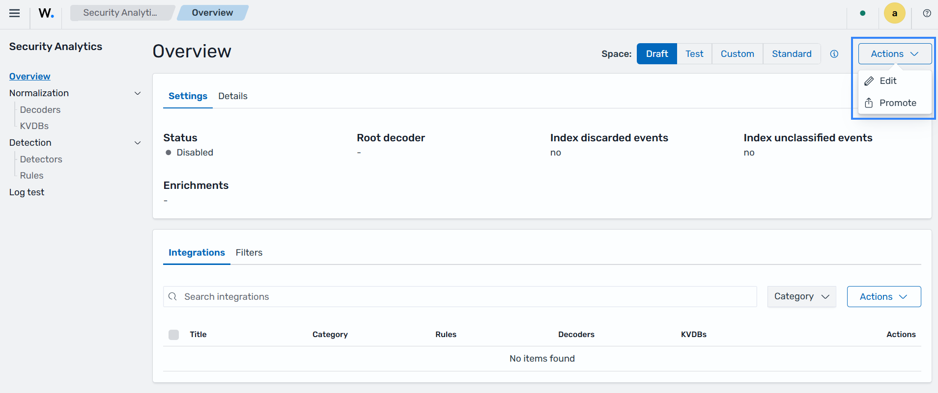
User-managed content is promoted sequentially from Draft to Test and from Test to Custom after validation. After creating an integration, click Actions at the top-right corner of the Wazuh dashboard and select Promote.
Note
When an integration is promoted from Draft to Test, or from Test to Custom, all of its associated decoders and rules are promoted together.
Decoder
A decoder defines how a raw log event is parsed and mapped to normalized fields. Decoders are written in YAML and are validated against the Wazuh Engine schema. Each decoder belongs to an integration.
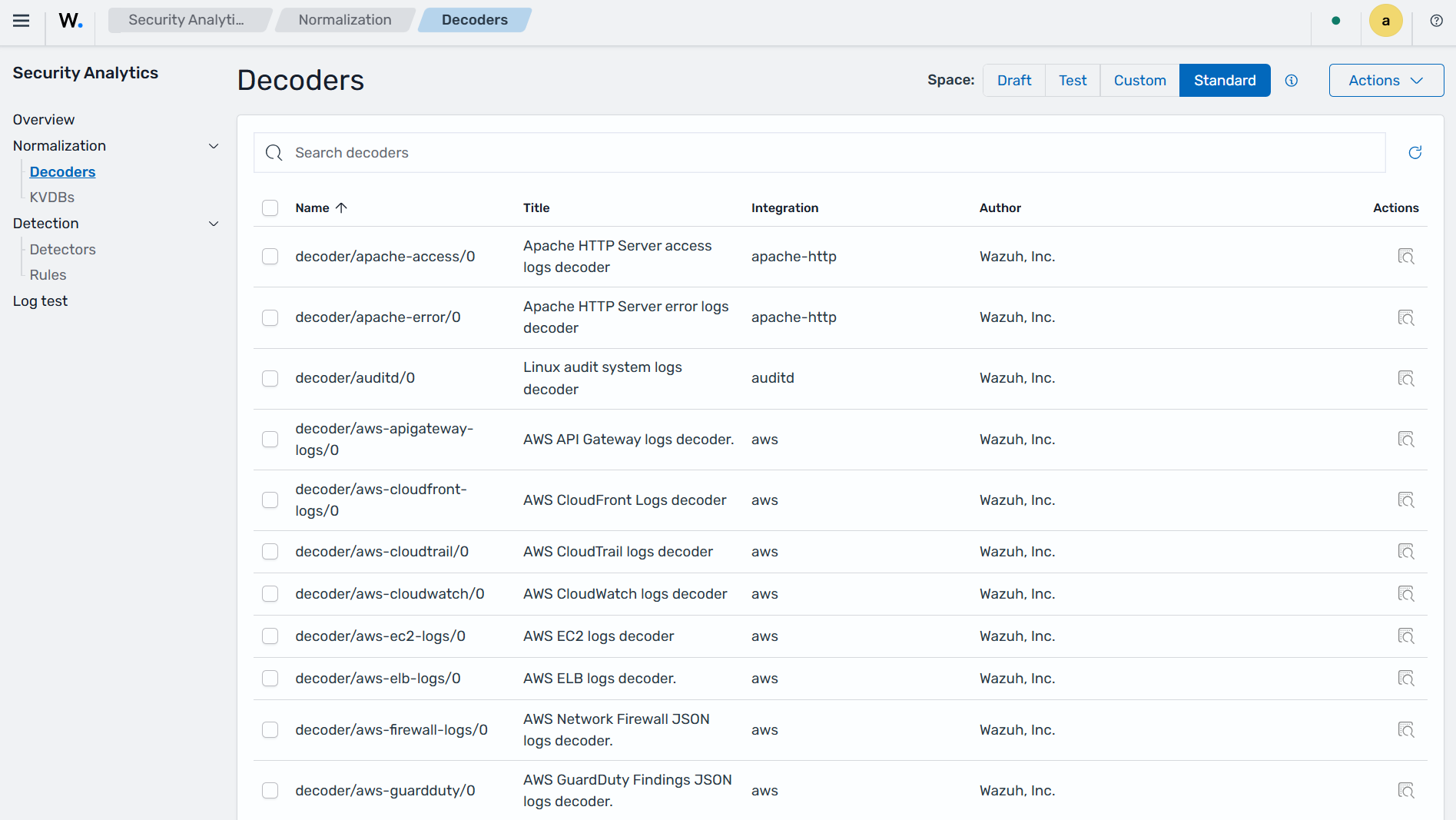
In the Security Analytics section of the Wazuh dashboard, navigate to Normalization > Decoders to display all decoders available across the active spaces (Draft, Test, Custom, and Standard).
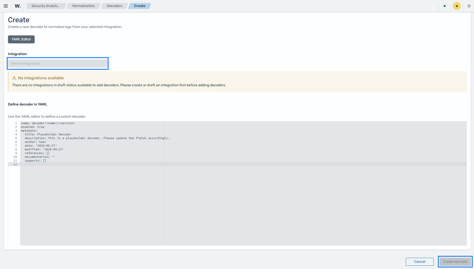
In the Security Analytics section of the Wazuh dashboard, navigate to Decoders > Draft > Actions > Create to create custom decoders. In the creation form, select the integration and provide the decoder definition, then click on Create decoder.
After creating the custom decoder, click Actions at the top-right corner of the Wazuh dashboard and select Promote. User-managed content is promoted sequentially from Draft to Test and from Test to Custom after validation.
KVDB
A KVDB (Key-Value Database) is a lookup table that can be referenced in decoder or rule logic to enrich events with additional context (for example, mapping IP addresses to threat categories).
The KVDB contains a key-value pair consisting of a field (key) and its expected content (value). The key identifies a specific field extracted during decoding, while the value defines the condition used for matching. Wazuh uses key-value pairs to verify whether extracted event fields, such as IP addresses, file hashes, usernames, or process names, match specific values defined in rules.
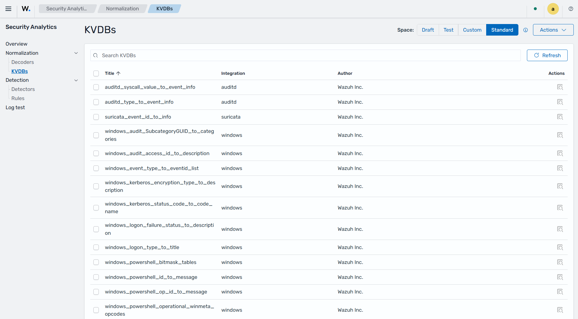
In the Security Analytics section of the Wazuh dashboard, navigate to KVDBs to display all KVDBs available across the active spaces (Draft, Test, Custom, and Standard).
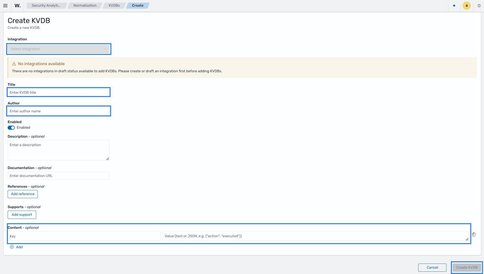
To create custom KVDBs, navigate to Security Analytics > KVDB > Draft > Actions > Create in the Wazuh dashboard. Perform the following steps:
Select the Integration.
Set the KVDB's Title and Author name.
Under the Content section, set the
key:valuepair.Click on Create KVDB to create the KVDB.
After creating the custom KVDB, click Actions at the top-right corner of the Wazuh dashboard and select Promote. User-managed content is promoted sequentially from Draft to Test and from Test to Custom after validation.
Detection
The Detection section of Security Analytics on the Wazuh dashboard provides visibility and management over the rules responsible for generating findings from normalized events processed by the Wazuh Engine.
This Detection section provides the following components:
Detectors
A detector connects detection rules to a specific data source (an index or alias) and runs continuously to identify security findings. Detectors operate on top of rules that are already active in the Custom or Standard space.
A detector uses the selected data source to determine which events are analyzed by the associated rules. When incoming events match the configured rule conditions, the detector generates findings for further analysis and monitoring. This allows organizations to apply specific detection logic to selected log sources for continuous threat monitoring.
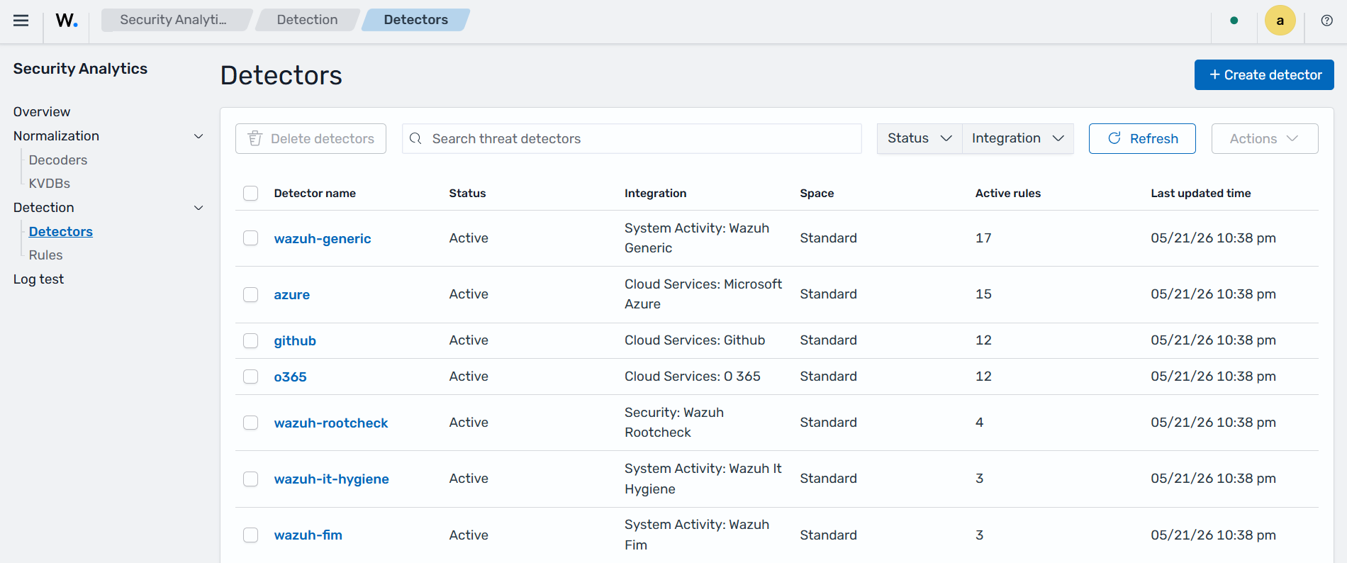
In the Security Analytics section of the Wazuh dashboard, navigate to Detection > Detectors to view all available detectors.
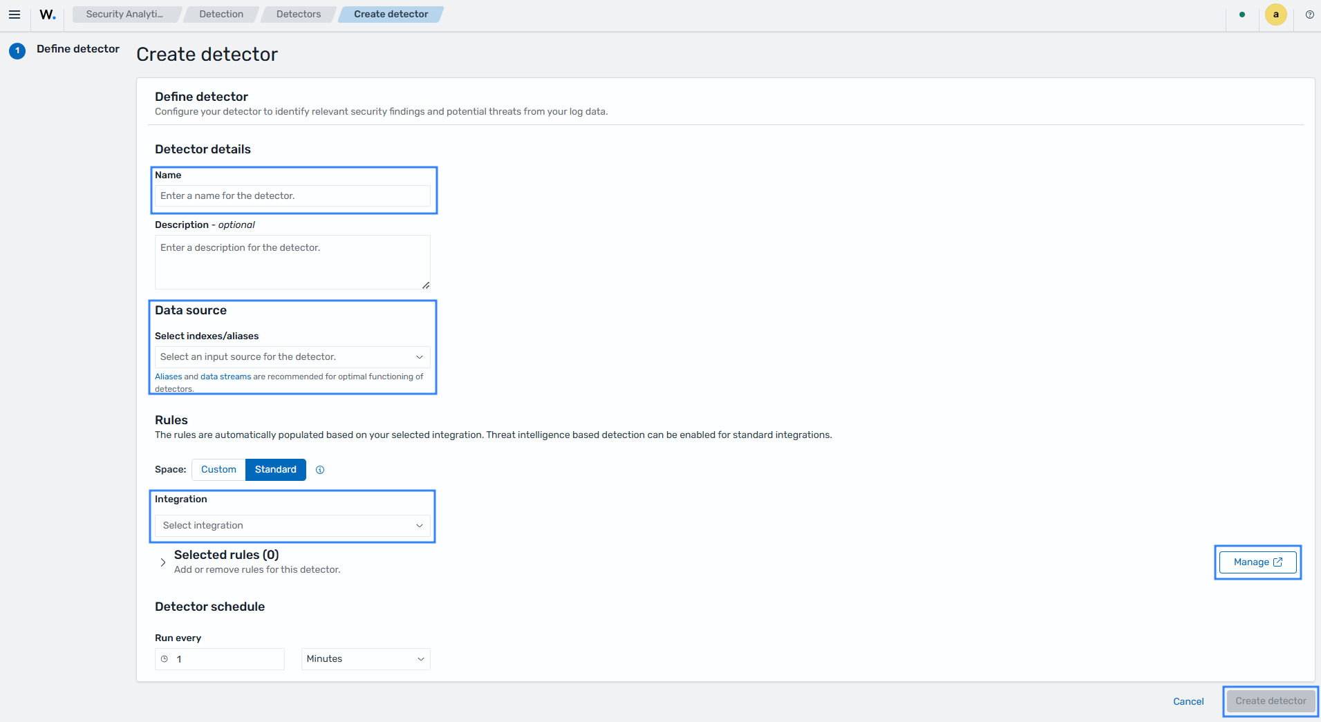
To create a Detector, navigate to Detection > Detectors > Create detector under the Security Analytics section of the Wazuh dashboard and perform the following actions:
Set the Detector Name.
Select a Data source.
Select an Integration. The Integrations are organized in different spaces, custom integrations are in the Custom space, and Wazuh out-of-the-box integrations are in the Standard space.
Select the rules that will be active for this detector under the Selected rules panel. Click Manage to add or remove individual rules.
Click on Create detector to create the detector.
Once the detector is created, it will start running against the configured data source using the selected rules.
Rules
A detection rule defines the conditions under which the Wazuh Engine generates a security finding. Rules operate on fields normalized by decoders and support references to compliance frameworks and the MITRE ATT&CK framework.
Rules are written in YAML and follow the same promotion lifecycle as integrations and decoders. The Draft, Test, and Custom spaces are user-managed, while the Standard space is read-only.
In the Security Analytics section of the Wazuh dashboard, navigate to Detection > Rules to display all rules available across the active spaces (Draft, Test, Custom, and Standard).
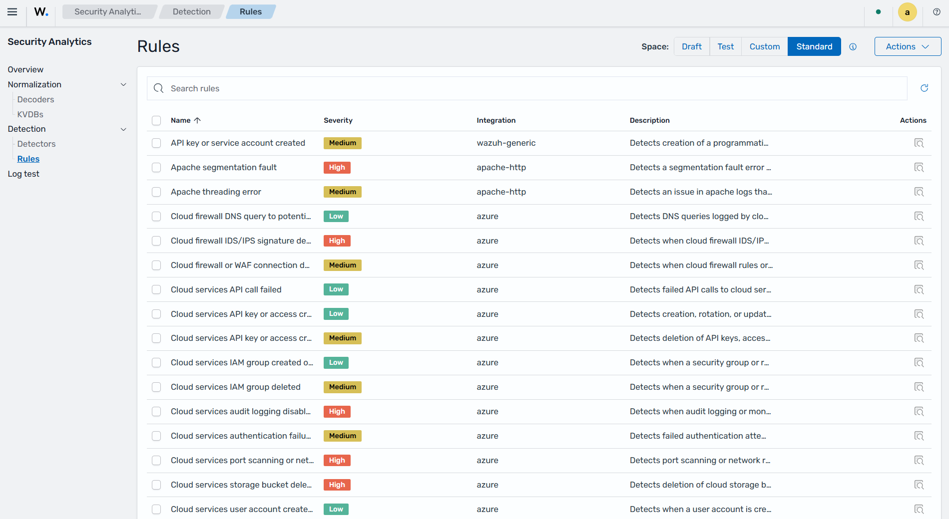
In the Security Analytics section of the Wazuh dashboard, navigate to Detection > Rules > Draft > Actions > Create to create custom rules. In the creation form, select the integration and provide the decoder definition, then click on Create rules.
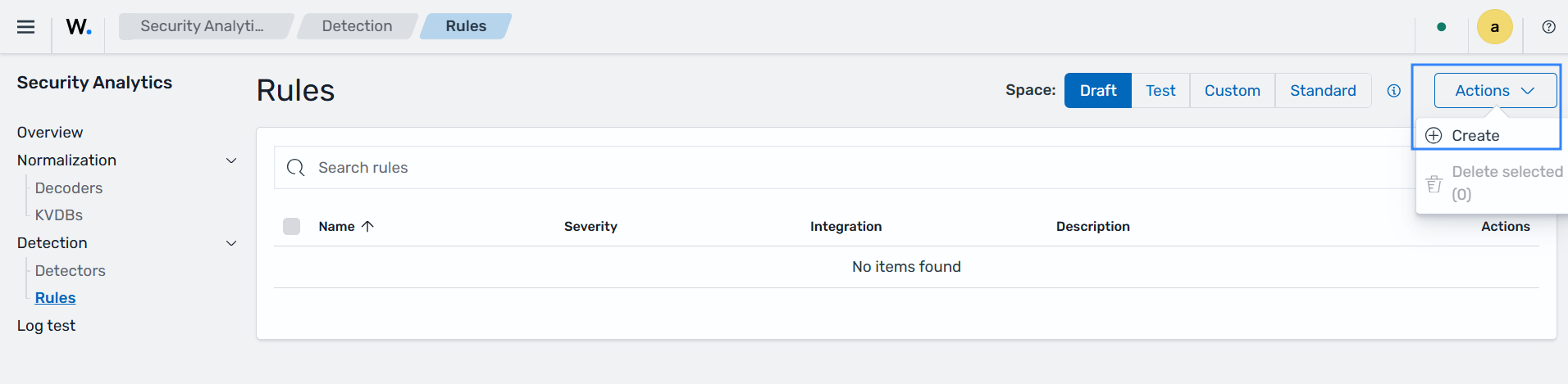
After creating the custom rules, click Actions at the top-right corner of the Wazuh dashboard and select Promote. User-managed content is promoted sequentially from Draft to Test and from Test to Custom after validation.
Log test
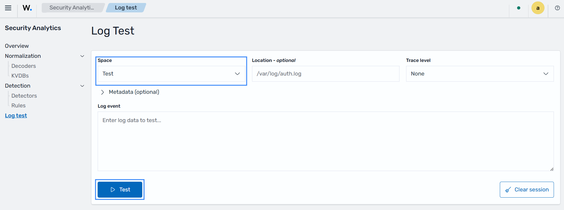
The Wazuh Log Test tool provides an interactive interface to validate that a specific log event is correctly parsed by active decoders and test detection logic directly from the Wazuh dashboard.
In the Security Analytics section of the Wazuh dashboard, click Log test to access the log testing tool. For Integrations in the Test space, select the Test in Space field, provide the log event, and click Test to verify that events are correctly parsed.
Active Response
The Active Response section on the Wazuh dashboard allows users to configure automated incident response actions triggered by security events detected by the Wazuh Engine. When specific rules are triggered, the Wazuh manager can execute scripts on monitored endpoints via the Wazuh agents to block IPs, disable accounts, or perform other security-relevant actions.
Active response is implemented through the wazuh-execd daemon, which receives commands from the Wazuh manager and executes response scripts on the Wazuh agent. It also manages the response lifecycle, including timeouts for stateful responses.
Perform the following actions to create an active response.
Click ☰ to open the menu and navigate to Explore > Active Response. Then click on Create active response.
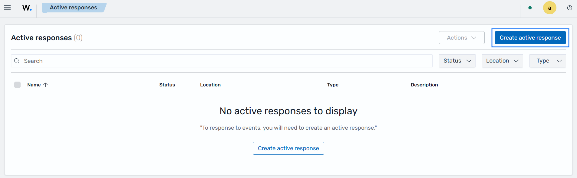
Fill in the configuration form with the following details:
Name: A name for this active response, used later when attaching it to a trigger action.
Description: An optional field that describes the purpose of the active response.
Executable: The active response script or executable that runs when the response fires. You don't need to specify the file name extension unless you have multiple scripts sharing the same name.
Extra arguments: An optional field where you can specify extra arguments required by the active response script.
Location: Specifies where the active response command executes. The available options are:
All: The active response executes on every agent. Use this option with caution, since an incorrect configuration can affect your whole environment.
Local: The active response executes on the agent that generated the alert.
Defined agent: It runs the script on a predefined agent, regardless of where the event occurred. Use the Agent ID field to specify the Wazuh agent ID of the Wazuh agent that must run the script.
Type: Specifies the type of active response that is being created. The available options are:
Stateful: A stateful active response reverts or stops its action after a specified period of time.
Stateless: This type of active response executes once on the specified endpoint(s) and does not revert to the previous state.
Stateful timeout: For stateful active responses, it specifies how long (in seconds) the action lasts before it's automatically reverted.
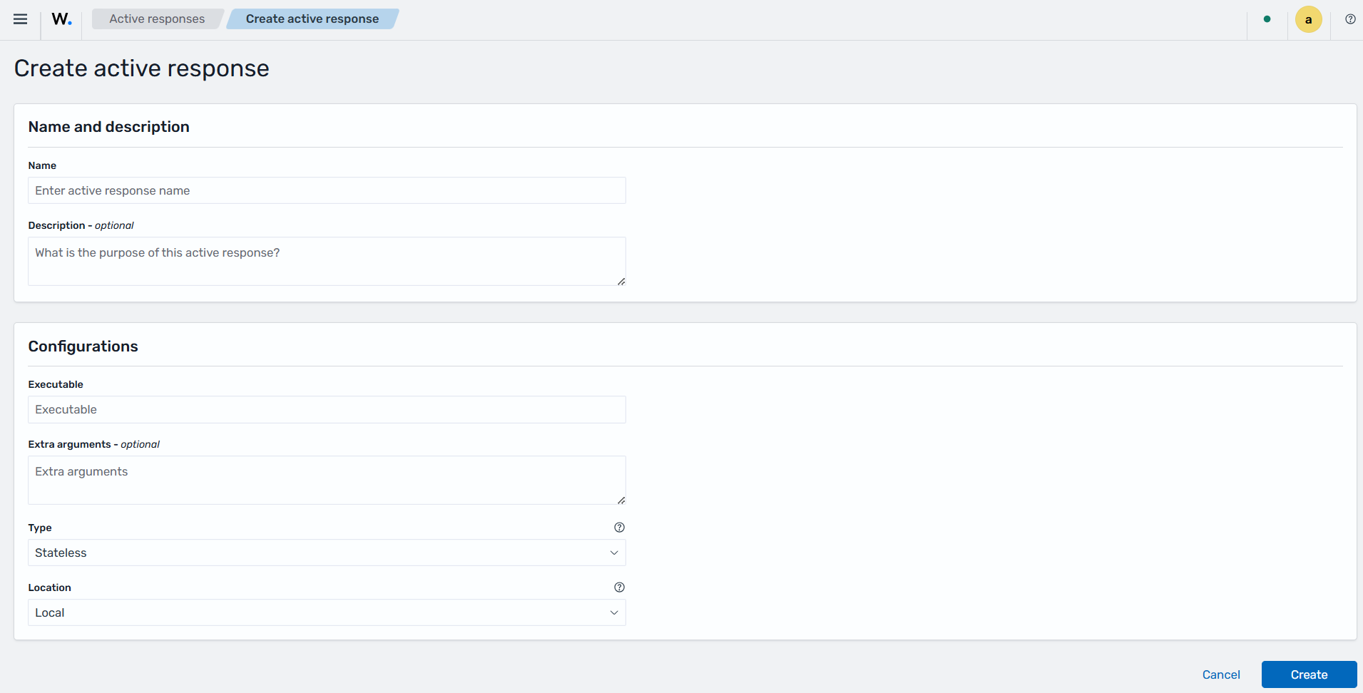
Click Create to save the configuration.
Notifications and Alerts
External API integrations such as Slack, PagerDuty, Jira, and Shuffle are centrally managed through the Wazuh dashboard using the Notifications and Alerting plugins. The Notifications plugin allows you to define output channels such as Slack, PagerDuty, Jira, or Shuffle, where Wazuh can send messages triggered by system events. The Alerting plugin enables the creation of monitors that query Wazuh data and execute actions when specific conditions are met, including sending alerts to the configured notification channels.
These capabilities are built into the Wazuh dashboard, and their availability depends on how the platform is installed and configured. To ensure proper functionality, Wazuh includes a health check mechanism that verifies the presence of the Notifications and Alerting plugins and confirms that a minimal, working configuration is in place. When both plugins are detected, the system automatically:
Creates default notification channels (muted by default) for the supported integrations.
Creates sample alerting monitors associated with these channels.
Logs the verification and creation progress in the Wazuh dashboard server logs.
This automation simplifies the setup process and ensures that notifications can be easily configured after installation.
Default notification channels
When notifications are enabled in the Wazuh dashboard, healthcheck automatically creates the following channels if they do not already exist. All channels are initially disabled.
Channel |
Description |
|---|---|
Slack |
Sends notifications via Slack incoming webhook. |
PagerDuty |
Sends alerts via the Events v2 API. |
Jira |
Creates issues via the Jira REST API. |
Shuffle |
Triggers Shuffle workflows via webhook. |
Sends an alert via a configured SMTP server to the recipient email address. |
All channels are stored as saved objects with names like Slack Channel, PagerDuty Channel, etc.
Note
Treat these URLs and credentials as secrets. Review permissions and channel visibility before enabling it.
Default sample monitors created
If the Alerts functionality is available, the healthcheck mechanism attempts to create the following sample monitors on the Wazuh alerts index pattern (wazuh-events*). Monitors will not be created if any required notification channel is missing:
Monitor name |
Target channel |
Behavior |
|---|---|---|
Sample: Slack |
Slack channel |
Queries for alerts with |
Sample: PagerDuty |
PagerDuty channel |
Queries for alerts with |
Sample: Jira |
Jira channel |
Queries for alerts with |
Sample: Shuffle |
Shuffle channel |
Queries for alerts with |
You can review the created monitors under Explore → Alerting → Monitors. For more information about monitor configuration, see OpenSearch Alerting Monitors Documentation.
Notifications and alerting configuration
The Notifications and Alerting configuration supports Slack, PagerDuty, Jira, Shuffle, and Email by default. Follow these steps to configure notifications and alerting for supported channels.
Slack
Prerequisites
This notification channel sends alerts to Slack via an incoming webhook. Create a Slack webhook and obtain the webhook URL.
Configure and enable the notification channel and monitor
Go to Explore > Notifications > Channels and open Slack Channel.
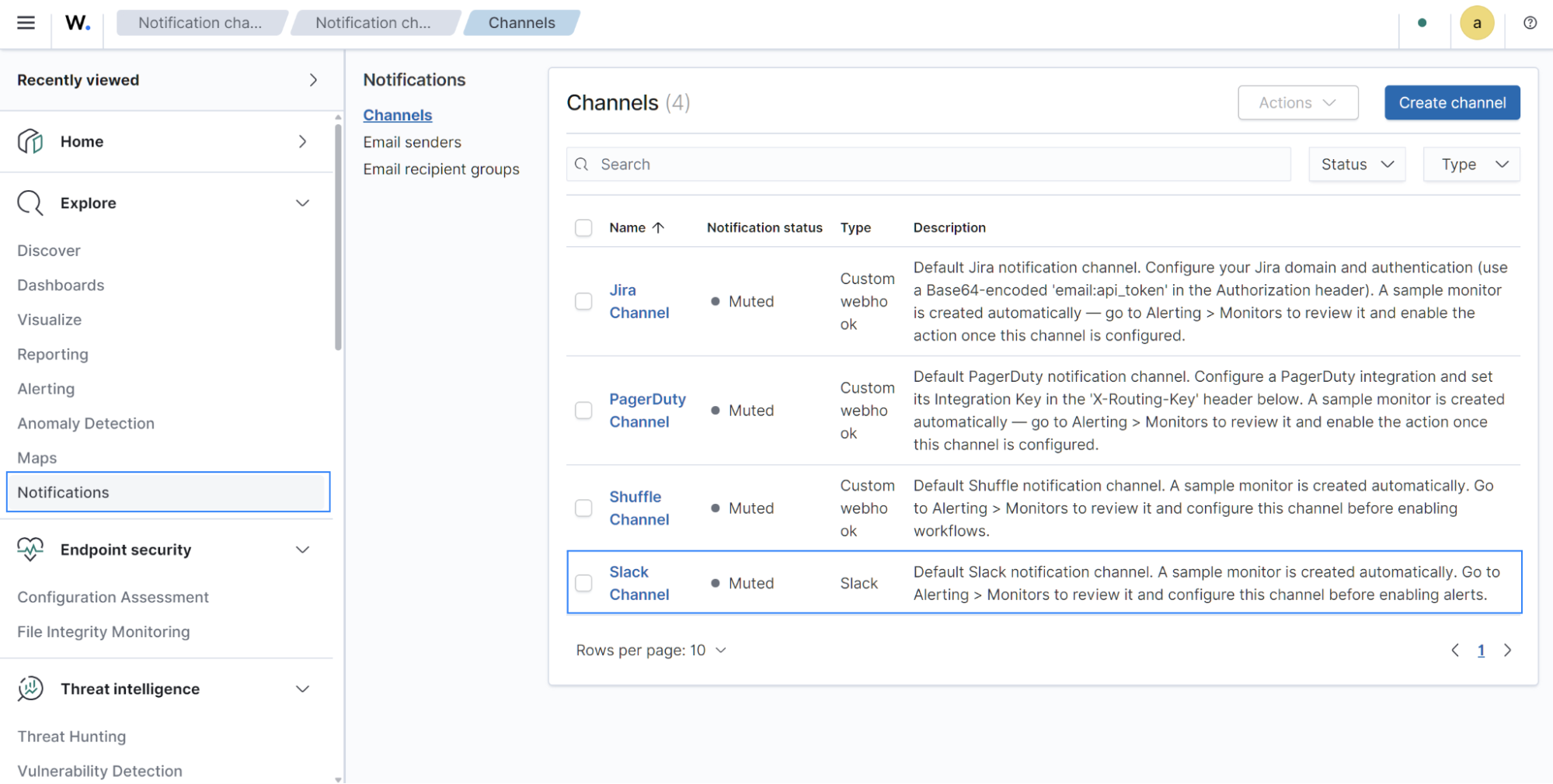
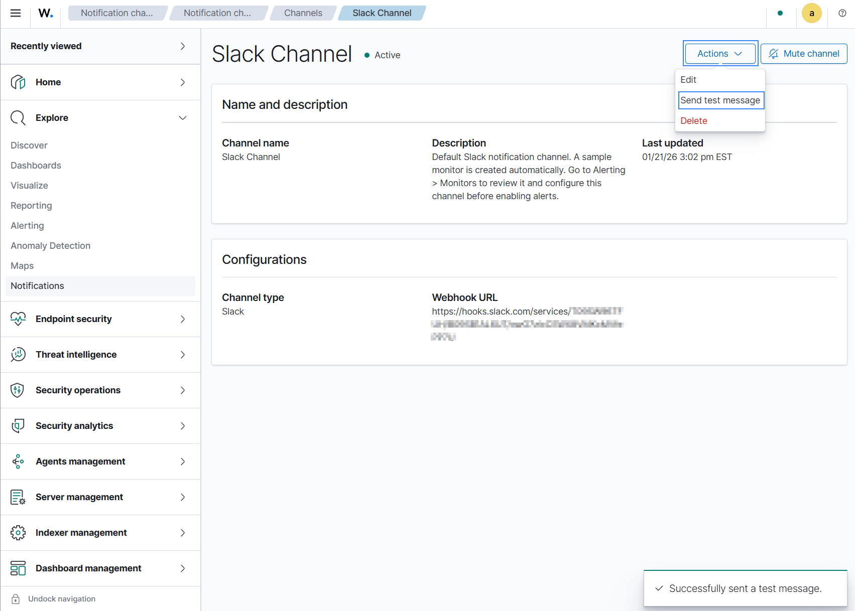
Click Action > Edit, then enter the incoming webhook URL obtained from your Slack workspace in the Slack webhook URL field.
Save the Slack channel configuration and unmute the channel.
Click Action > Send test message to validate the channel.
Go to Explore > Alerting > Monitors and open the corresponding Sample: Slack monitor.
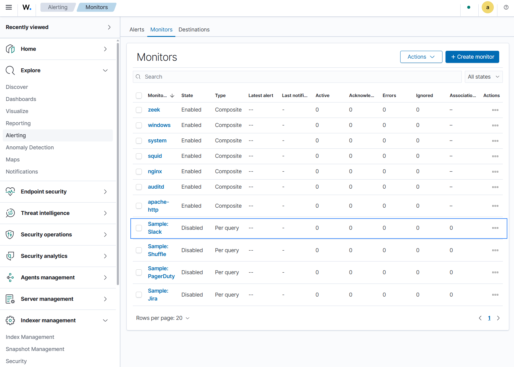
If the monitor has no actions in the default trigger, click Edit, and add a Send notification action using the Add action option. Then select the previously configured channel. If an action already exists, verify that it points to the correct channel. Adjust the subject/message template if necessary, then save and enable the monitor.
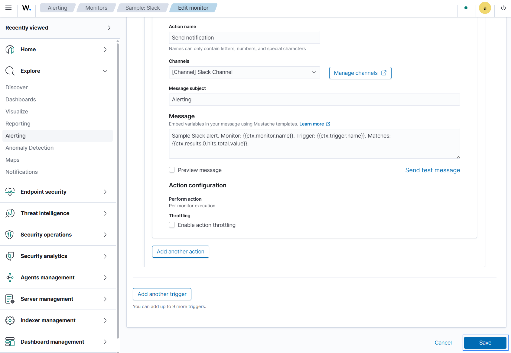
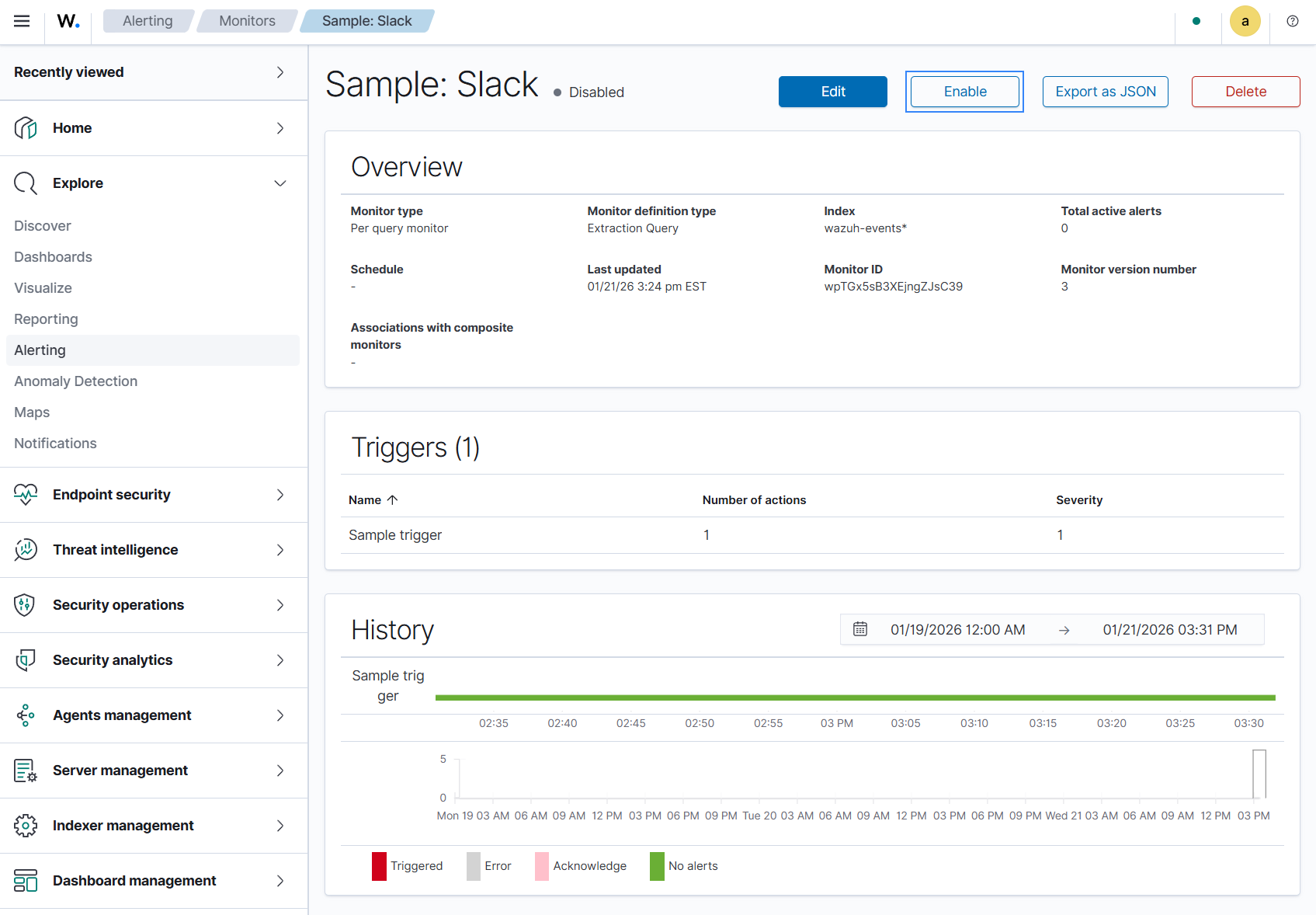
Open Dashboard management > Health Check and run the checks. Once channels and monitors are enabled, the related checks should pass to a healthy state.
PagerDuty
Prerequisites
This notification channel sends alerts to PagerDuty via the Events v2 API. Create a PagerDuty Events v2 integration and obtain your Integration Key.
Configure and enable the notification channel and monitor
Go to Explore > Notifications > Channels and open PagerDuty Channel.
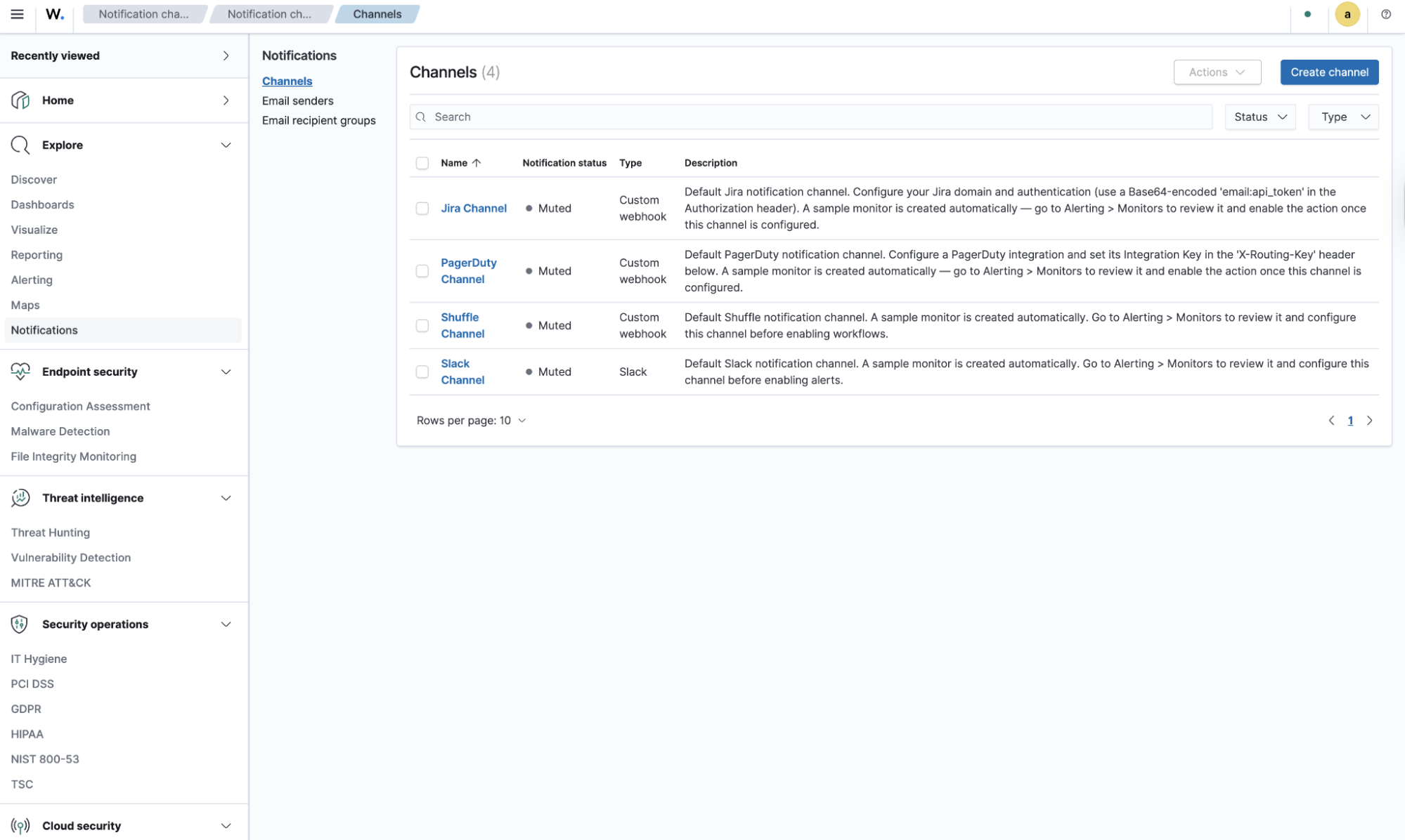
Click Action > Edit, leave the default URL, and enter your Integration Key as the
X-Routing-Keyvalue.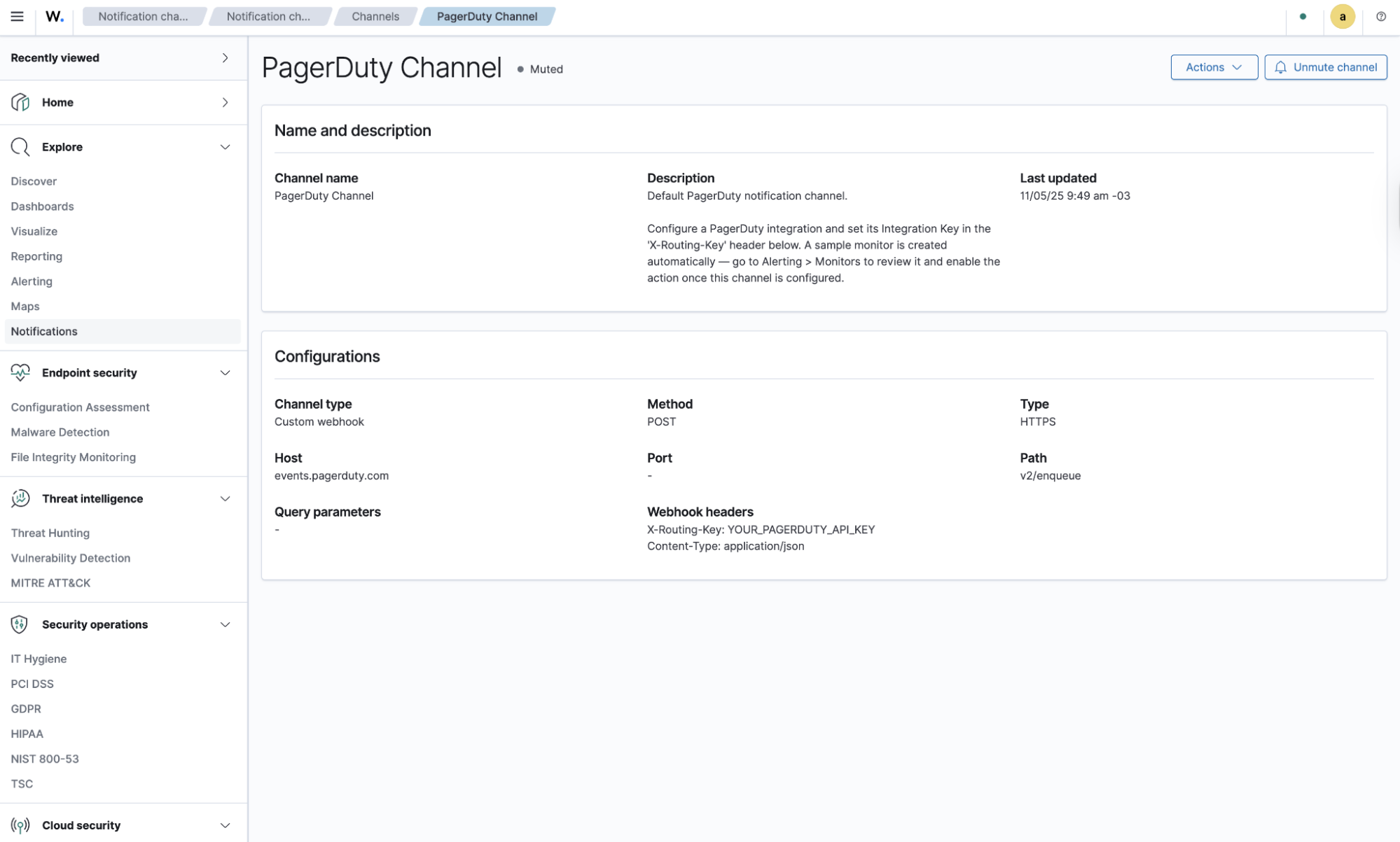
Save the PagerDuty channel configuration and unmute the channel.
Go to Explore > Alerting > Monitors and open the corresponding Sample: PagerDuty monitor.
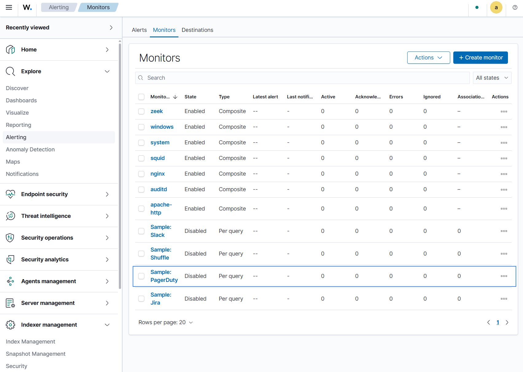
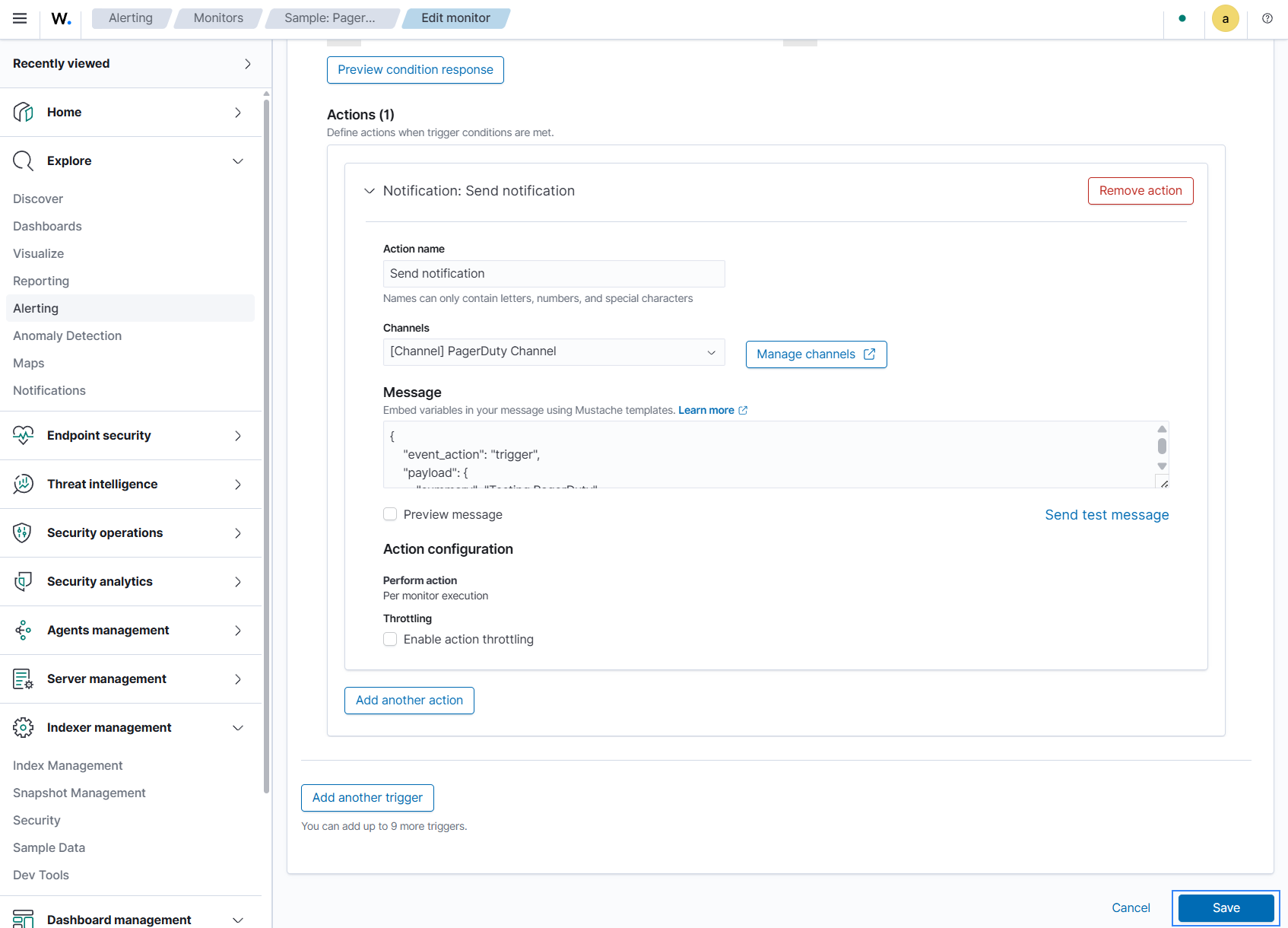
If the monitor has no actions in the default trigger, click Edit, and add a Send notification action using the Add action option. Then select the previously configured channel. If an action already exists, verify that it points to the correct channel. Adjust the subject/message template if necessary, then save and enable the monitor.
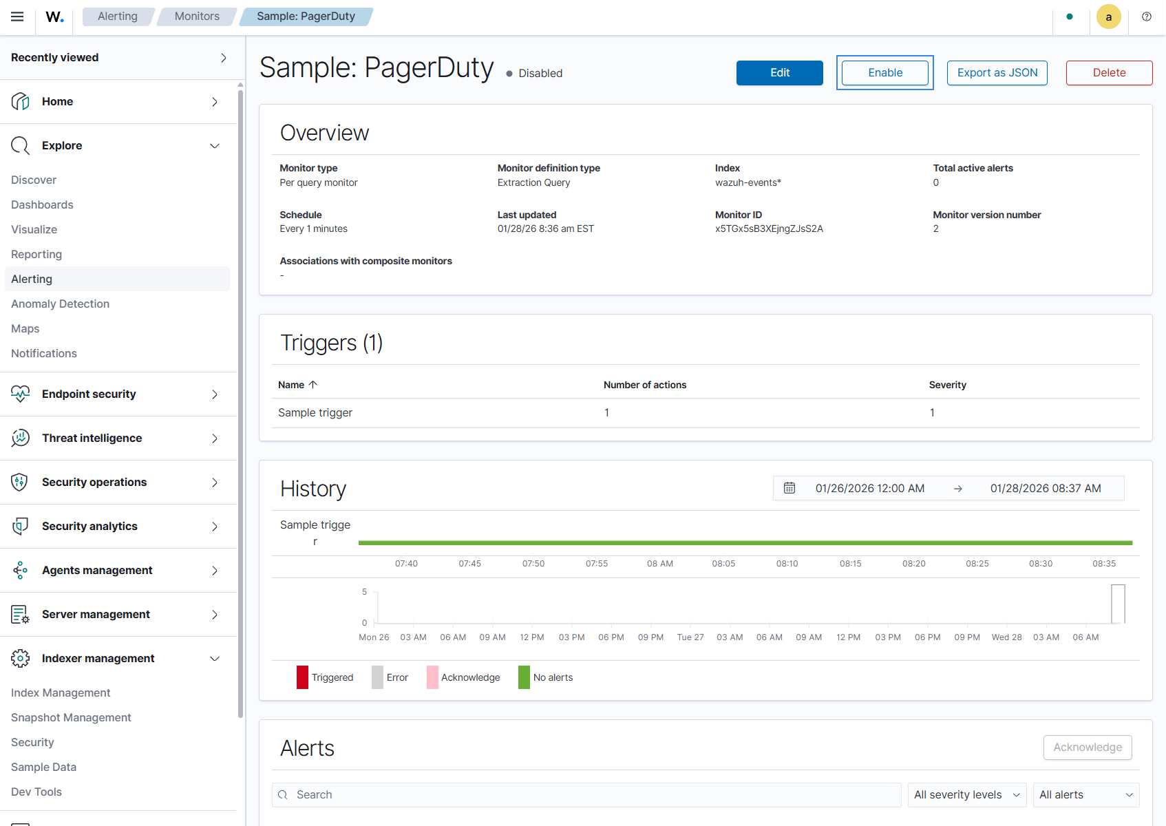
Open Dashboard management > Health Check and run the checks. Once channels and monitors are enabled, the related checks should pass to a healthy state.
Jira
Prerequisites
This notification channel sends alerts to Jira using a Jira API token. To configure it, obtain your Jira instance URL and generate a Jira API token. Use a Base64-encoded email:api_token string in the Authorization header.
Configure and enable the notification channel
Go to Explore > Notifications > Channels and open Jira Channel.
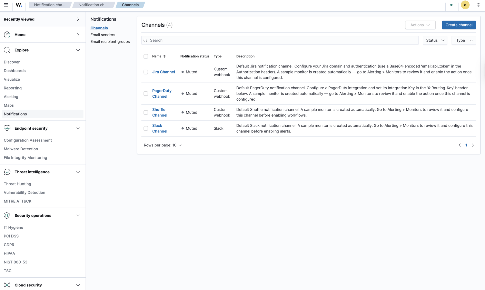
Specify your instance URL in the Webhook URL, use the Base64-encoded value of your Jira instance email and API token as the Authorization header value. This will be in the form
Authorization: Basic base64(email:api_token).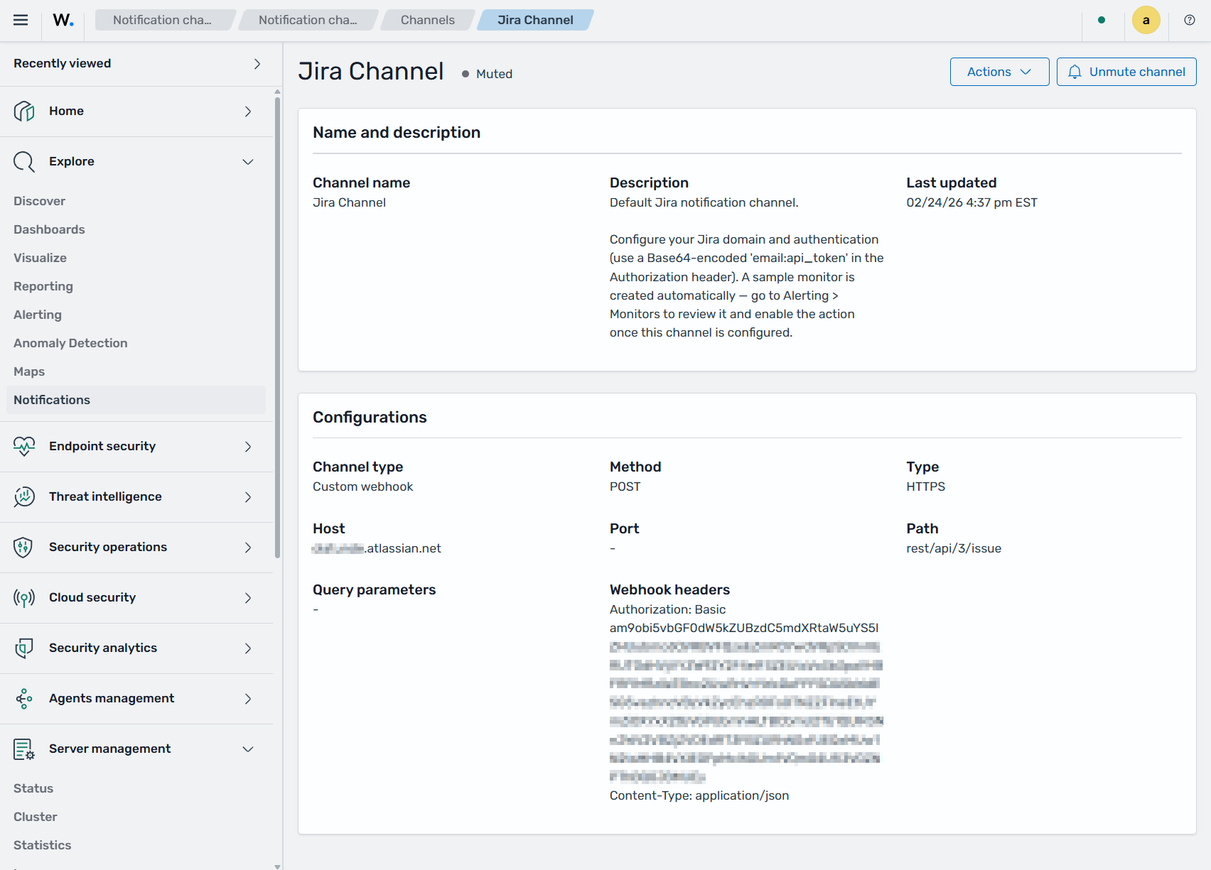
Save the Jira channel configuration and unmute the channel.
Go to Explore > Alerting > Monitors and open the corresponding Sample: Jira monitor.
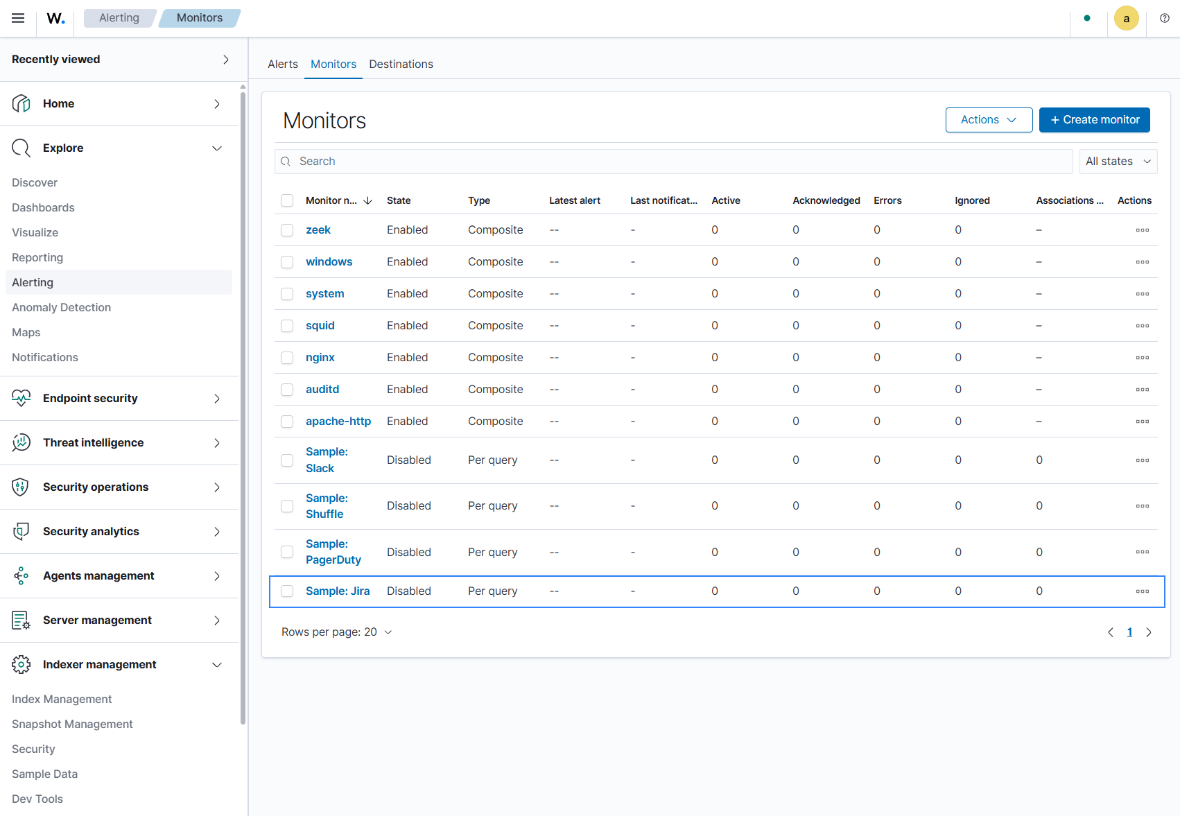
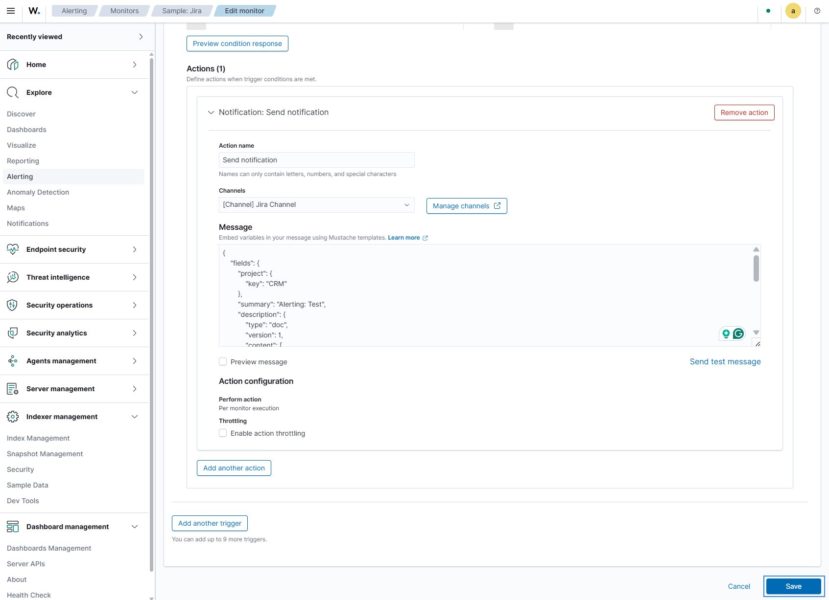
If the monitor has no actions in the default trigger, click Edit, and add a Send notification action using the Add action option. Then select the previously configured channel. If an action already exists, verify that it points to the correct channel. Adjust the subject/message template to match your Jira instance, then save and enable the monitor.
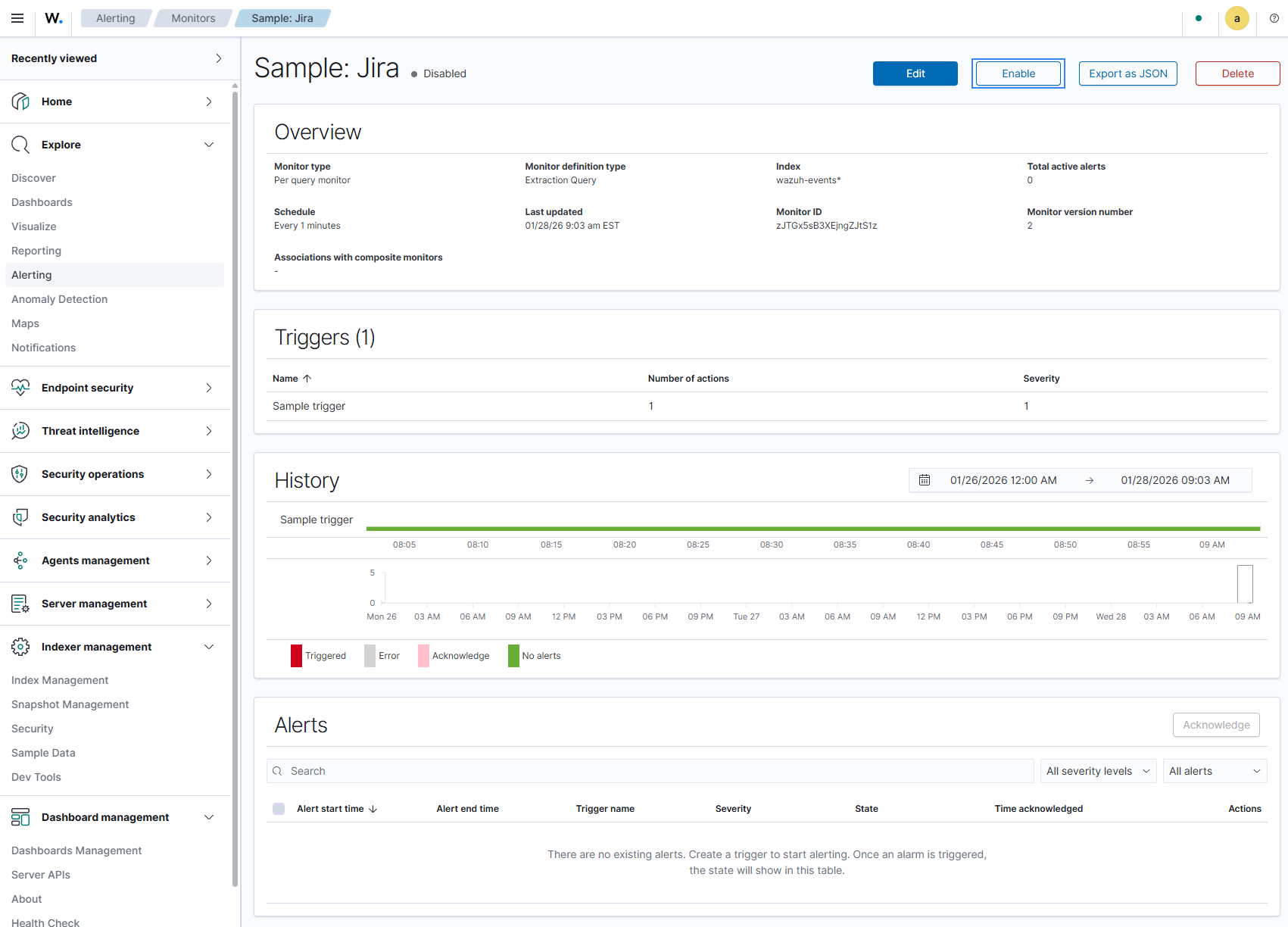
Open Dashboard management > Health Check and run the checks. Once channels and monitors are enabled, the related checks should pass to a healthy state.
Shuffle
Prerequisites
This notification channel sends alerts to Shuffle via the Shuffle webhook URL. Create a Shuffle workflow webhook URL and obtain the Webhook URL.
Configure and enable the notification channel
Go to Explore > Notifications > Channels and open Shuffle Channel.
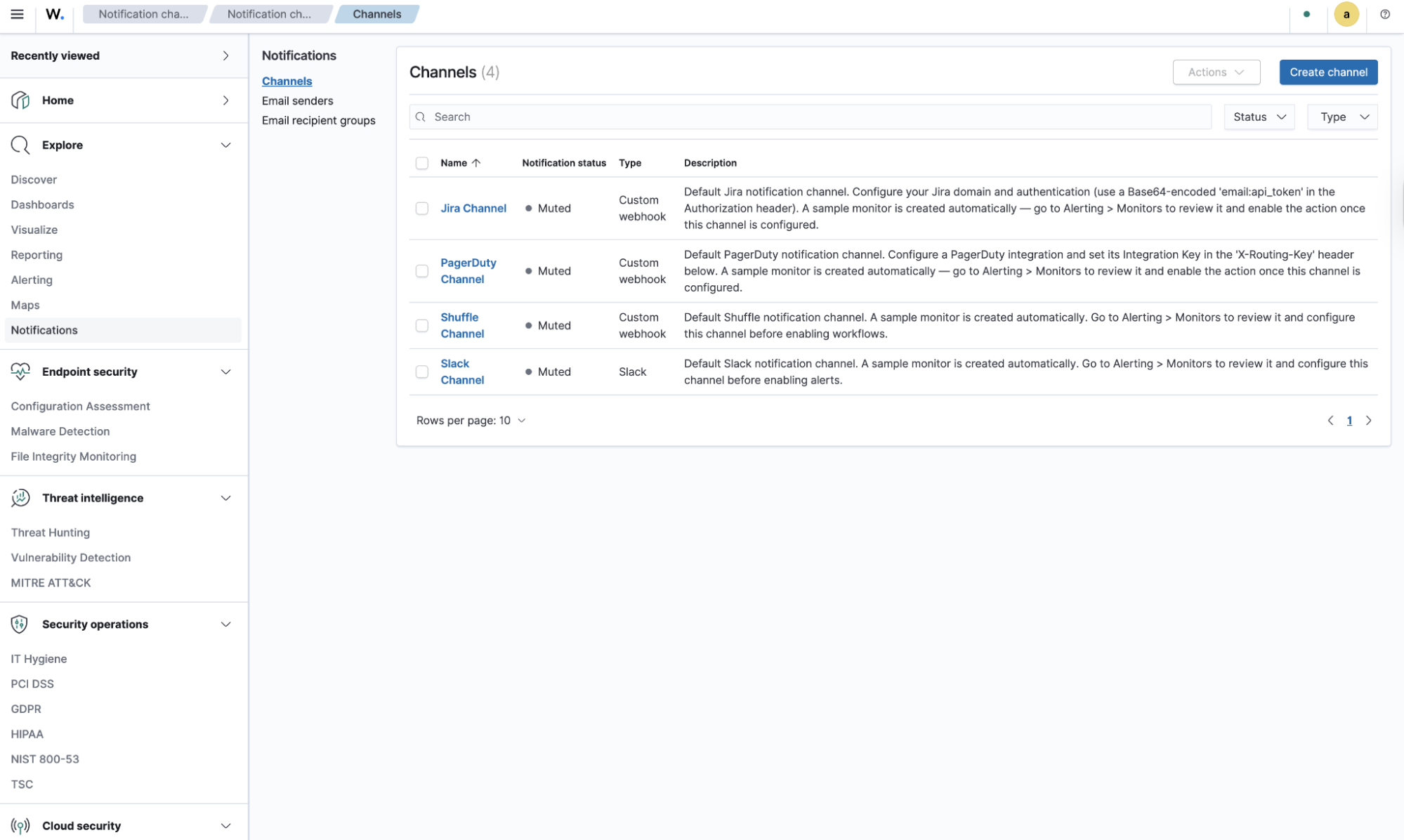
Specify the Webhook URL of the workflow you will use. You can validate the channel by sending a test message from the Notifications interface.
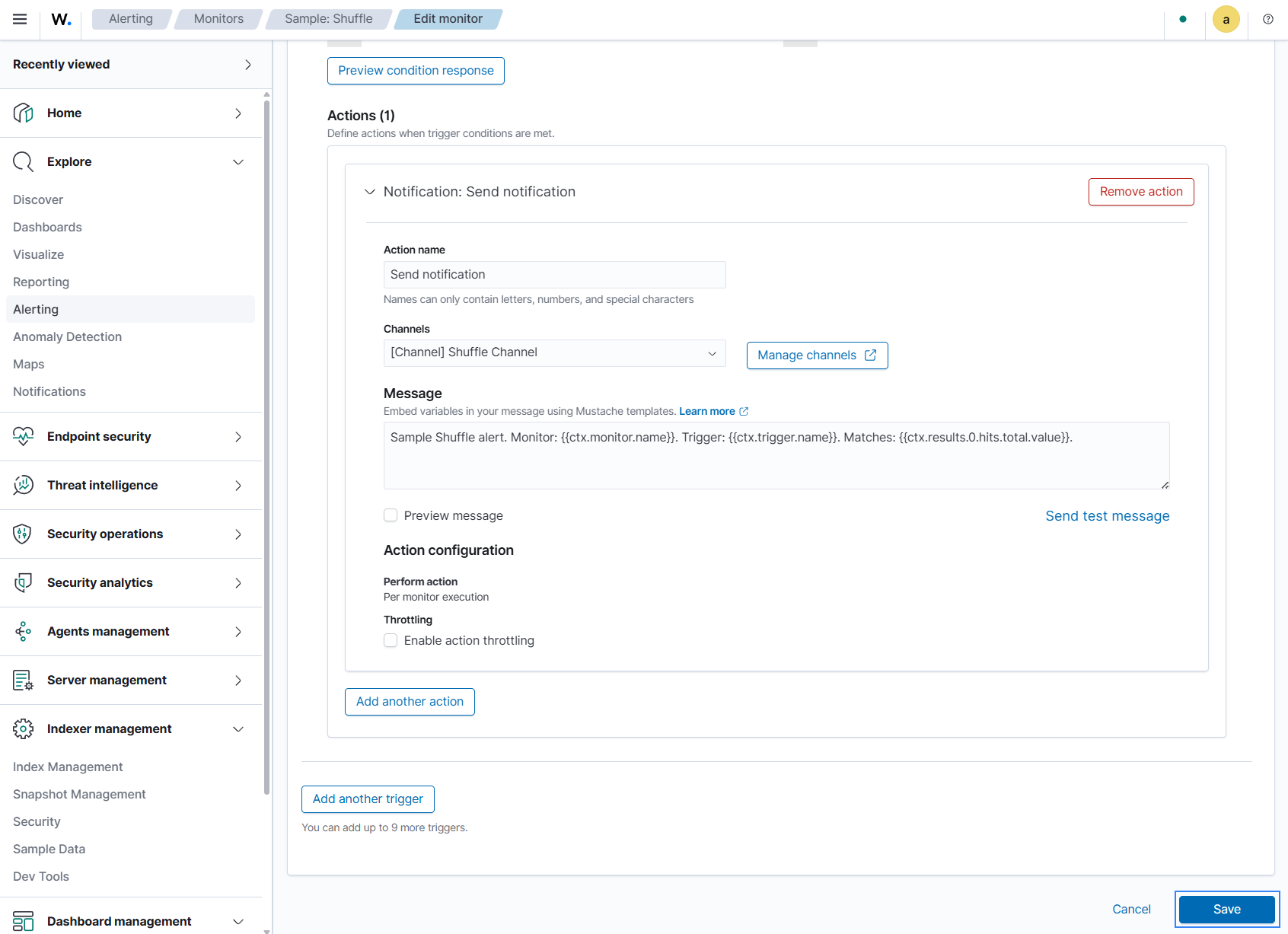
Save the Shuffle channel configuration and unmute the channel.
Go to Explore > Alerting > Monitors and open the corresponding Sample: Shuffle monitor.
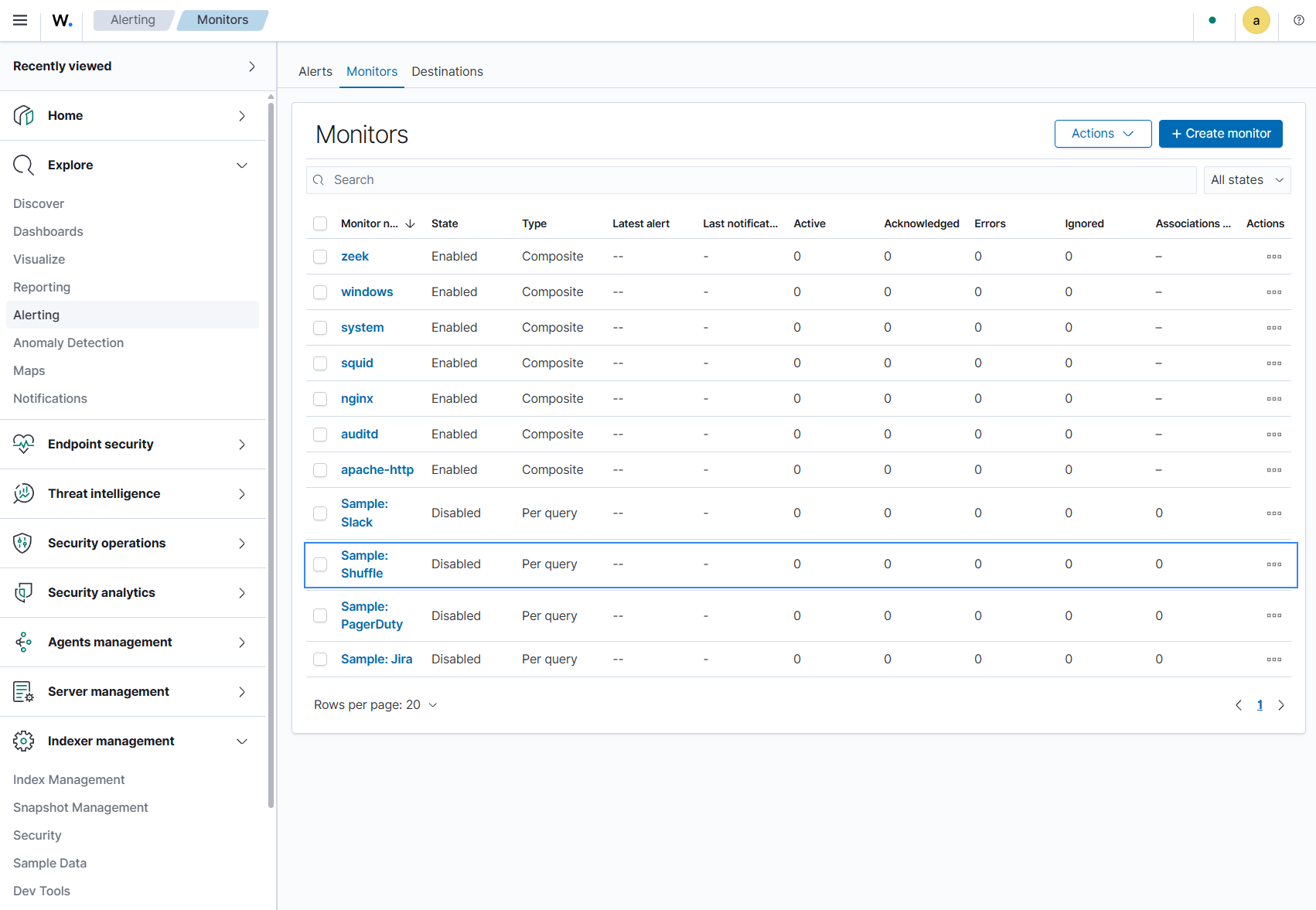
If the monitor has no actions in the default trigger, click Edit, and add a Send notification action using the Add action option. Then select the previously configured channel. If an action already exists, verify that it points to the correct channel. Adjust the subject/message template if necessary, then save and enable the monitor.
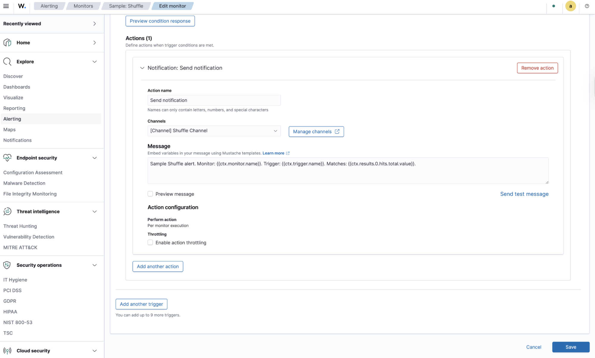
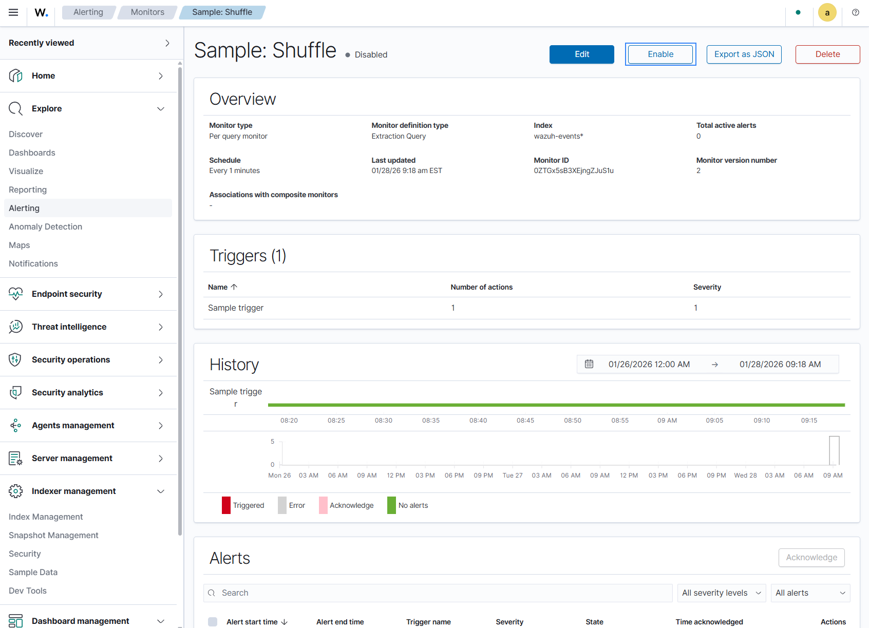
Open Dashboard management > Health Check and run the checks. Once channels and monitors are enabled, the related checks should pass to a healthy state.
Prerequisites
This notification channel sends alerts via a configured SMTP sender to the recipient email address based on the configured alert monitor. To configure email alerting, follow the steps below.
Configure the SMTP sender
The SMTP sender defines the mail server that sends the notifications.
Click the menu icon, then navigate to Explore > Notifications.
Click Email senders > Create SMTP sender.
Type a unique name in Sender name.
Type the address that sends the notifications in Email address.
Type the hostname or IP address of your SMTP server in Host.
Type the port of your SMTP server in Port. The default value is
465.Select an Encryption method.
Click Create.
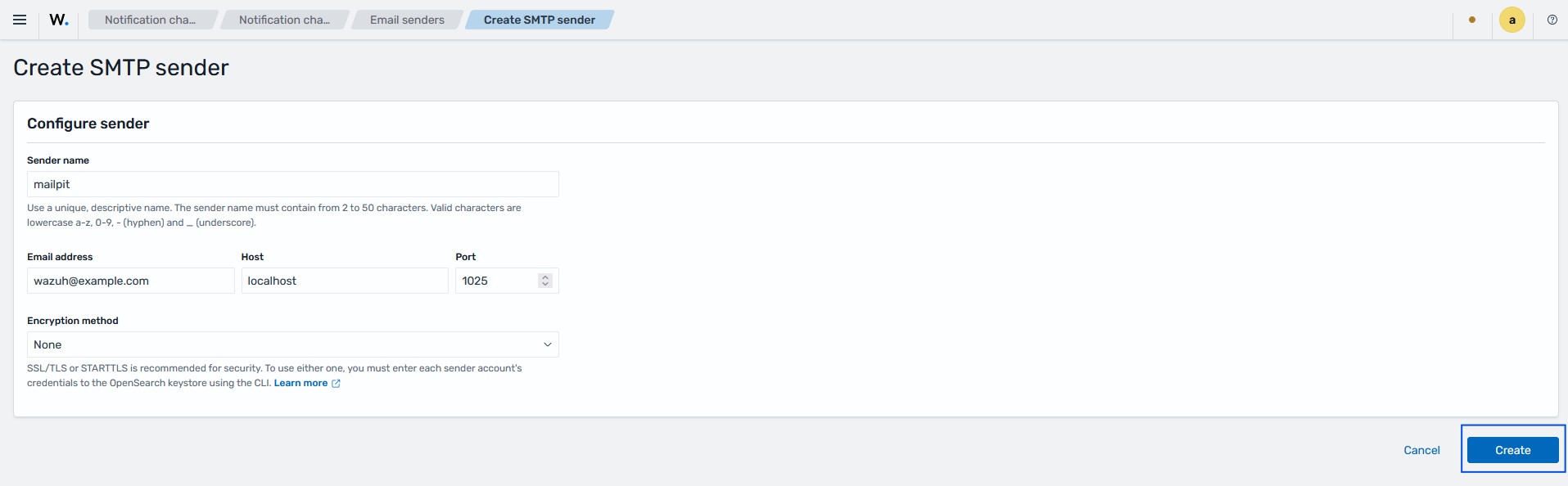
Note
SSL/TLS and STARTTLS require you to add the sender account credentials to the Wazuh indexer keystore.
The Encryption method field offers three options:
Option |
Description |
|---|---|
SSL/TLS |
Encrypts the connection to the SMTP server. Use this option when your
server supports implicit TLS, usually on port |
STARTTLS |
Upgrades a plain connection to an encrypted one. Use this option when your
server supports STARTTLS, usually on port |
None |
Sends mail without encryption. Use this option only in a test environment, because it does not protect the credentials or the message content. |
Configure the recipient group
The recipient group defines who receives the email notifications.
Click the menu icon, then navigate to Explore > Notifications.
Click Email recipient groups > Create recipient group.
Type a name for the group in Name.
Describe the purpose of the group in Description. This field is optional.
Type one or more email addresses in Emails. For this use case, add the address of your data protection officer.
Click Create.
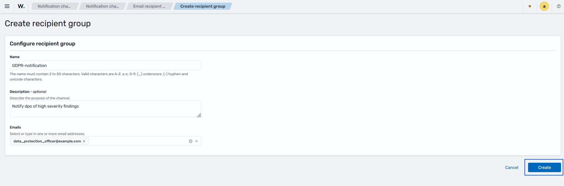
Note
You can also add recipient addresses directly to the channel. A recipient group is useful when you send notifications to the same addresses from more than one channel.
Configure the email channel
The email channel binds the sender and the recipients. The alerting monitor sends its notifications to this channel.
Click the menu icon, then navigate to Explore > Notifications.
Click Channels > Create channel.
Type a name for the channel in Name.
Describe the purpose of the channel in Description. This field is optional.
Select Email in Channel type. You cannot change the channel type after you create the channel.
Select SMTP sender in Sender type.
Select the sender you created in SMTP sender.
Select the recipient group you created in Default recipients. You can also type an email address directly.
Click Send test message to confirm the configuration. A success message confirms that the channel works.
Click Create.
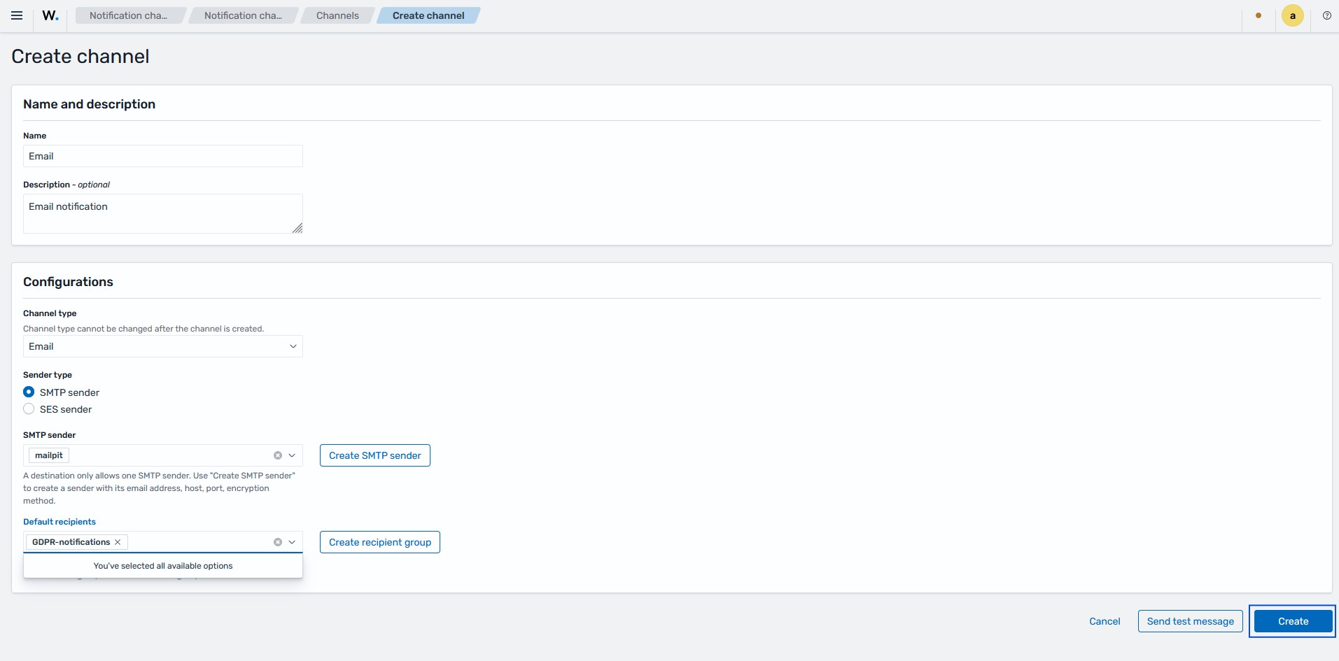
The Sender type field offers two options:
Option |
Description |
|---|---|
SMTP sender |
Uses your own SMTP server. Use this option in most environments. |
SES sender |
Uses Amazon Simple Email Service (SES). Use this option when you run Wazuh on Amazon Web Services (AWS) and send mail through SES. An SES sender needs an AWS region and a role Amazon Resource Name (ARN) instead of a host and port. |
Create the alerting monitor
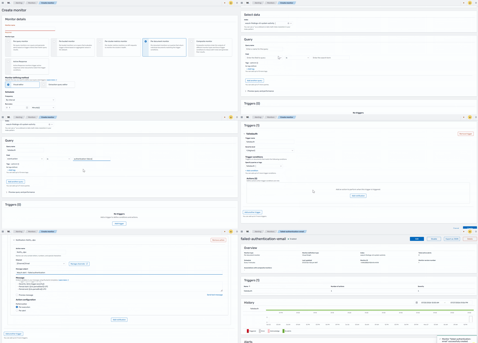
The query Wazuh data and execute actions when specific conditions are met, including sending alerts to the configured notification channels. For the configuration below, we create an alerting monitor that watches your findings for failed authentication attempts. When the monitor detects a match, it triggers the action that sends the email.
Click the menu icon, then navigate to Explore > Alerting.
Switch to the Monitors tab and click Create monitor.
Type a name for the monitor in Monitor name.
Select Per document monitor in Monitor type.
Select Visual editor in Monitor defining method.
Set Frequency to By interval and set Run every to
1minute under Schedule.Under Select data, select
wazuh-findings-v5-system-activityin Index.Under Query, in Query name, type a name.
Set the query condition. In Field, select
event.action. In the operator list, select is. In the value field, typeauthentication-failure.Note
You can also match the finding by its rule identifier. In Field, select
wazuh.rule.sigma_idand type the rule identifier. Theevent.actionfield is more stable, because it does not change when the rule identifier changes.Click Add trigger under Triggers.
Type a name in Trigger name.
Select a level in Severity level. Level
1is the highest.Under Trigger conditions, in Specify queries or tags, select the name of the query.
Click Add notification under Actions.
Type a name in Action name.
Select the email channel you created in Channel.
Type a subject such as "Wazuh alert - failed authentication" in Message subject.
In Message, type the notification body. You can embed variables with Mustache templates.
A failed authentication attempt was detected on a monitored endpoint.

Trigger: {{ctx.trigger.name}}
Severity: {{ctx.trigger.severity}}
Monitor: {{ctx.monitor.name}}
Detected between {{ctx.periodStart}} and {{ctx.periodEnd}} UTC.

Review the finding in the Wazuh dashboard for the source IP, user, and host details.
Select Per alert in Perform action.
Click Send test message to confirm the action. A test email arrives at the recipient address.
Click Create.
The Monitor type field offers these options:
Option |
Description |
|---|---|
Per document monitor |
Generates an alert for each document that matches the query. Use this option to alert on each failed authentication finding. |
Per query monitor |
Runs a query and generates an alert when the results match the trigger criteria. Use this option to alert when failed authentications exceed a threshold in a time window, such as a brute force attempt. |
The Perform action field controls how often Wazuh sends the notification:
Option |
Description |
|---|---|
Per alert |
Sends one email for each matching finding. Use this option to notify on every failed authentication. |
Per execution |
Sends one email for each monitor run, regardless of how many findings match. Use this option to receive a single summary notification for each interval. |
Note
On a busy endpoint, the Per alert option can generate frequent emails. To reduce the volume, use a Per query monitor with a threshold instead.
Note
The Monitor defining method offers two options. The Visual editor lets you build the query with fields and values. The Extraction query editor lets you write the query in raw query syntax. Use the extraction query editor for conditions that the visual editor cannot express.
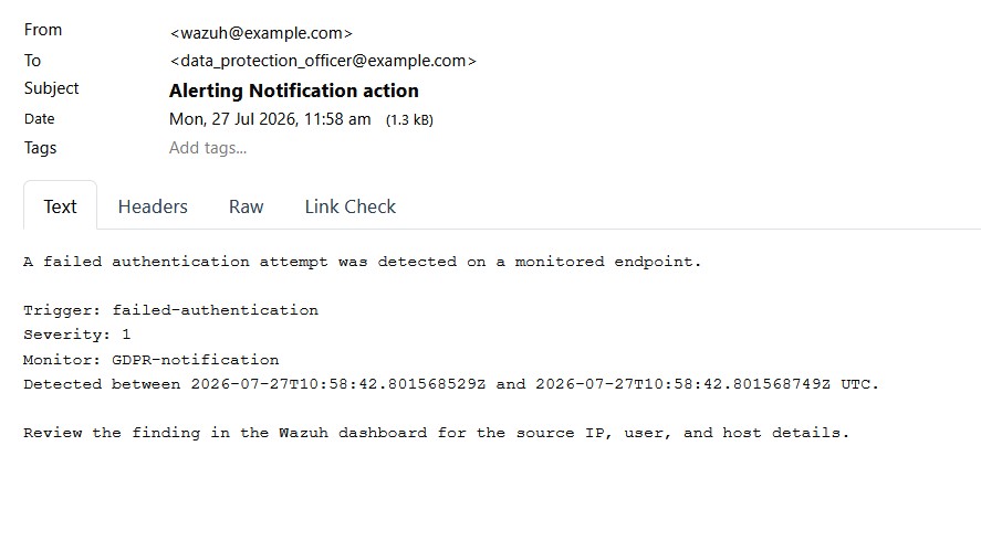
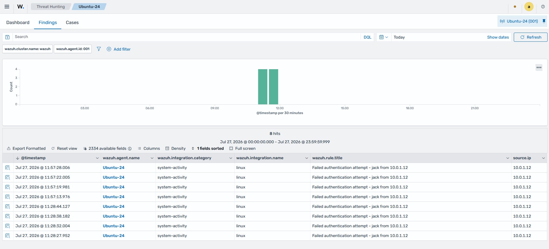
The email identifies the trigger, the severity, the monitor, and the detection window. To view more details, such as the source IP address, the recipient opens the finding on the Wazuh dashboard.
AI Assistant
The Wazuh AI Assistant provides a conversational interface for exploring security data using natural language from the Wazuh dashboard. Analysts can ask questions about vulnerabilities, security findings, and agent activity. The AI Assistant provides written responses and structured results that link to Discover for further investigation. Conversations are saved, allowing analysts to revisit previous queries and continue their investigations.
The AI Assistant supports multiple model providers. You can configure the Wazuh AI Assistant brain, Anthropic, or an OpenAI-compatible service according to your requirements. You can also configure field policies to anonymize or exclude specific finding fields before data is sent to the configured provider. Privacy mode can be enforced by default across the cluster or controlled by individual users for each conversation.
Perform the following actions to configure the AI Assistant.
Click ☰ to open the menu and navigate to Explore > AI Assistant. Under the Settings tab, click on Add a provider to set up an AI Assistant provider.
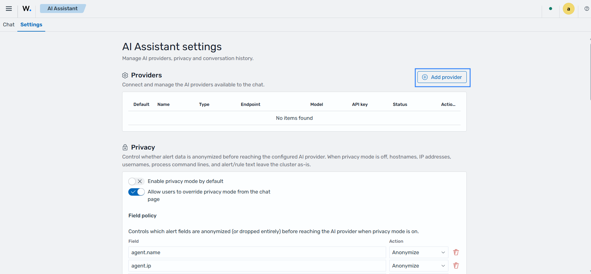
Fill in the configuration form with the following details:
Name: A name for the provider.
Provider type: Select a provider type The available options are:
OpenAI-compatible (OpenAI, Gemini, Ollama and LM studios)
Anthropic
Wazuh AI Assistant Brain
Endpoint URL: Provide the endpoint URL for the AI Assistant provider
API Key - Provide the API key for the AI Assistant provider.
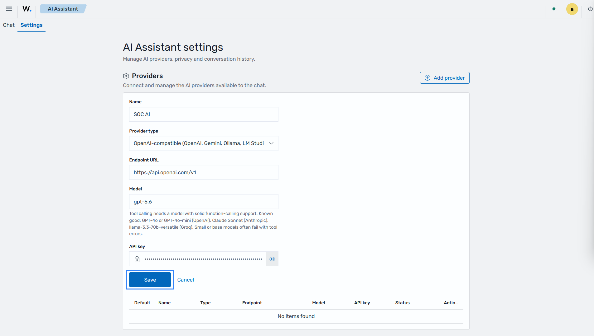
Click on Save to add the AI Assistant provider.
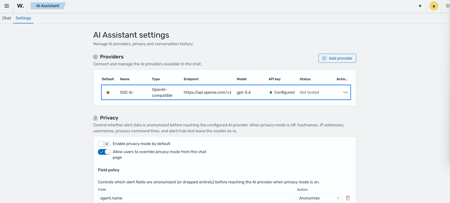
Configure the privacy settings to control how security data is handled before it is sent to the configured AI provider:
Enable privacy mode by default: Enables privacy mode by default for AI Assistant conversations. When enabled, configured fields containing sensitive information are anonymized or excluded before data is sent to the AI provider.
Allow users to override privacy mode from the chat page: Allows users to enable or disable privacy mode for individual conversations from the AI Assistant chat page. Disable this option to enforce the default privacy mode setting for all users.
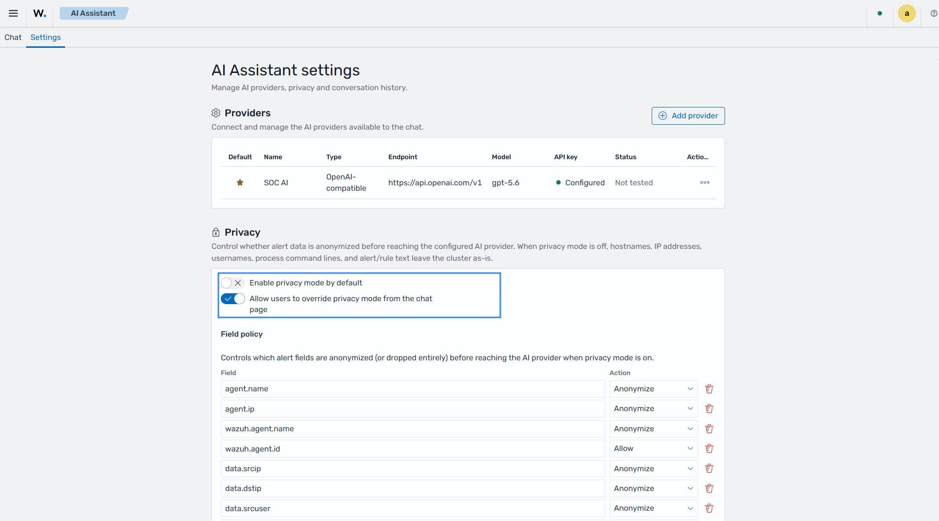
Click on Save privacy settings to save the privacy configuration.
Configure the conversation history settings to control how long saved AI Assistant conversations are retained. Set the value to
0to retain saved conversations indefinitely. Click Save conversation history settings to apply the configuration.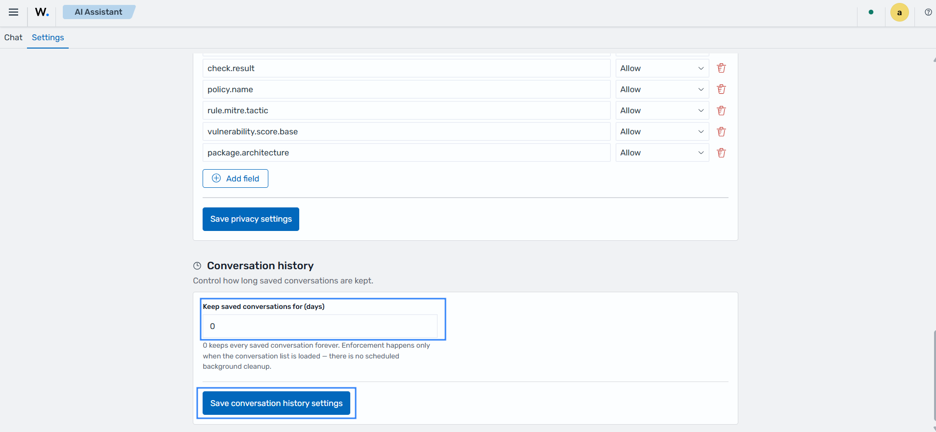
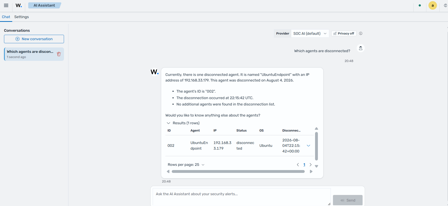
In the Chat tab, analysts can ask questions about vulnerabilities, security findings, and agent activity using natural language. In the example below, we queried the AI Assistant to identify disconnected Wazuh agents. The AI Assistant summarizes the response and displays the matching agent information in a structured results table for further investigation.
Multi-tenancy
Tenants in the Wazuh dashboard are containers for saving index patterns, visualizations, dashboards, and other objects. Tenants are useful for safely sharing your work with other users. You can control which roles have access to a tenant and whether those roles have read or write access. By default, all Wazuh dashboard users have access to two independent tenants:
Global: This tenant is shared between every Wazuh dashboard user.
Private: This tenant is exclusive to each user and can't be shared. Users in the private tenant can't access routes or index patterns made by users in the global tenant.
Custom: Administrators can create custom tenants and assign them to specific roles. Once created, these tenants can then provide spaces for specific groups of users.
Configuring multi-tenancy
Follow the instructions below on the Wazuh dashboard to enable multi-tenancy.
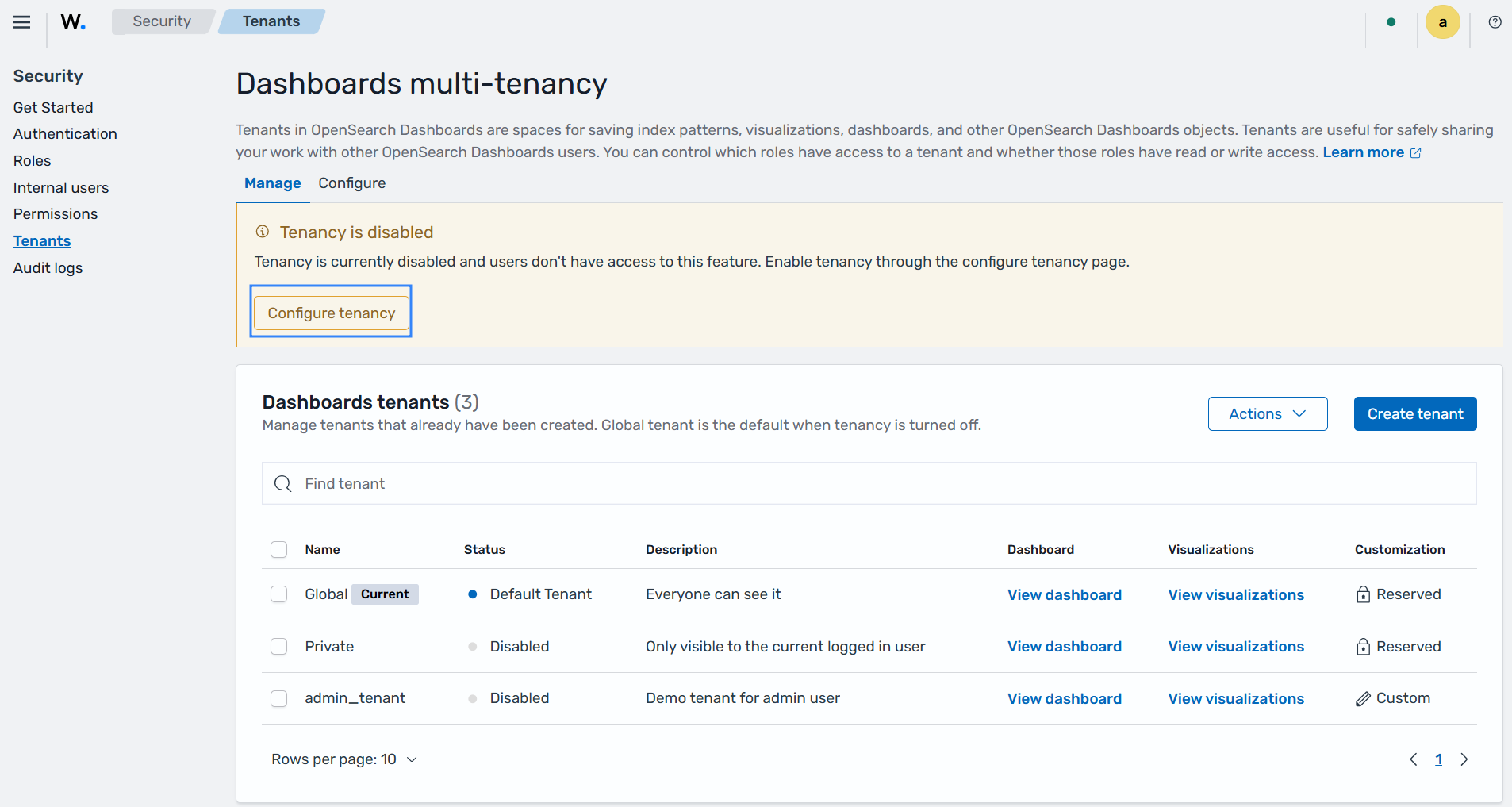
Navigate to Indexer management > Security > Tenants on the Wazuh dashboard. Click on Configure tenancy to enable multi-tenancy.
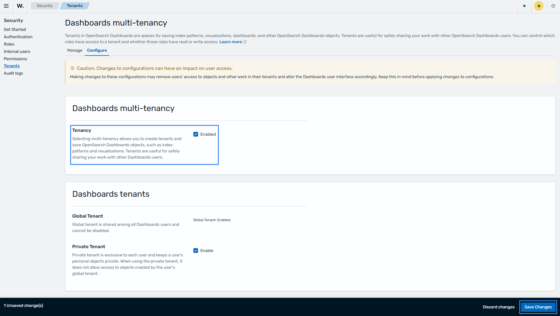
Under Dashboards multi-tenancy, select the checkbox to enable tenancy. Click Save Changes to save the configuration.
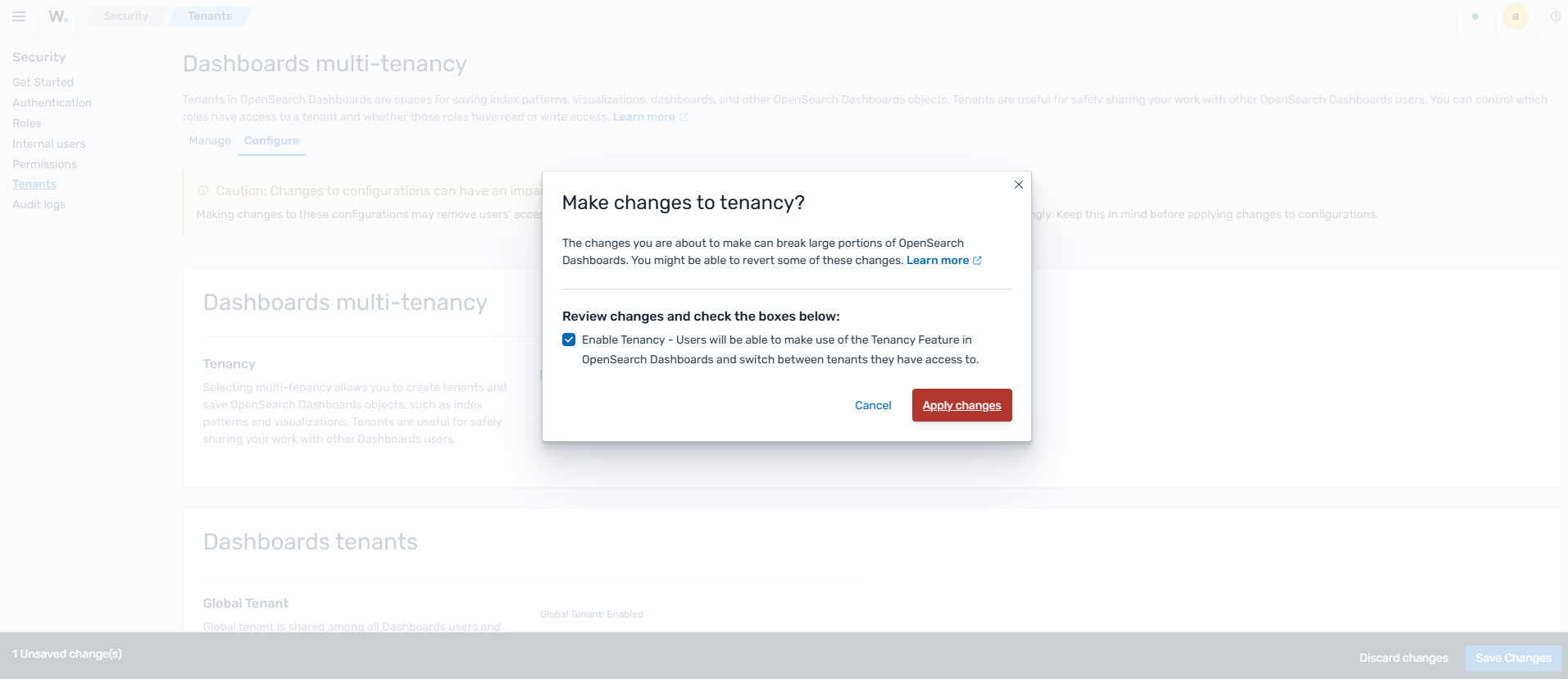
Review the configuration, then click Apply changes to apply it.
The configuration above adds the options to switch tenants on the Wazuh dashboard.
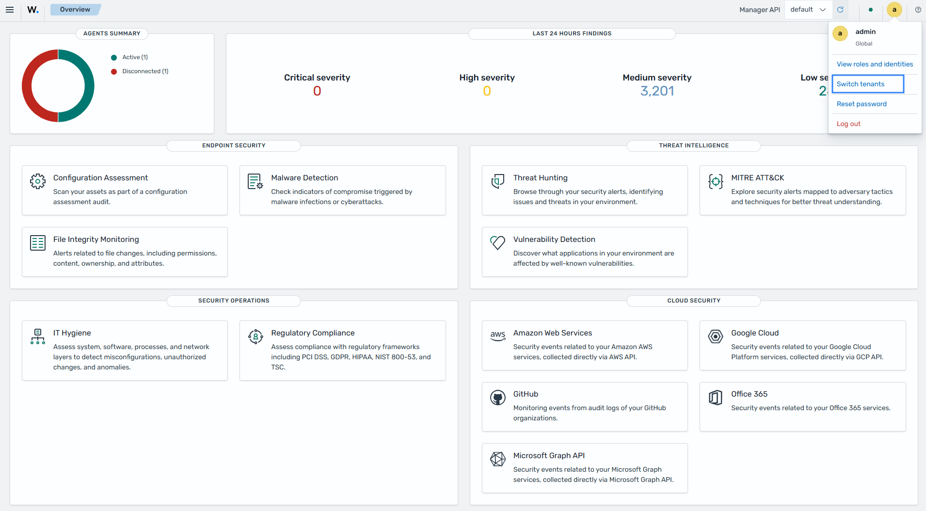
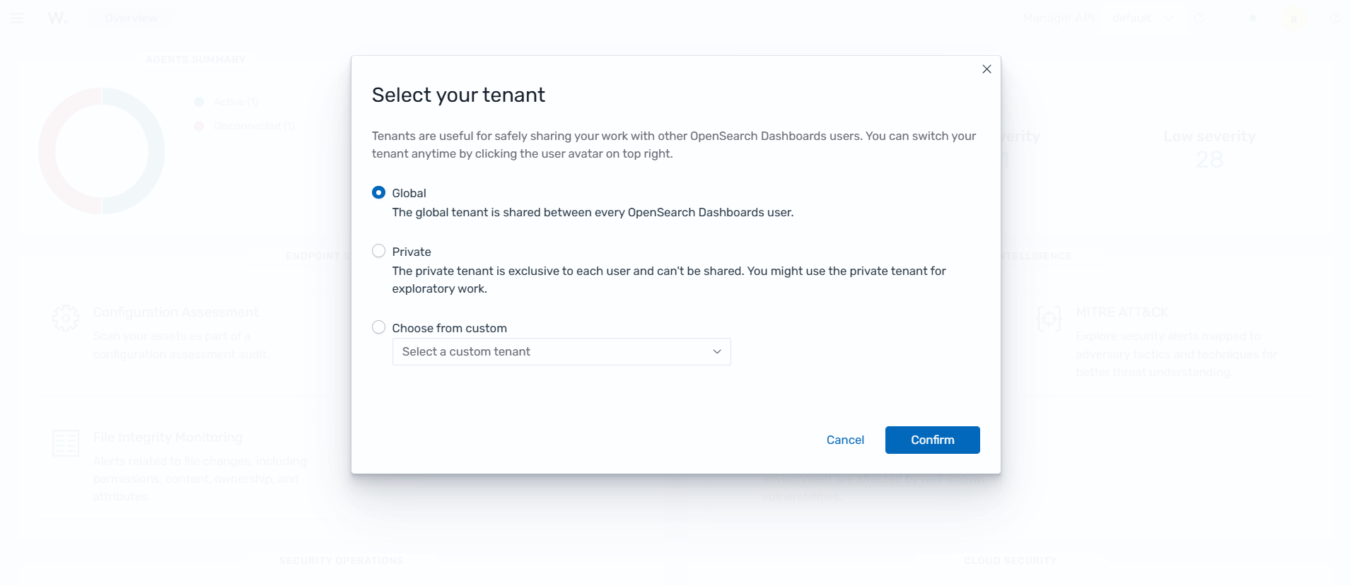
Select your tenant and click Confirm to switch to the selected tenant.
Creating custom dashboards
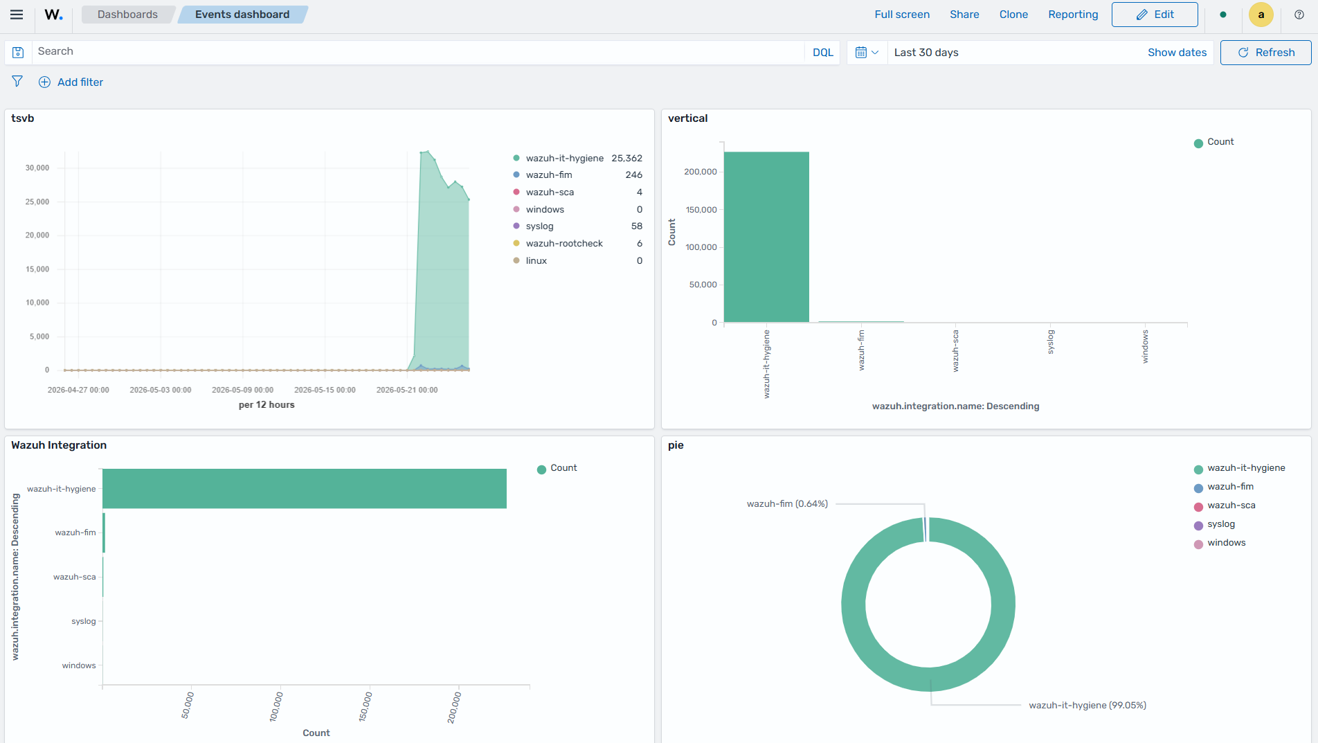
The Wazuh dashboard provides visualization and dashboarding capabilities that enable users to create custom views of their security and operational data. Users can build visualizations from Wazuh indices, combine multiple visualizations into a single dashboard, and customize the layout to focus on specific security monitoring, threat hunting, compliance, or operational requirements.
This section describes the process of creating a set of custom visualizations using the Wazuh dashboard component. We also show how to add individually created visualizations together to create a custom dashboard.
Visualizing the data
Data visualization helps security analysts understand and interpret large volumes of security data collected by Wazuh. By presenting data in charts, maps, tables, and dashboards, users can identify attack patterns, monitor threat activity, track vulnerabilities, assess compliance status, and gain visibility into the overall security posture of their environment.
The Wazuh dashboard supports multiple visualization types, including bar charts, line charts, area charts, pie charts, heat maps, data tables, maps, and time-series visualizations. These visualizations can be customized, saved, combined into dashboards, and shared with other users.
This section demonstrates how to create different visualization types in the Wazuh dashboard and combine them into custom dashboards for security monitoring and analysis.
Creating visualizations
To create a visualization, click ☰ to open the menu and navigate to Explore > Visualize. This opens the Visualize page, where you can view existing visualizations or create new visualizations.
Click on Create visualization, and then select the visualization type from the New Visualization screen.
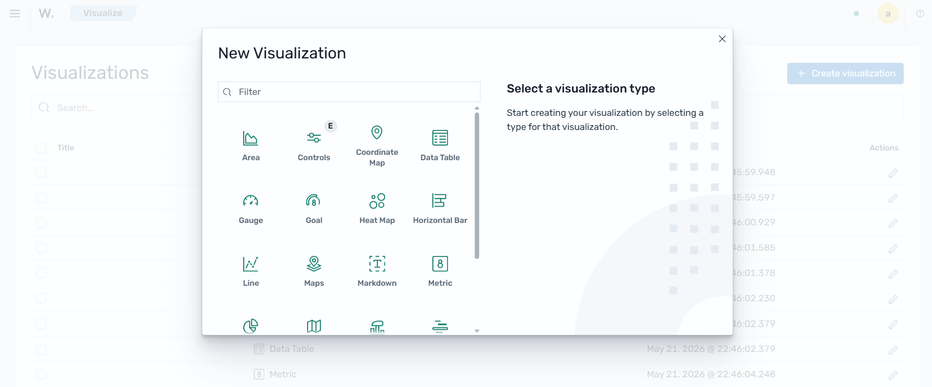
Choose the visualization option that best suits your data by clicking on the visualization type box. Here, we selected the Area chart visualization.
After selecting a visualization type, the next step for most visualization types is to choose the index pattern to use. The selected index pattern serves as the data source for building the visualization.
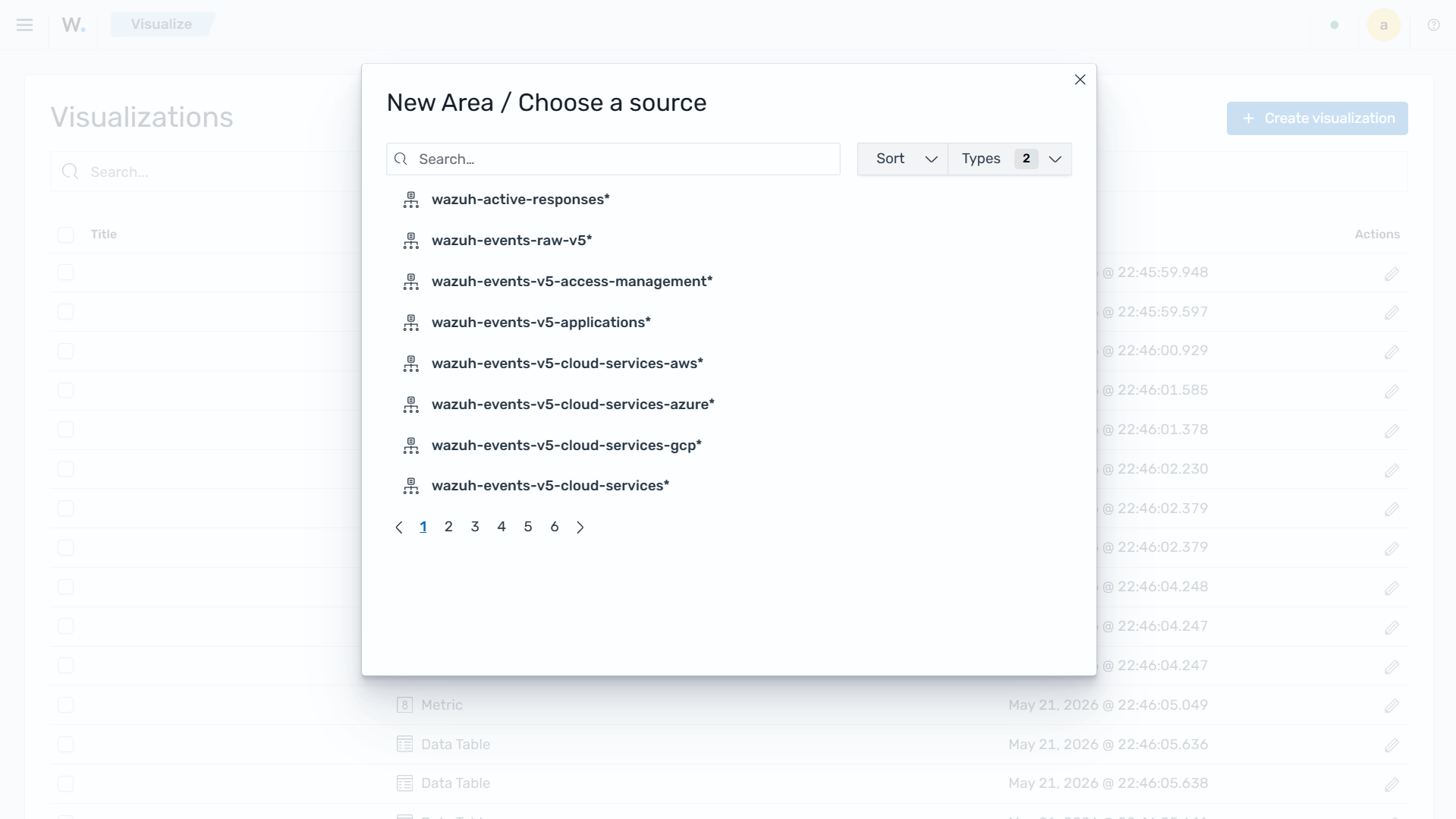
Wazuh dashboard aggregation
The Wazuh dashboard visualization contains two main aggregation objects:
Metrics aggregation.
Bucket aggregation.
Metric aggregation
Metric aggregation calculates metrics by aggregating data values. This contains the actual values of the metric to be calculated. Metric aggregation is typically represented on the Y-axis.
There are different types of metric aggregations as shown below:
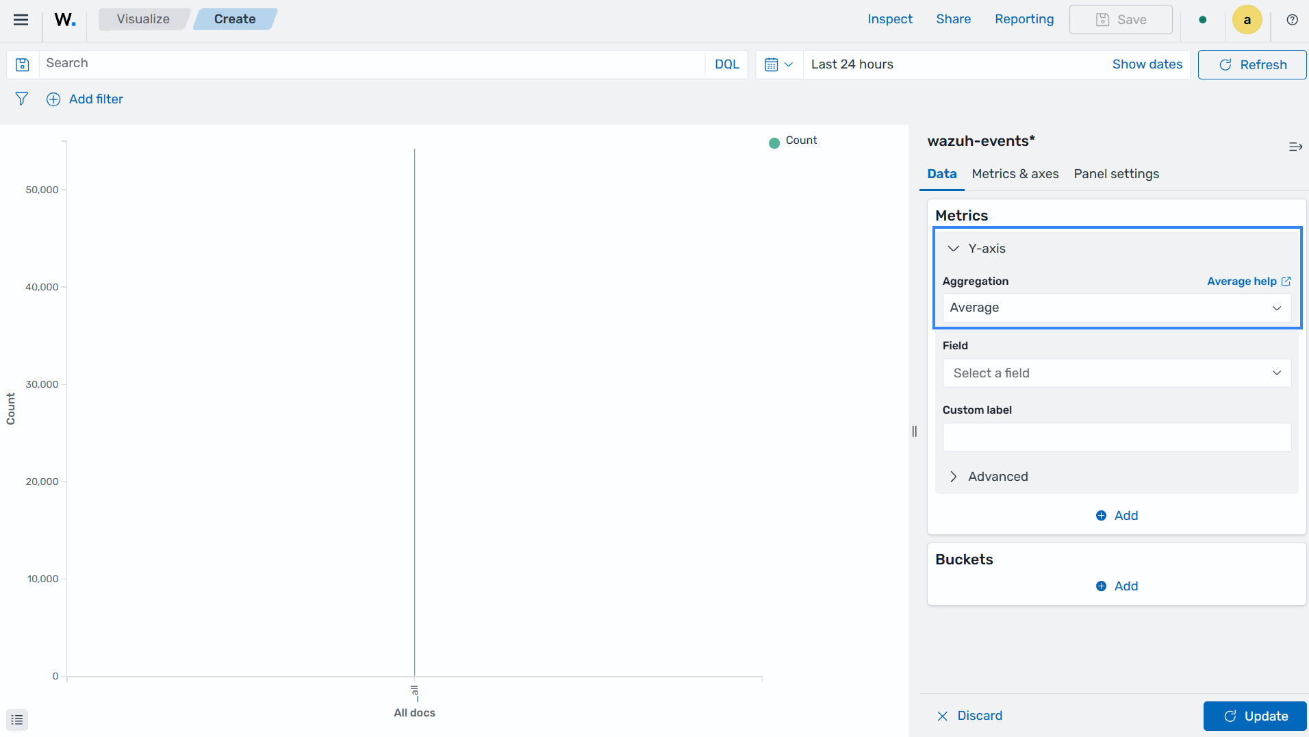
Average: This is the average of a numeric field. It calculates the arithmetic mean of an existing set of data values. The average is obtained by adding up all the data values and dividing their sum by the total count. Average aggregation helps calculate the average duration of security incidents, the average severity score of alerts, the average response time to resolve incidents, and more.
Count: This is the number of data values that match a query within the selected index pattern. It counts the number of data points in a set and provides the total count of a queried event. Count aggregation helps determine the total number of security events, the number of alerts triggered by a specific rule, the number of failed login attempts, and more.
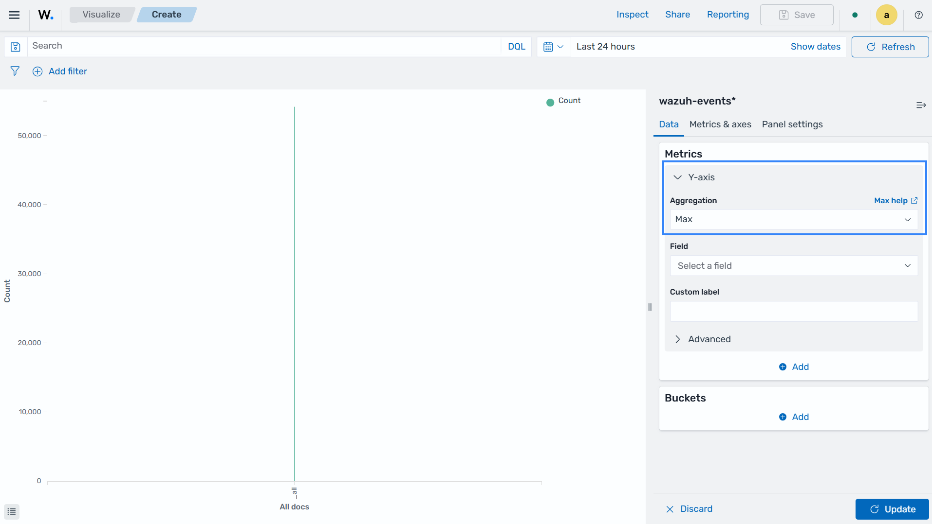
Max: This is the maximum value of a numeric field within a selected index pattern. Max identifies the highest value among a group of values. Max aggregation helps identify the maximum severity level of alerts, maximum CPU usage, and more.
Median: This is the median value in a numeric field. Median determines the middle value in a sorted set of values within a selected index pattern by separating the higher half from the lower half of the data. Median aggregation provides the middle value of event durations, helping to identify the typical or median response time.
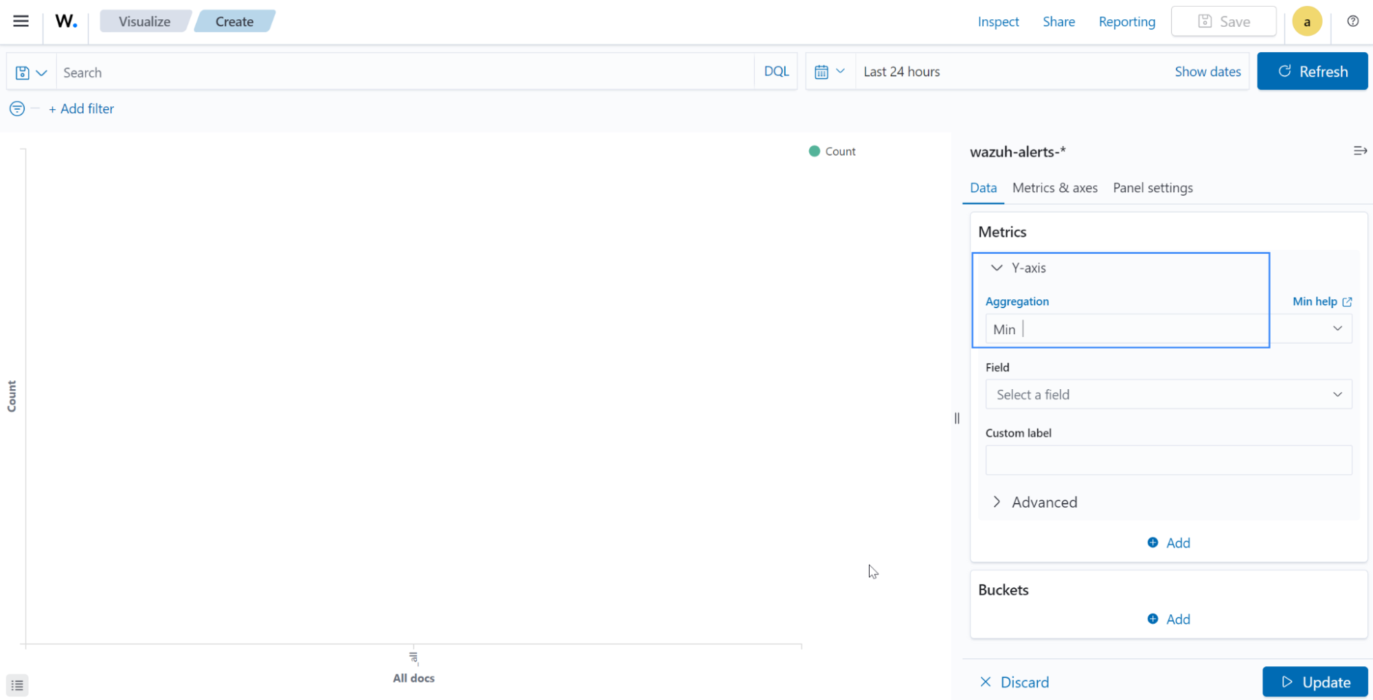
Min: This is the minimum value in a numeric field set. Min identifies the lowest value among a group of values. Min aggregation determines the minimum severity level of alerts, minimum disk space usage, minimum number of successful logins, and more.
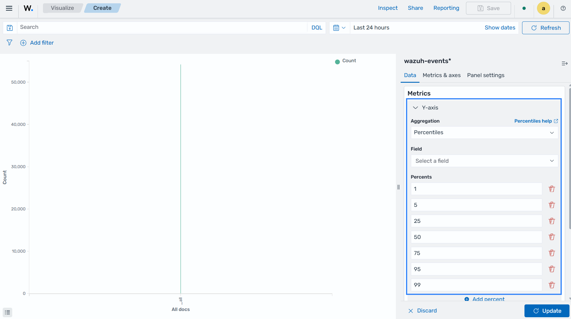
Percentile Ranks: This is the ranking for values within a given numeric field in percentiles. Percentile rank calculates the percentage of values below a specific value in a set and expresses how a given value compares to the distribution of the data. Percentile rank aggregation helps in assessing the relative severity of alerts in comparison to the entire dataset. This determines the percentile rank of a specific severity score.
Percentile: This aggregation changes numeric field values into percentile bands. Percentile identifies specific data values that correspond to specific percentiles. For example, the 90th percentile represents the value below which 90% of the data falls.
Standard Deviation: This measures the amount of variation in a set of numeric field values. It evaluates the average distance between each value and the mean value. Standard deviation aggregation can help identify changes in event durations. This provides insights into the volatility or stability of security events.
Sum: This is the total sum of a numeric field. Sum calculates the total sum of a set of values by adding up all the values in the dataset within a selected index pattern. Sum aggregation determines the total count of specific event types, the total number of successful logins, the total disk space used, and more.
Top Hit: This aggregation identifies the top data point based on a specified criterion or sort order. Top hit is commonly used to extract specific information from the dataset based on the top metric. Top hit aggregation helps in extracting key information from security events, such as retrieving the most recent log entry for a particular host or user.
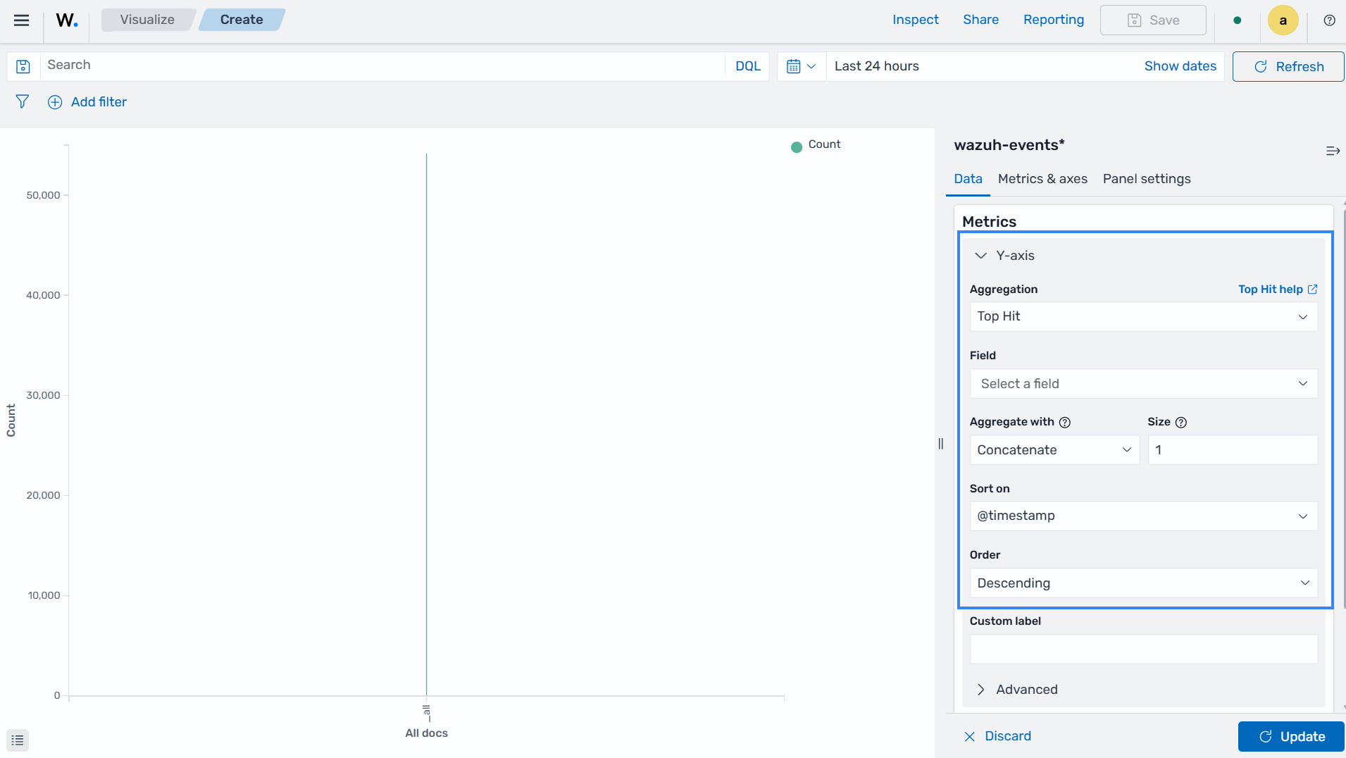
Unique Count: This is the count of unique values within a designated field. It counts the number of unique or distinct values in a set. Unique count disregards any duplicate events and provides the count of unique values. Unique count aggregation helps in determining the number of distinct IP addresses accessing a system, the number of unique users triggering alerts, the count of unique event types, and more.
Parent pipeline aggregations
This category of pipeline aggregations is able to compute new buckets based on other parent aggregations.
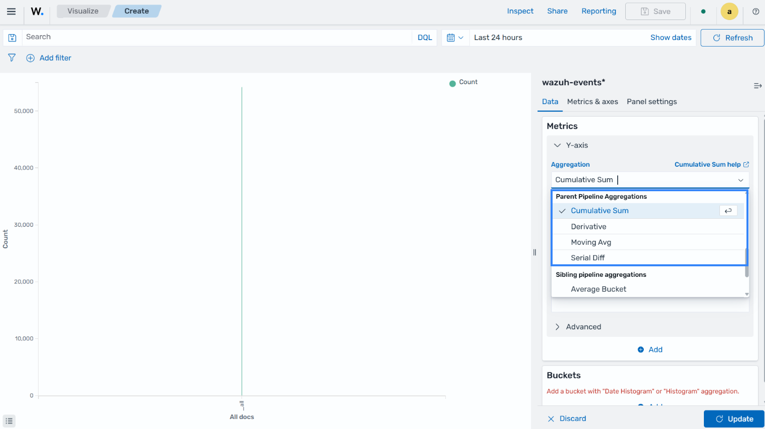
Cumulative Sum: Calculates the running sum of a metric across a specified set of data points. It shows the progressive total as each data point is added. Cumulative sum aggregation can be used to track the total count of security events over time, providing insights into the cumulative impact of incidents.
Derivative: Calculates the rate of change of values over time. Derivative is the difference between consecutive values in a time series or dataset. Derivative aggregation helps in calculating the rate of change in event counts or severity scores. This enables the detection of sudden spikes or anomalies.
Moving Avg: Calculates the average of a metric over a moving window of data points. It provides a neat representation of the data, hence reducing noise or fluctuations. This helps identify trends, patterns, and anomalies in event counts or resource usage over time.
Serial Diff: Calculates the difference between consecutive values in a time series or ordered dataset. It measures the absolute change from one data point to the next. Serial diff aggregation identifies the difference in event counts or resource usage between consecutive data points, showing changes or trends.
Sibling pipeline aggregations
This category of aggregations computes new aggregations that will be at the same level as the sibling aggregation from which its input was provided.
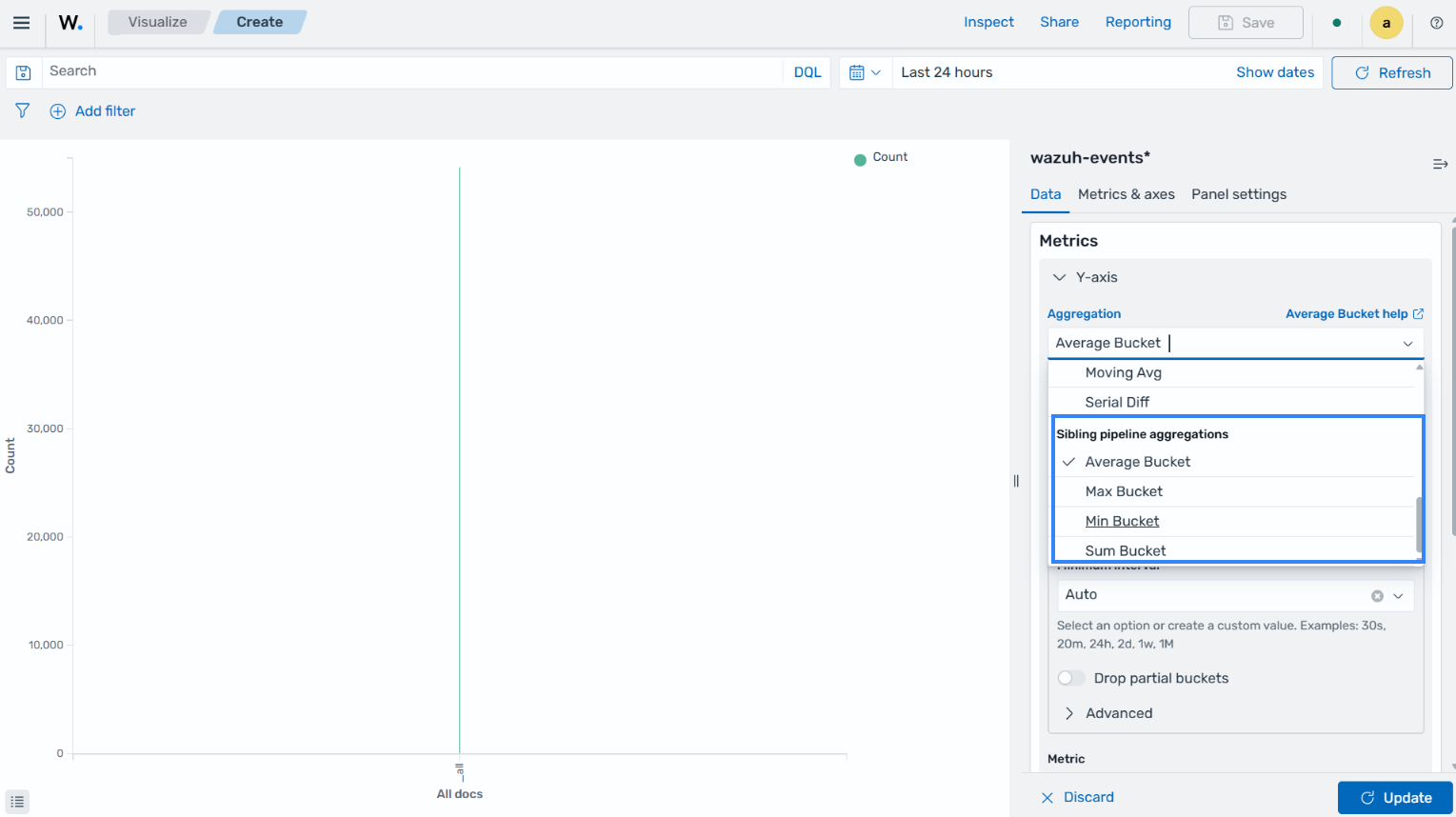
Average Bucket: This is the average value of a metric within each bucket of a specified aggregation. The average bucket provides the average value per group or category. Average bucket aggregation helps in calculating the average severity score or event count within specific time intervals or categories.
Max Bucket: This is the maximum value of a metric within each bucket of a specified aggregation. It identifies the highest value per group. Max bucket aggregation enables the identification of the maximum severity level or event count within specific time intervals or categories.
Min Bucket: This is the minimum value of a metric within each bucket of a specified aggregation. It identifies the lowest value per group or category. Min bucket aggregation helps identify the minimum severity level or event count within specific time intervals or categories.
Sum Bucket: This is the total sum of a metric within each bucket of a specified aggregation. It adds up the values per group. Sum bucket aggregation helps in calculating the total count or severity score within specific time intervals or categories.
Bucket aggregation
This is used to determine the type of information we are trying to get from the dataset. The bucket aggregation determines how the data is segmented or grouped, such as by date. It is typically represented on the X-axis.
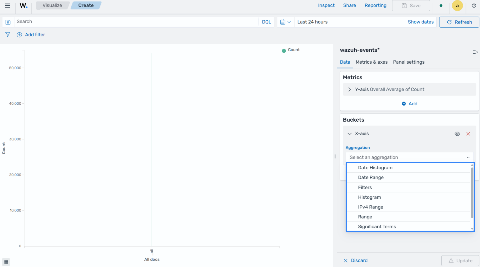
The following are the types of bucket aggregations:
Date Histogram: This aggregation is used to display data organized by a date.
Date Range: This aggregation is used to report the values within a date range which we can specify.
Filters: This aggregation is used to apply filters to data.
Histogram: This aggregation is used for numeric fields, where we can provide the integer interval for the selected field.
IPv4 Range: This aggregation provides us with the option to set the range using IPv4 addresses.
Range: This aggregation is used to provide the range of numeric field values.
Significant Terms: This aggregation returns interesting or unusual occurrences of terms in a set.
Terms: This aggregation enables us to pick the top or bottom n elements of the selected field.
Both the Y-axis and the X-axis are used to plot the data points on a visualization chart.
Basic charts
The following is a list of the basic charts for visualization:
Bar, area, and line charts: These charts are used for comparing different series on the x-axis and y-axis.
Pie charts: These charts are used when all of the fields are related to each other.
Heat maps: These are used to shade the cells within a matrix.
Bar charts
Bar charts are a type of visualization that is used to compare specific measures for different data categories. These are the most common types of visualization and are easy to create and interpret. Bar charts are used to present categorical data in the form of rectangular bars with heights/lengths that are proportional to the given values.
Creating a Bar chart
Horizontal Bar: This is a type of bar chart where rectangular bars are displayed horizontally. The length or width of each bar corresponds to a particular value. This allows an easy comparison between different data points. Horizontal bar charts are often used to visualize data that has distinct categories or to show rankings.
The steps below show how to create a horizontal bar visualization that shows varying numbers of MITRE tactics detected within a set timeframe.
Click Create visualization from the Visualize tab, select the Horizontal Bar visualization format, and use
wazuh-findings*as the index pattern name.Set the following value in the Data section, on the
Y-axis, in Metrics:Aggregation=Count
Add an
X-axisin Bucket and set the following values:Aggregation=TermsField=rule.mitre.tacticOrder by=Metric: CountOrder=DescendingSize=10
Click the Update button.
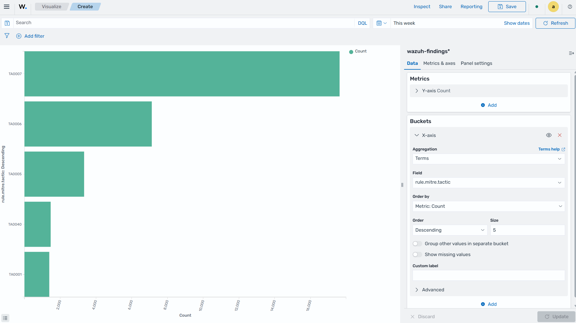
Click the Save button in the top right corner and assign a title to save the visualization.
Vertical Bar: This is a type of bar chart where the bars are displayed vertically, with the length or height of each bar representing a particular value. Vertical bar charts are suitable for comparing data across different categories. They are commonly used to display rankings, comparisons, or the distribution of values.
The steps below show how to create a vertical bar visualization that shows varying numbers of MITRE tactics detected within a set timeframe.
Click Create visualization from the Visualize tab, select the Vertical Bar visualization format, and use
wazuh-findings*as the index pattern name.Set the following value in the Data section, on the
Y-axis, in Metrics:Aggregation=Count
Add an
X-axisin Bucket and set the following values:Aggregation=TermsField=rule.mitre.tacticOrder by=Metric: CountOrder=DescendingSize=10
Click the Update button.
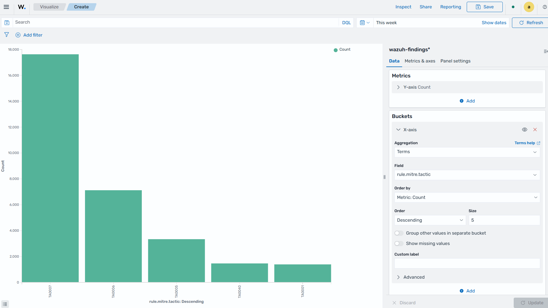
Click the Save button in the top right corner and assign a title to save the visualization.
Pie charts
This is a circular chart that is divided into sectors, with each sector representing a percentage of the whole data set. They are commonly used to show market share, composition of data, or distribution of categories. The total slice size of a pie chart is calculated by the metrics aggregation. In the case of a pie chart, we use the count, sum, and unique count.
The steps below show how to create a Pie chart visualization that shows MITRE tactics count within a timeframe.
Creating a Pie chart
Click Create visualization from the Visualize tab, select the Pie visualization format, and use
wazuh-findings*as the index pattern name.Set the following value in the Data section, on the
Slice size, in Metrics:Aggregation=Count
Add a Split slices in Bucket and set the following values:
Aggregation=TermsField=rule.mitre.tacticOrder by=Metric: CountOrder=DescendingSize=10
Customize the Pie chart by toggling on
show labelin the Options section.Click the Update button.
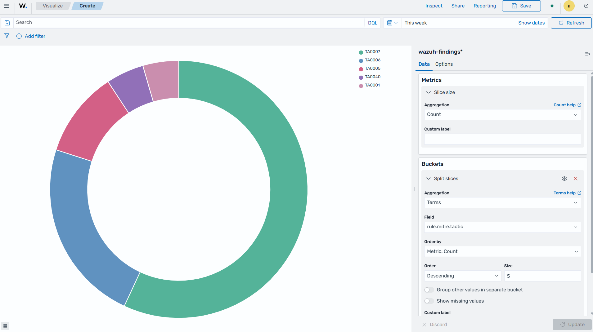
Click the Save button in the top right corner and assign a title to save the visualization.
Area charts
This is used to display graphically quantitative data using filled-in areas. The areas between axes and lines are typically filled with colors or patterns to differentiate between different categories or data points. This emphasizes the quantity beneath a line chart. Area charts are useful for showing the magnitude and distribution of data over time or categories. They are often used to display trends, comparisons, or cumulative values.
The steps below show how to create an Area chart that visualizes a histogram of Wazuh rule levels and their maximum fired times.
Creating an Area chart
Click Create visualization from the Visualize tab, select the Area visualization format, and use
wazuh-events*as the index pattern name.Set the following value in the Data section, on the
Y-axis, in Metrics:Aggregation=MaxField=event.severity
Add another
Y-axisin Metric and set the following values:Aggregation=MaxField=rule.firedtimes
Add an
X-axisin Bucket and set the following values:Aggregation=Date HistogramField=timestamp
Click the Update button.
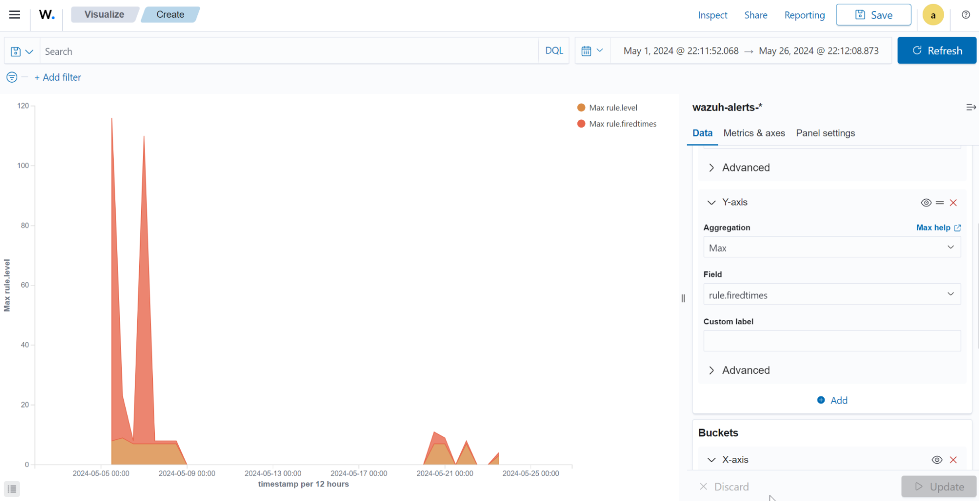
Click the Save button in the top right corner and assign a title to save the visualization.
Line charts
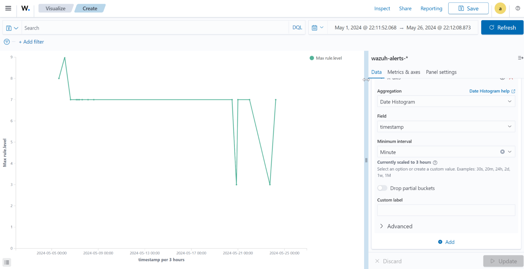
This visualization represents data points connected by straight lines. It is commonly used to display trends, patterns, relationships over time, or a continuous range. By plotting data along a Cartesian coordinate system, lines are drawn to connect the data points. This provides a clear depiction of how the values change.
The steps below show how to create a Line chart that visualizes the Wazuh rule levels triggered the maximum times within a timeframe.
Creating a Line chart
Click Create visualization from the Visualize tab, select the Line visualization format, and use
wazuh-events*as the index pattern name.Set the following value in the Data section, on the
Y-axis, in Metrics:Aggregation=MaxField=event.severity
Add an
X-axisin Buckets and set the following values:Aggregation=Date HistogramField=timestampMinimum interval=Minute
Click the Update button.
Click the Save button in the top right corner and assign a title to save the visualization.
Heat maps
This is a graphical representation that uses colors to visualize the density of certain variables. Heat maps display data points as colored cells, with each color representing a different value or level of intensity. Heat maps are useful for identifying patterns, trends, or variations within a dataset.
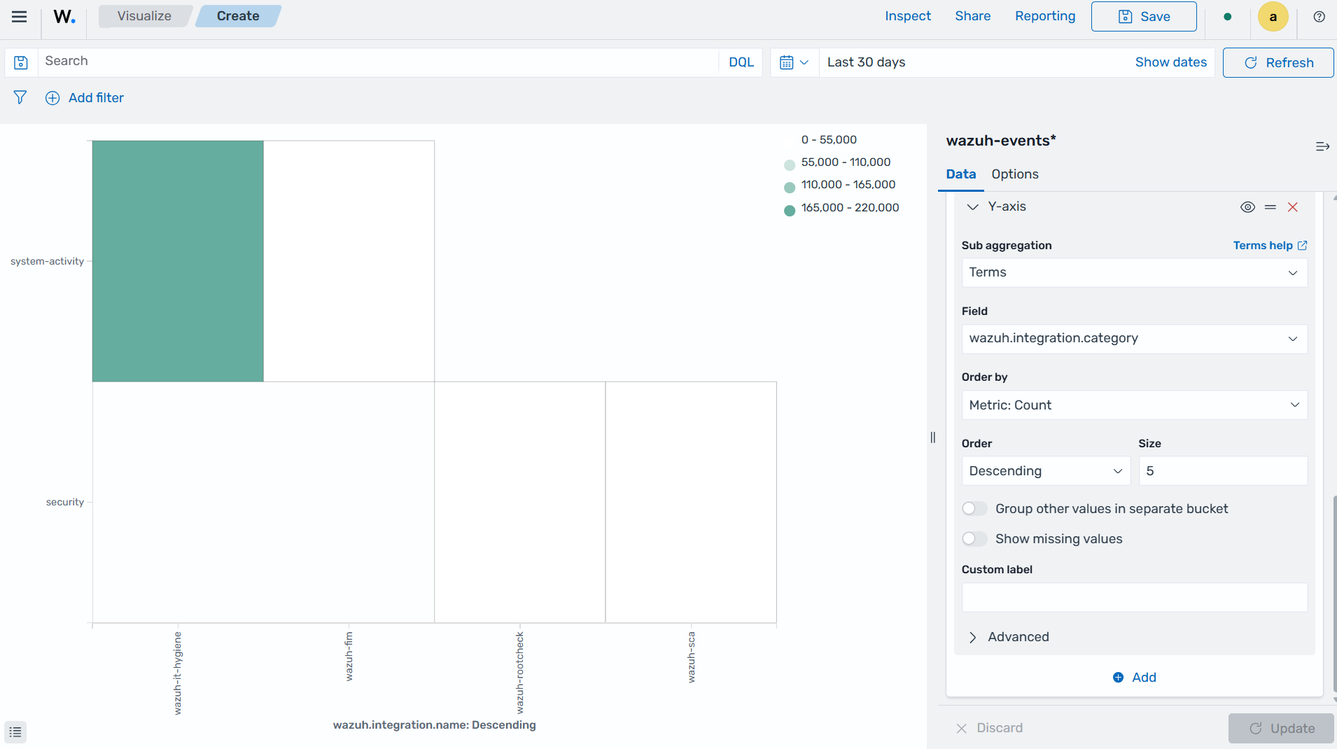
The steps below show how to create a Heat map that visualizes the mapping of Wazuh integrations and event categories.
Creating a Heat Map
Click Create visualization from the Visualize tab, select the Heat Map visualization format, and use
wazuh-events*as the index pattern name.Set the following value in the Data section, on the
Y-axis, in Metrics:Aggregation=Count
Add an
X-axisin Buckets and set the following values:Aggregation=TermsField=wazuh.integration.nameOrder by=Metric: CountOrder=DescendingSize=5
Add a
Y-axisin Buckets and set the following values:Aggregation=TermsField=wazuh.integration.categoryOrder by=Metric: CountOrder=DescendingSize=5
Click the Update button.
Click the Save button in the top right corner and assign a title to save the visualization.
Data
Data metric visualization is a single number that displays any count or calculation.
The following is a list of data visualizations:
Data table: This is where the data is shown in tabular form.
Metric: This is where a single number is displayed, which we can use to show any important metric data.
Goal and gauge: This is used when we want to display any progress.
Data table
This is a tabular representation of data that is organized into rows and columns. It provides a structured format to display and analyze data. Each row represents a specific entry, and each column represents a different variable. Data tables are widely used for data analysis, reporting, and providing a clear overview of multiple variables.
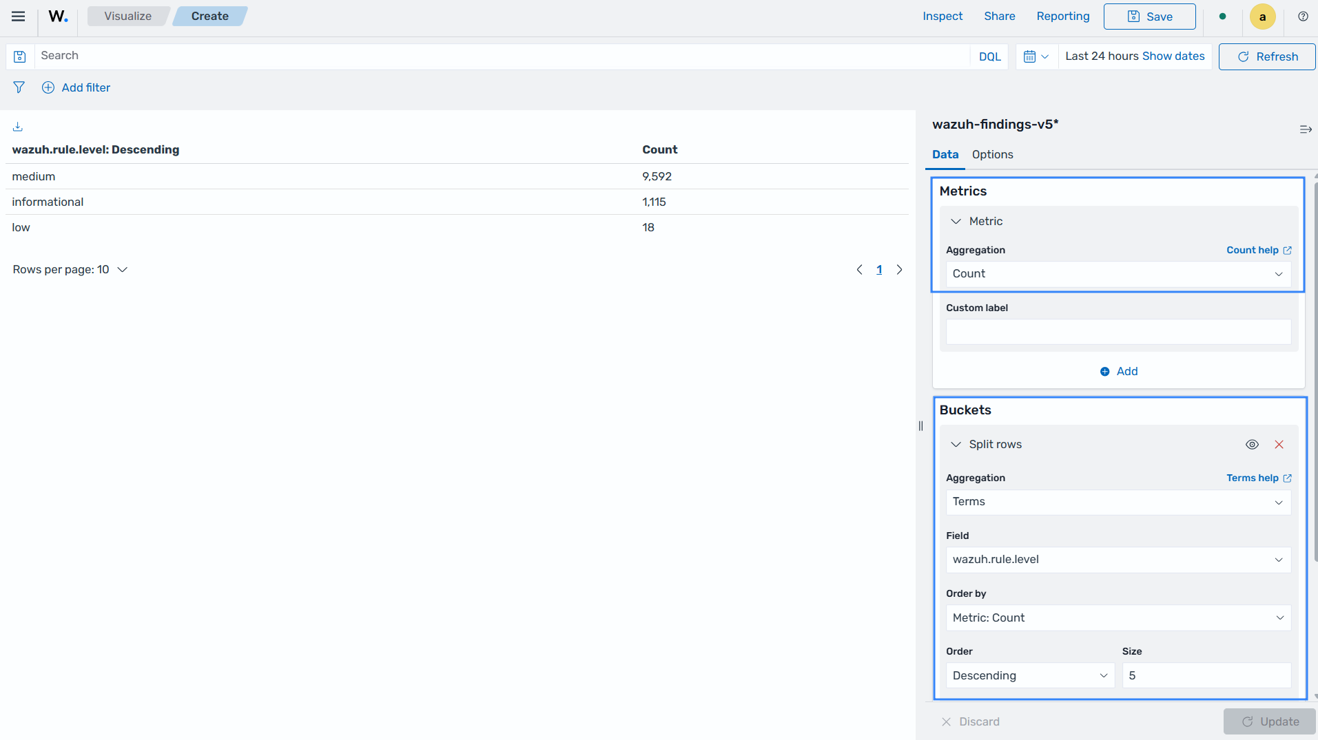
The following steps show how to create a Data table to visualize the maximum count of Wazuh rule levels that were triggered.
Creating a Data table
Click Create visualization from the Visualize tab, select the Data Table visualization format, and use
wazuh-findings-v5*as the index pattern name.Set the following metrics in the Data section:
Aggregation=Count
Add a
Split rowsin Buckets and set the following values:Aggregation=TermsField=wazuh.rule.levelOrder by=Metric: CountOrder=DescendingSize=5
Click the Update button.
Click the Save button in the top right corner and assign a title to save the visualization.
Metric
This is a quantifiable measurement that is used to evaluate performance, progress, or specific characteristics. A metric represents a calculation as a single numerical value. They are applicable in various domains, including business analytics, key performance indicators (KPIs), and performance monitoring.
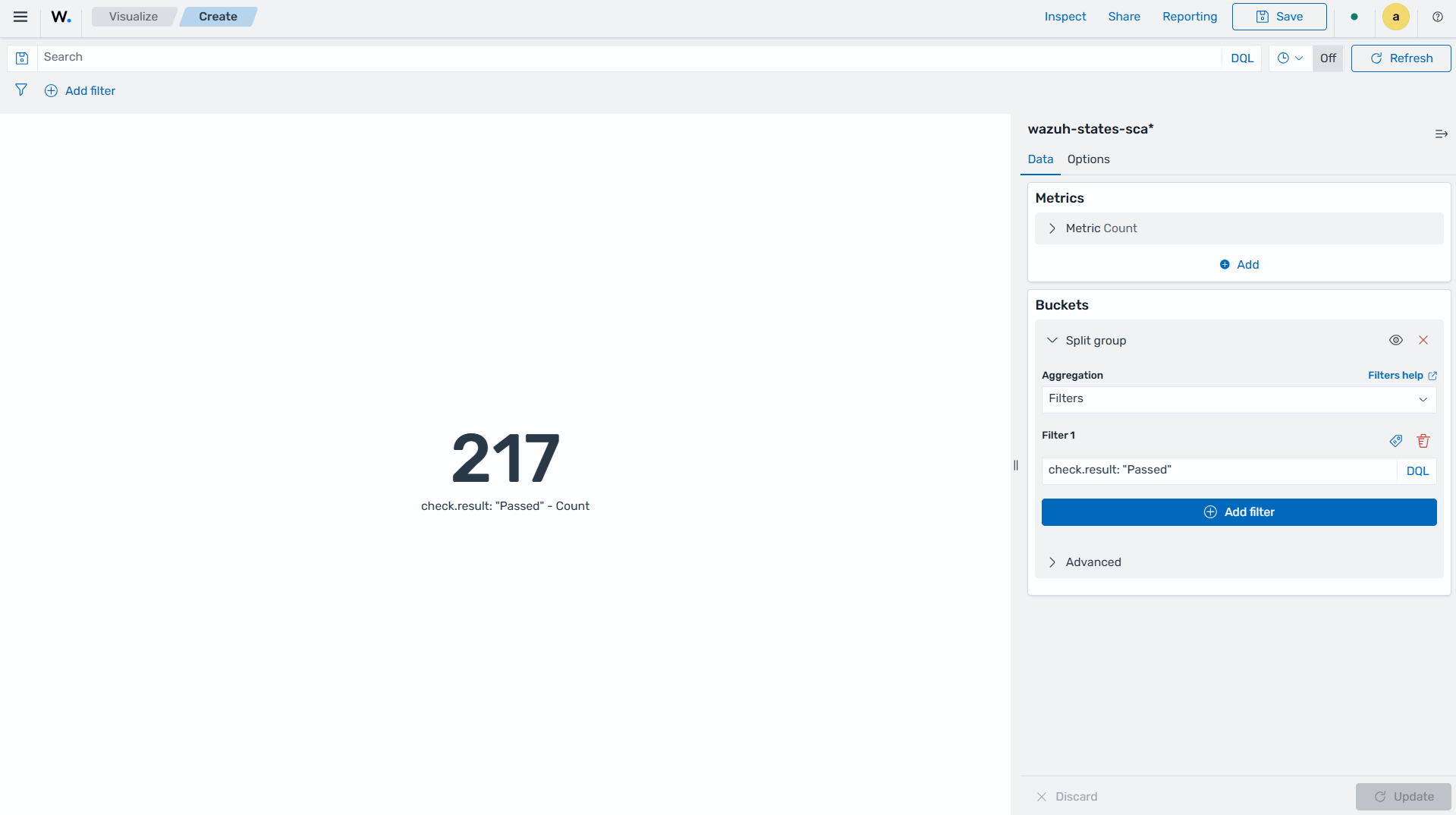
The following steps show how to create a Metric to visualize the number of SCA checks.
Creating a Metric
Click Create visualization from the Visualize tab, select the Metric visualization format, and use
wazuh-states-sca*as the index pattern name.Set the following metrics in the Data section:
Aggregation=count
Add a
Split groupin Buckets and set the following values:Aggregation=FiltersFilter=check.result: "Passed"
Click the Update button.
Click the Save button in the top right corner and assign a title to save the visualization.
Gauge
This is a visualization that is represented as a meter. It is commonly used to display a single value within a specific range. The gauge consists of a pointer that shows the current value. This is displayed as a position along a circular or linear scale. Gauges are used to indicate progress, performance metrics, or levels of achievement. It shows how a metric’s value relates to reference threshold values.
The steps below show how to create a Gauge to visualize the SCA failed counts.
Creating a Gauge
Click Create visualization from the Visualize tab, select the Metric visualization format, and use
wazuh-states-sca*as the index pattern name.Set the following metrics in the Data section:
Aggregation=count
Add a
Split groupin Buckets and set the following values:Aggregation=FiltersFilter=check.result: "Failed"
Click the Update button.
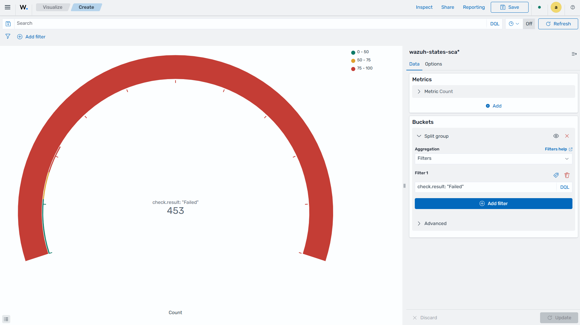
Click the Save button in the top right corner and assign a title to save the visualization.
Maps
These are visual representations of geographical regions. Maps display spatial data, such as locations, boundaries, or distributions, on a graphical interface. They provide a means to explore and analyze geographic information, making them valuable for various applications, including navigation, data visualization, and spatial analysis.
The steps below show how to create a geographic map.
Creating a map
Click Create visualization from the Visualize tab, and select the Maps visualization format.
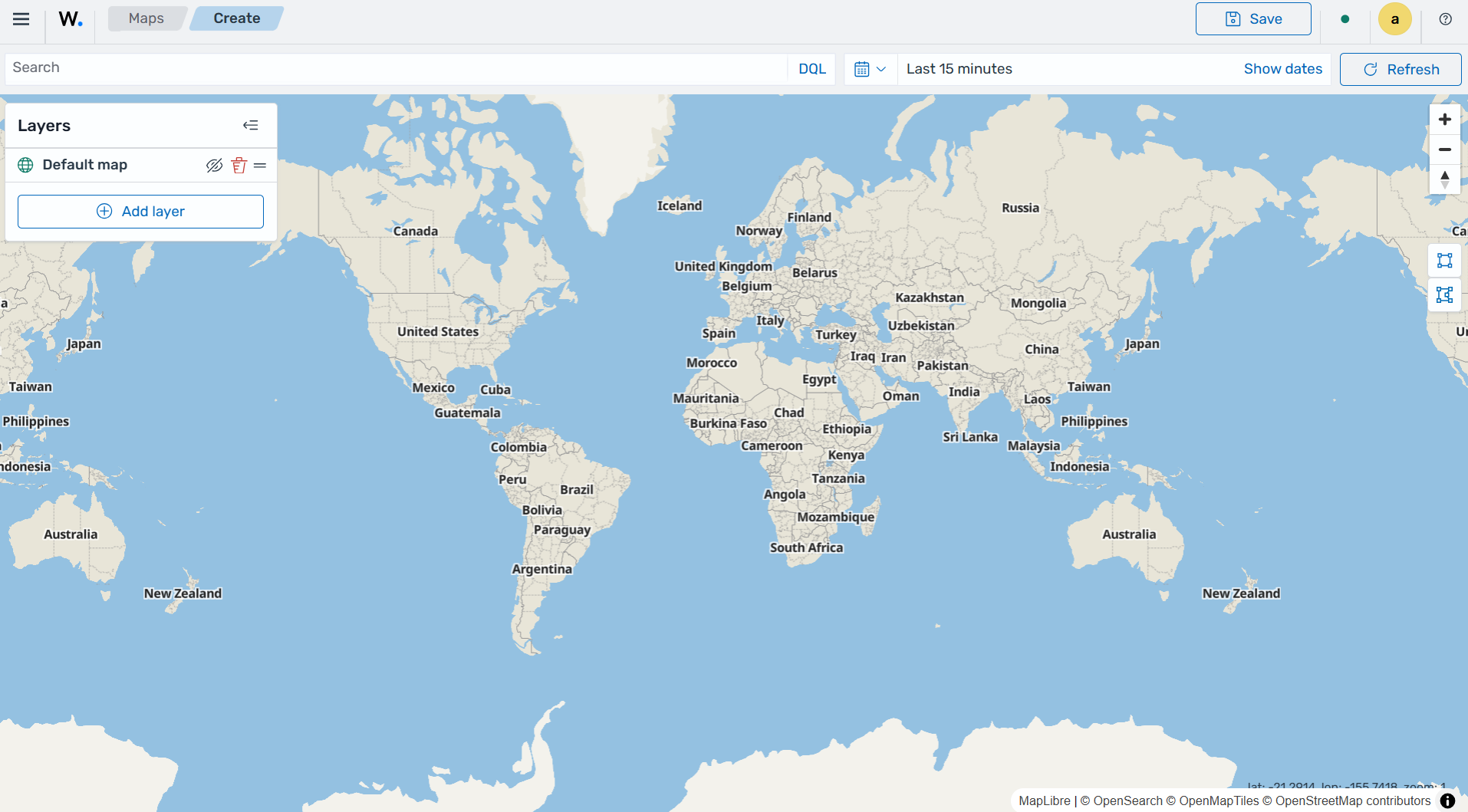
Click on Add layer.
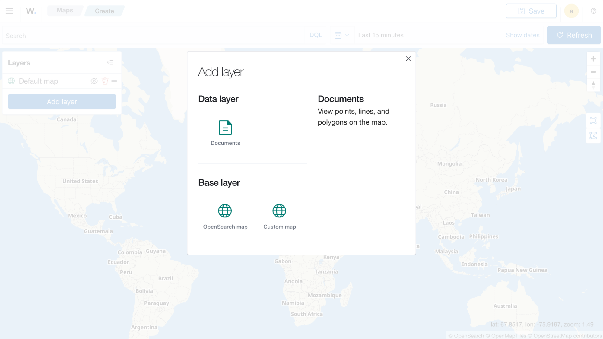
Select
Documentsas the Data layer.Set the following values in the New layer:
Data source=wazuh-events*Geospatial field=destination.geo.locationNumber of documents=1000
Click the Update button.
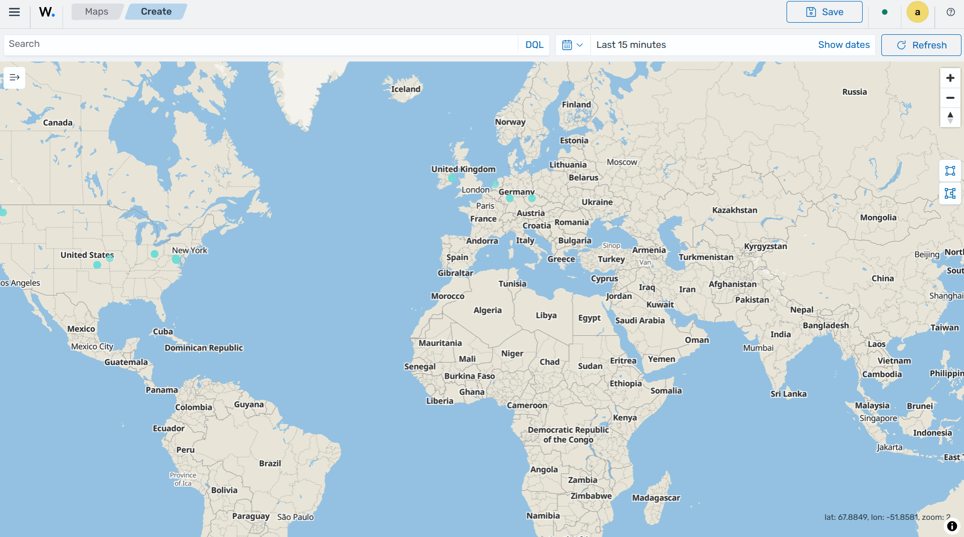
Click the Save button in the top right corner and assign a title to save the visualization.
The following is a list of maps used in visualization:
Coordinate map: This can be used for linking the aggregation of data fields with geographic locations.
Region map: This is a kind of thematic map where we use color intensity to show a metric's value with locations.
Coordinate Map
This uses geographic coordinates to display data points or regions on a map. Coordinate maps allow you to plot and visualize information in relation to specific locations or geographical areas. By using latitude and longitude coordinates, you can represent data in a spatial context.
Coordinate maps are ideal for plotting latitude and longitude coordinates. This allows the visualization of spatial data, such as locations, regions, or density. They are commonly used in geographical analysis, tracking data by location, or displaying demographic information.
The steps below show how to create a coordinate map based on the origin location.
Creating a Coordinate map
Click Create visualization from the Visualize tab, select the Coordinate Map visualization format, and use
wazuh-events*as the index pattern name.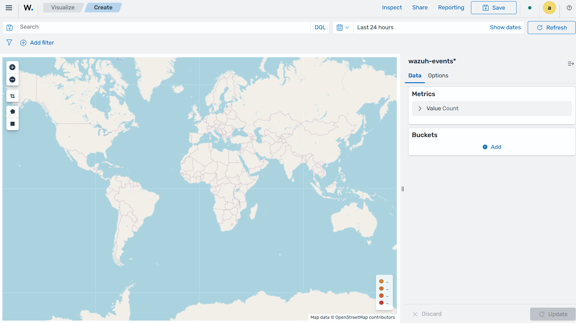
Set the following values on the Metric in Data:
Aggregation=Count
Add a
Geo coordinatein Buckets and set the following values:Aggregation=GeohashField=destination.geo.location
Click the Update button.
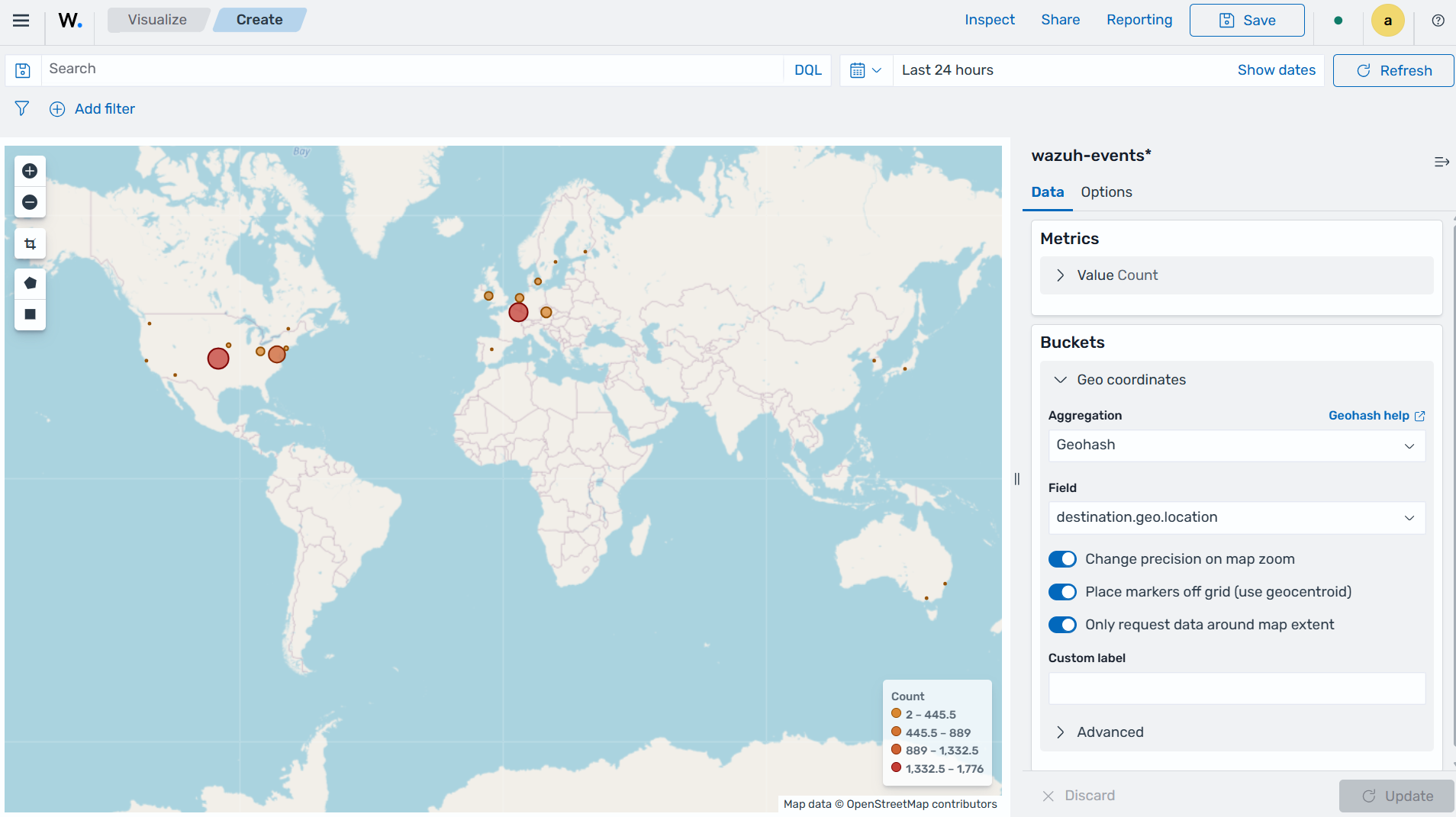
Click the Save button in the top right corner and assign a title to save the visualization.
Region Map
This is a map-based visualization that displays data by dividing regions into distinct boundaries. Region maps are suitable for displaying data at a territorial level. They are often used in geopolitical analysis, demographic comparisons, or election results.
The steps below show how to create a region map based on the destination country.
Create region map
Click Create visualization from the Visualize tab, select the Region Map visualization format, and use
wazuh-events*as the index pattern name.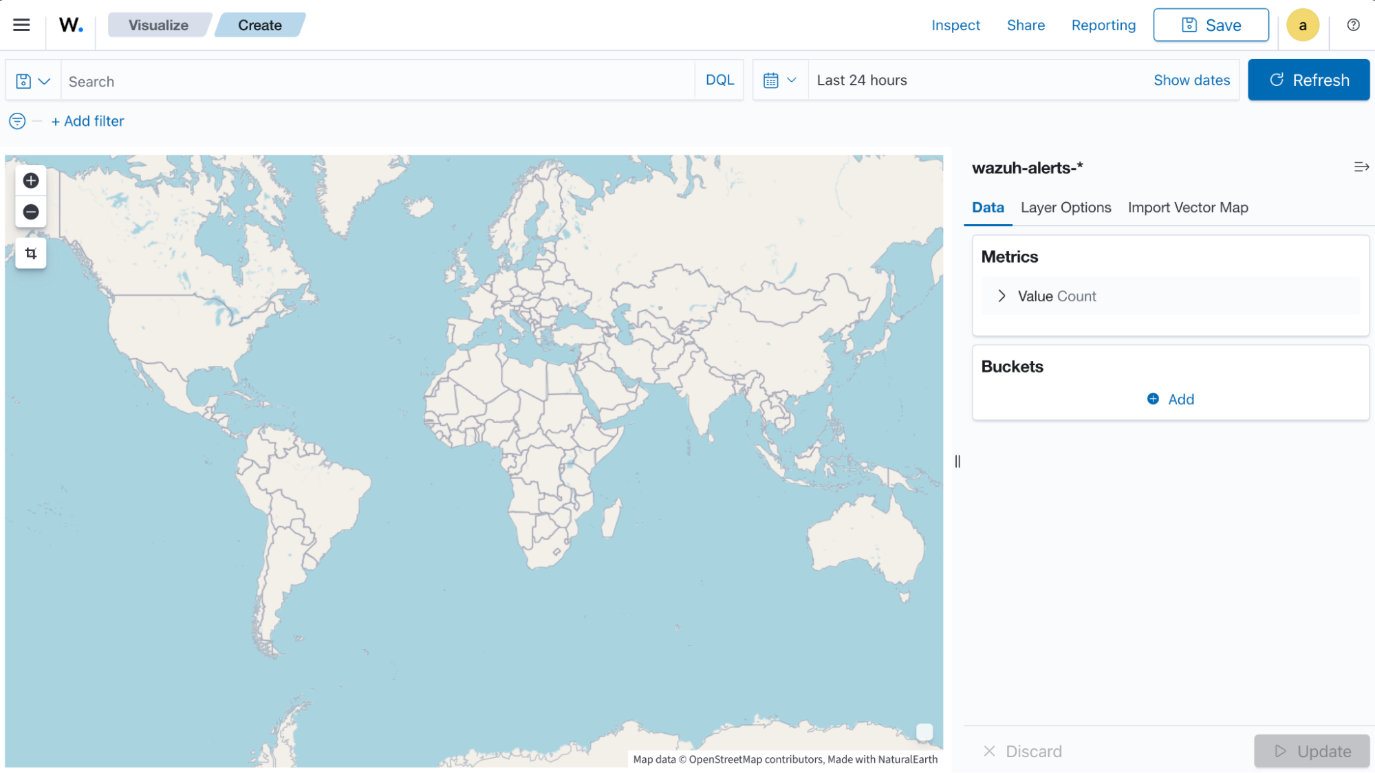
Set the following values on the Metric in Data:
Aggregation=Count
Add a
Shape fieldin Buckets and set the following values:Aggregation=TermsField=destination.geo.country_nameOrder by=Metric: CountOrder=Descending
Select Name as Join field under the Layer Options tab.
Click the Update button.
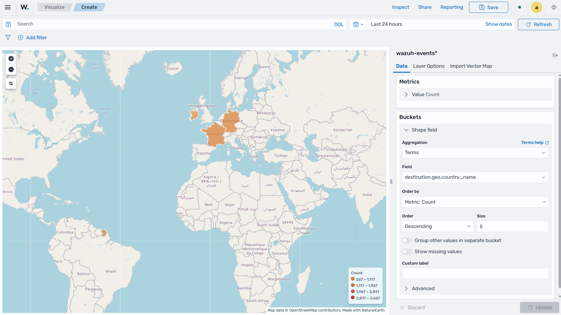
Click the Save button in the top right corner and assign a title to save the visualization.
Time series
The following is a list of time series used in visualization:
VisBuilder: This is used to display the results from single or multiple indices by combining data from multiple time series datasets.
Time series visual builder: This is used to visualize time series data using data aggregations.
VisBuilder
Visualization Builder is an intuitive tool that allows users to create customized visualizations without programming knowledge. It is beneficial for users who want to quickly generate visual representations of their data without extensive technical knowledge.
As of the time of writing this document, this visualization is experimental. The design and implementation are less mature than stable visualizations and might be subject to change.
The steps below show how to use Visualization Builder to present the Wazuh integration name and category.
Creating a Visualization Builder
Click Create visualization from the Visualize tab, select the VisBuilder visualization format, and use
wazuh-events*as the index pattern name.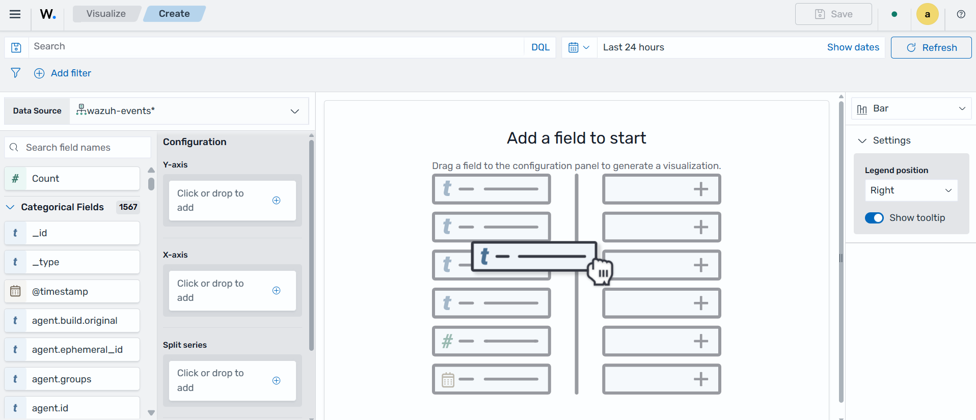
Drag a field to the configuration panel to generate a visualization.
Set aggregation to
counton the Y-axis.Set
wazuh.integration.nameon an X-axis.Set
wazuh.integration.categoryon the Split series.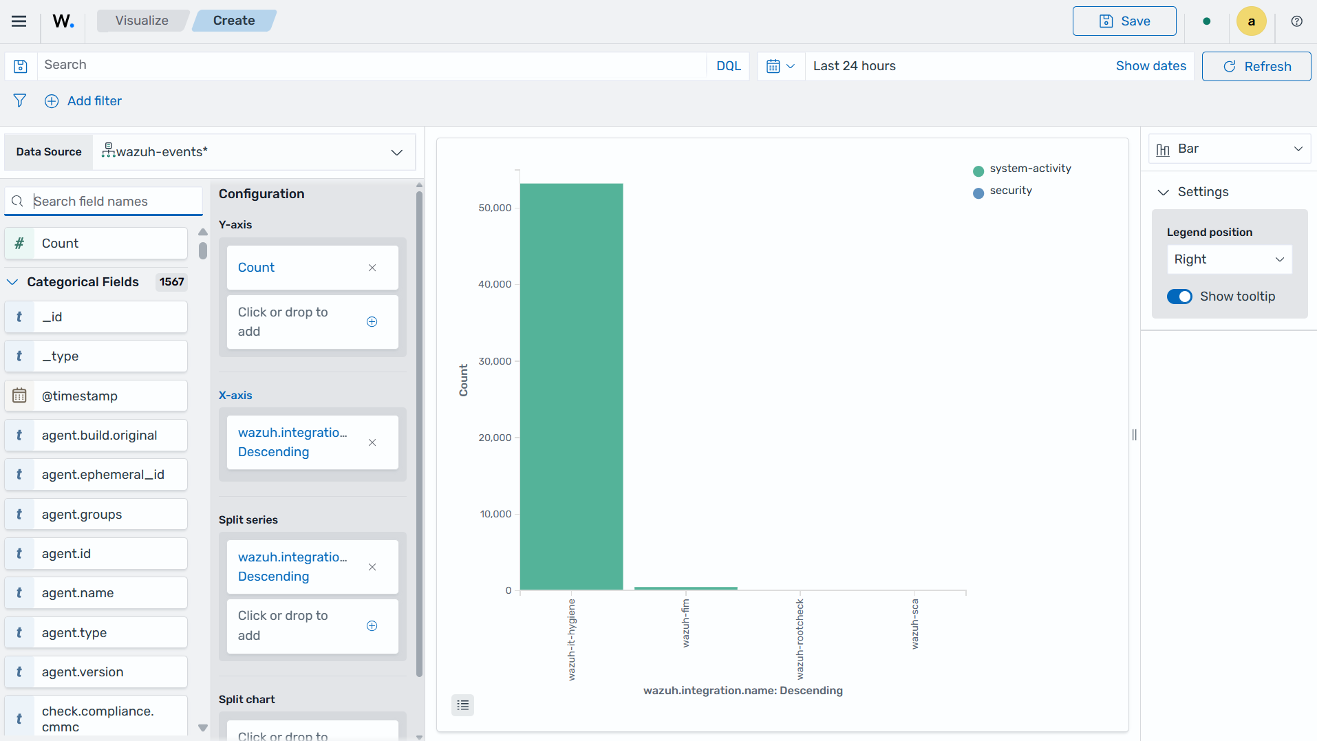
Click the Save button in the top right corner and assign a title to save the visualization.
TSVB
Time Series Visual Builder (TSVB) is a component of the Wazuh dashboard that allows users to create visualizations and analyze time series data using a visual pipeline interface. It provides features such as aggregations, filters, and metrics specifically tailored for time-based analysis.
The steps below show how to use Time Series Visual Builder to visualize Wazuh integration count within a timeframe.
Creating a TSVB
Select the TSVB visualization format from the Visualize tab.
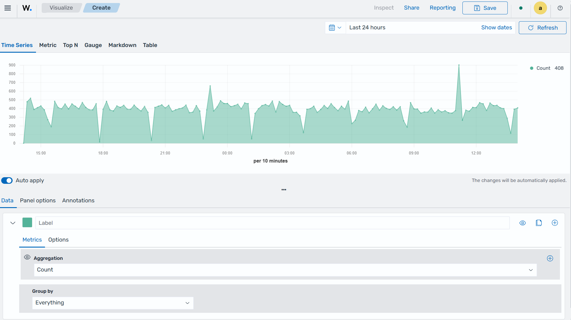
Set the following values on the Metric tab in Data:
Aggregation=CountGroup by=TermsBy=wazuh.integration.categoryTop=10Order by=Doc Count (default)Direction=Descending
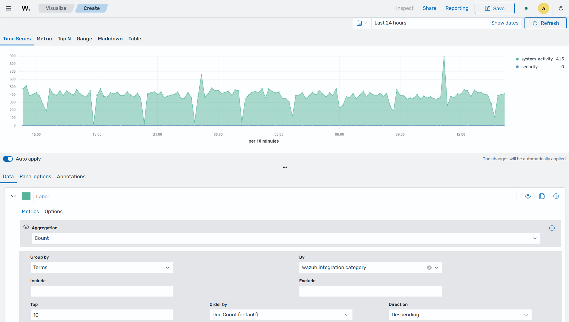
Click the Save button in the top right corner and assign a title to save the visualization.
Others
Here are some other items that are used in visualization:
Tag cloud: This is where selected field values are picked for creating a cloud of words.
Markdown: This will display a form for showing information or instructions.
Tag Cloud
This is a visual representation of text data where words are displayed in varying sizes based on their importance. Tag clouds are often used in data visualization, text analysis, or content analysis.
Creating a tag cloud
Click Create visualization from the Visualize tab, select the Tag cloud visualization format, and use
wazuh-events*as the index pattern name.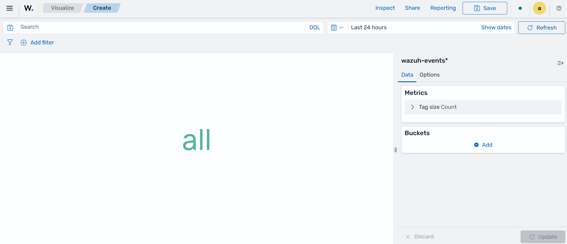
Set the following value on the Metric in Metrics data:
Tag size=Count
Add a new Tag in Bucket data and set the following values:
Aggregation=TermsField=wazuh.integration.nameOrder by=Metric: Count
Click the Update button.
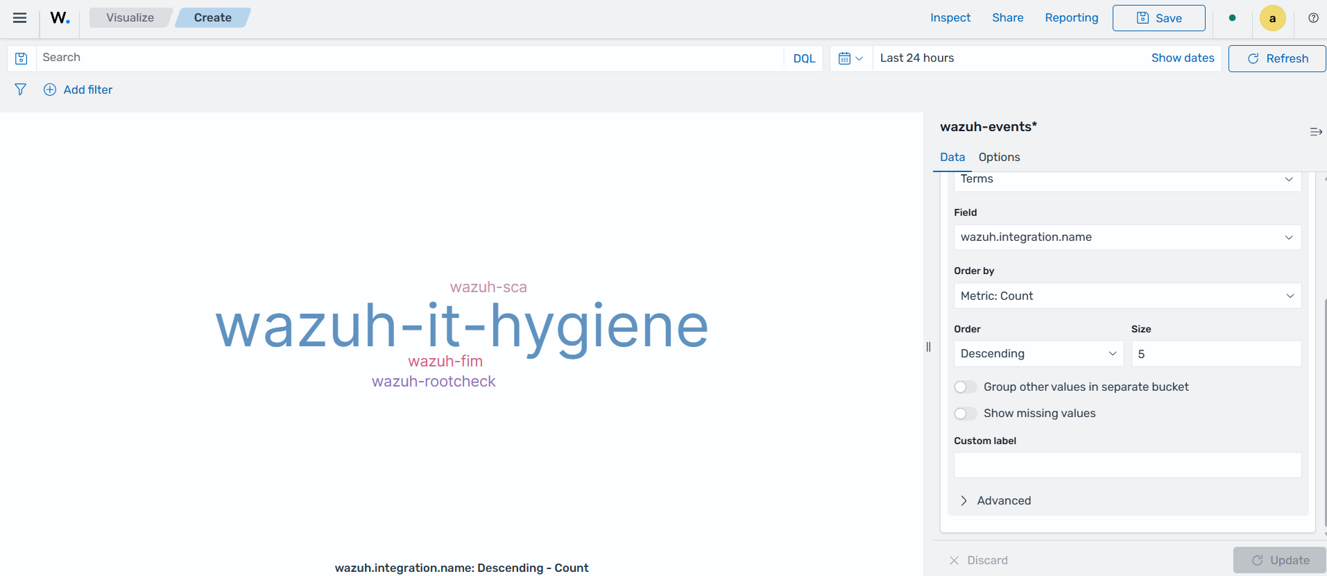
Click the Save button in the top right corner and assign a title to save the visualization.
Markdown
Markdown is a lightweight markup language that is used for formatting text. It allows users to add structure, emphasis, and styling to plain text documents without the need for complex coding. Markdown is often utilized in documentation, websites, and note-taking applications to create easily readable and formatted content.
Creating a markdown
Click Create visualization from the Visualize tab, select the Markdown visualization format, and use
wazuh-events*as the index pattern name.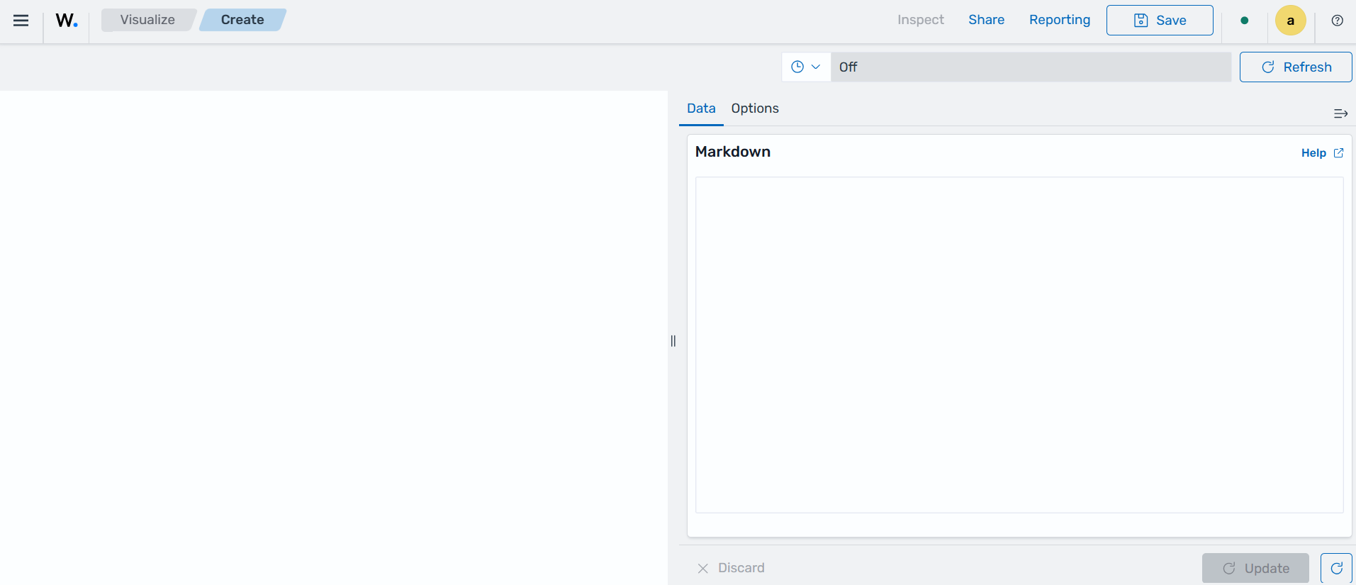
Add the text content in the given text area on the Data tab.
Increase or decrease the font using the controller on the Options tab.
Click on the Update button to show the markdown:
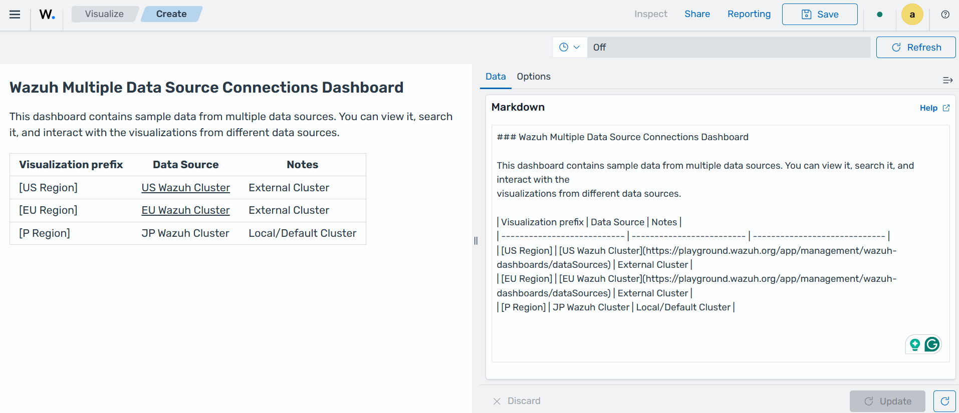
Click the Save button in the top right corner and assign a title to save the visualization.
Controls
These are interactive tools that provide users with the ability to manipulate or adjust parameters or settings within a software application or user interface. These controls enable users to customize their experience or modify certain aspects of the system according to their preferences. Controls are typically used in interactive applications or interfaces where users need to adjust settings, parameters, or filters to customize their experience or analyze specific aspects of the data.
At the time of writing this document, this visualization is experimental. The design and implementation are less mature than stable visualizations and might be subject to change.
Creating controls
Click Create visualization from the Visualize tab, and select the Controls visualization format.
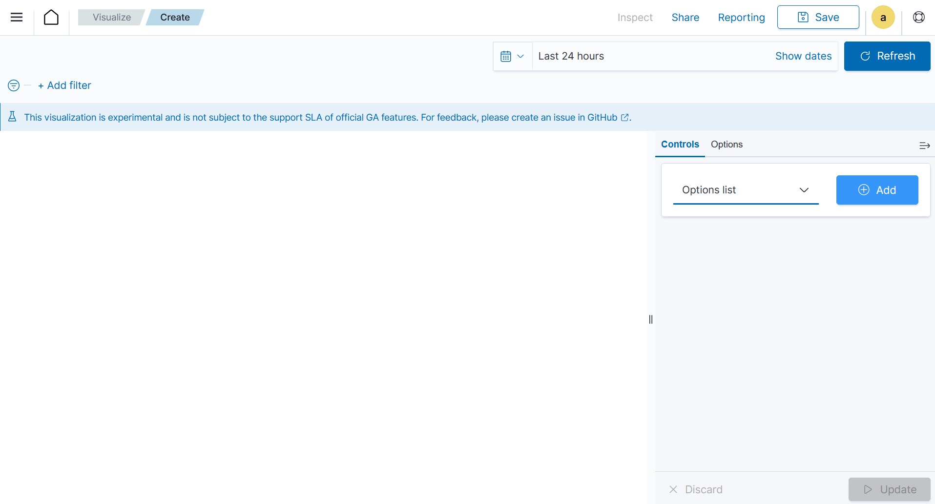
Click on the Add button to add a new
Options listand set the Control Label asMITRE tactic.Set
wazuh-events*as the Index Pattern name.Select the field
rule.mitre.tactic.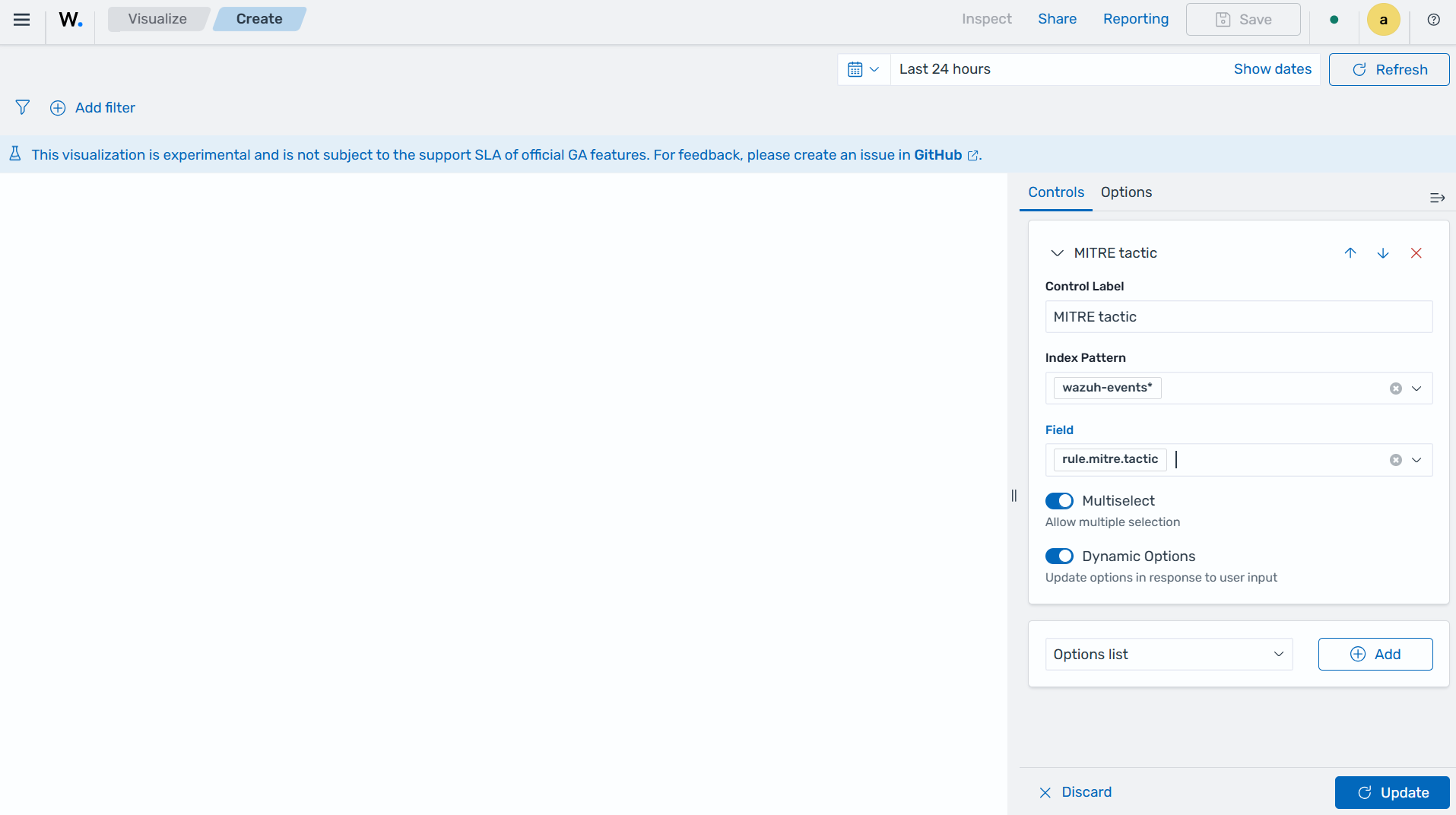
Click the Update button.
In the dropdown list, select
Range sliderand click on the Add button. Set the Control Label asQuantity.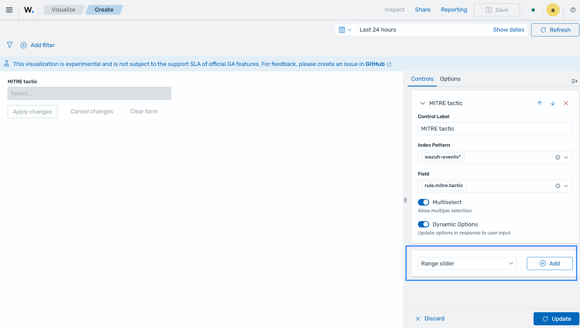
Select
wazuh-events*as the Index Pattern name.Select
event.severityas the Field.Click the Update button.
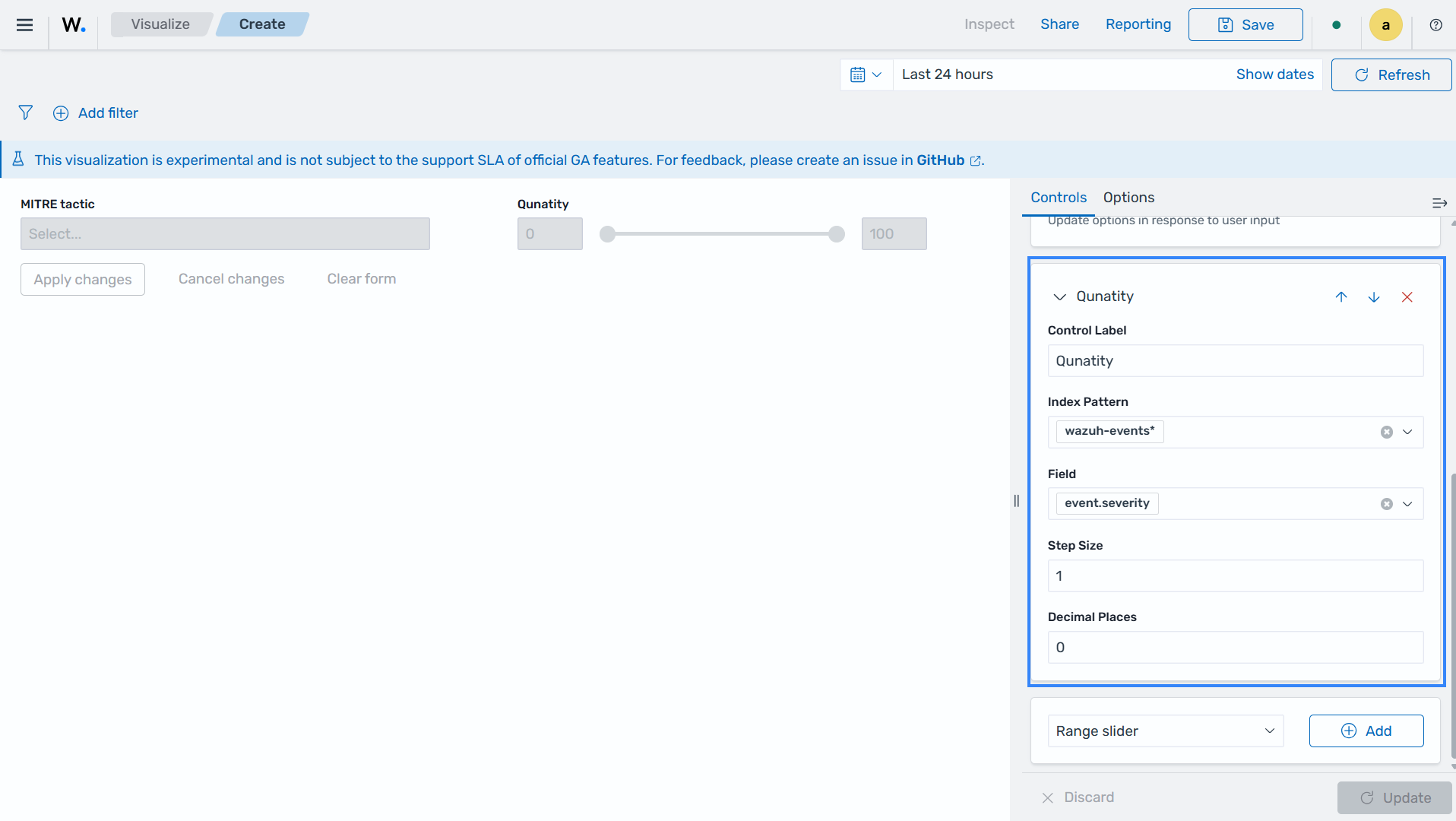
Click the Save button in the top right corner and assign a title to save the visualization.
Timeline
This is a chronological display of events or activities, often depicted as a horizontal line with dates or time periods marked along it. Timeline builds a time-series using functional expressions.
They are commonly used in historical analysis, project planning, or storytelling.
Creating Timeline
Click Create visualization from the Visualize tab, and select the Timeline visualization format.
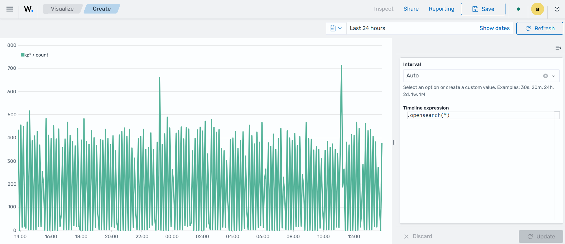
Choose a source for the chart. In the Timeline expression windows, within
.opensearch(*). The expression.opensearch(*)is a wildcard value that represents all the indexes currently within the Wazuh indexer, combined together. Here we selectedwazuh-events*as the index to use..opensearch(index=wazuh-events-*)
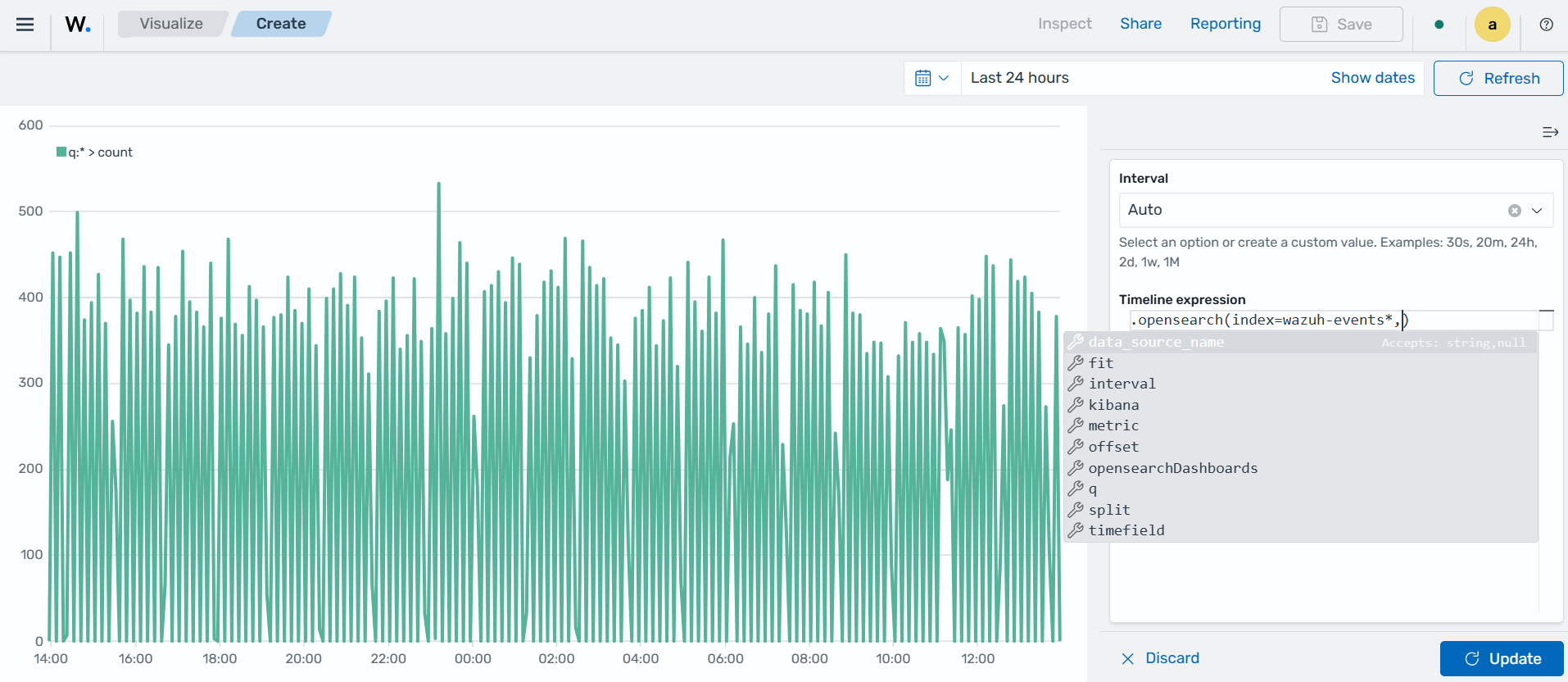
Where:
Index represents the data storage unit containing the data to be used for visualization.
Interval represents the time duration between data points or events.
Timefield represents a specific field in a dataset that holds timestamp or time information for each data point.
Metric represents the quantitative measure to be used from the data.
Offset is used to adjust the time displayed on the timeline for aligning with specific events.
opensearchDashboards represents a platform that provides a web-based interface for visualizing and exploring real-time data.
Q represents a query or set of queries used to filter and retrieve specific data for display.
Split represents the function that divides or groups data into segments based on a specified parameter for visualization and analysis.
A sample query:
.opensearch(index=wazuh-alerts-*, timefield=@timestamp, metric=count:request).aggregate(function=avg)
Vega
This is a versatile declarative language for creating interactive visualizations. It allows users to define visualizations using JSON syntax. It allows users to define complex visualizations using JSON syntax and is suitable for advanced data visualization needs.
Creating a dashboard
Dashboards transform your data from one or more single visualization perspectives into a group of visualizations that provide a clear representation of your data. This allows you to concentrate solely on the data that matters to you by presenting a dynamic representation of your data.
To create a custom dashboard, do the following:
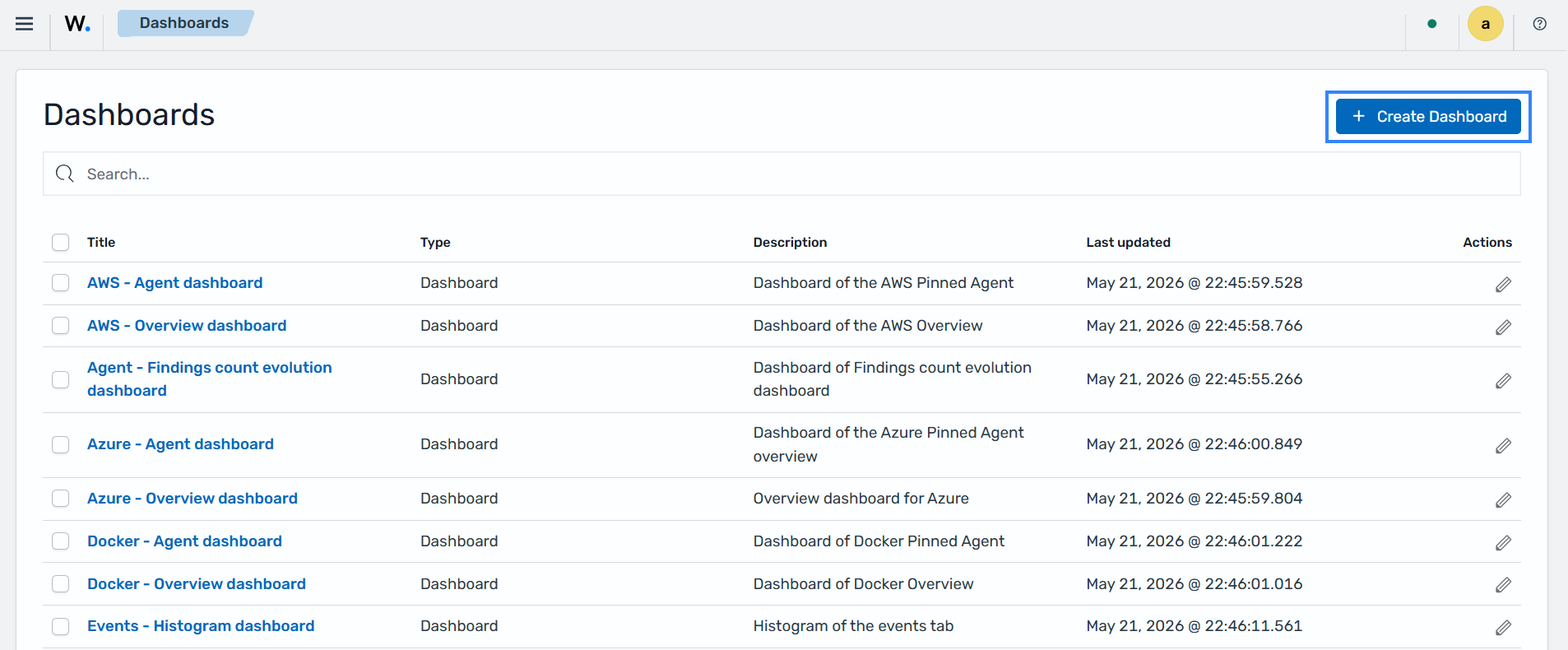
Click ☰ to open the menu and navigate to Explore > Dashboards > Create dashboard.
Click Add an existing and select the newly created visualizations to populate the dashboard.
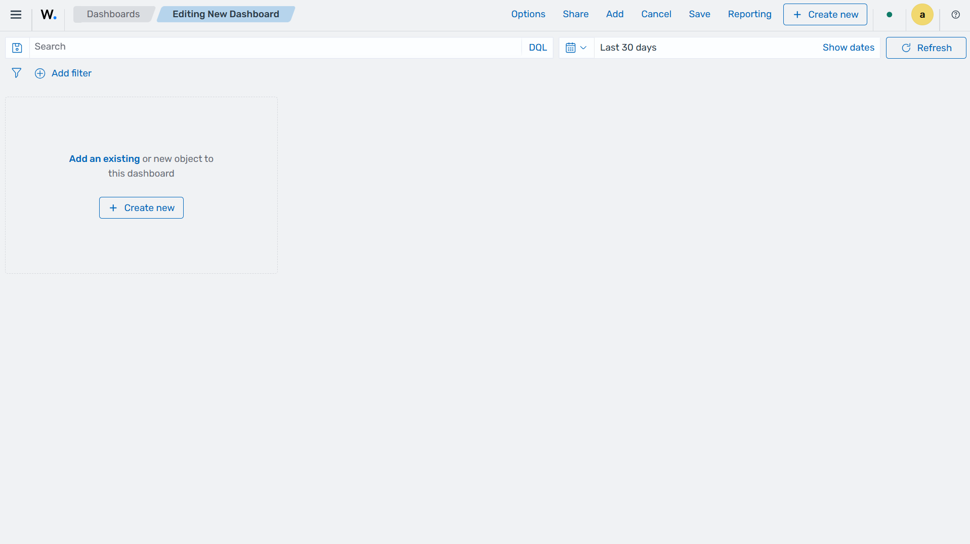
Save the dashboard by clicking the Save option on the top-right navigation bar.